BE CREATIVE. BE UNIQUE. BE YOUR BRAND.
BE CREATIVE. BE UNIQUE. BE YOUR BRAND.
Inspiring DACA students and their supporters to take action in response to the turmoil of the Trump administration's attempt to dissolve the DACA policy

THE CLIENT
THE BRIEF
THE PROJECT
LOCATION: CALIFORNIA, US
INDUSTRY: NONPROFIT & EDUCATIONAL INSTITUTES
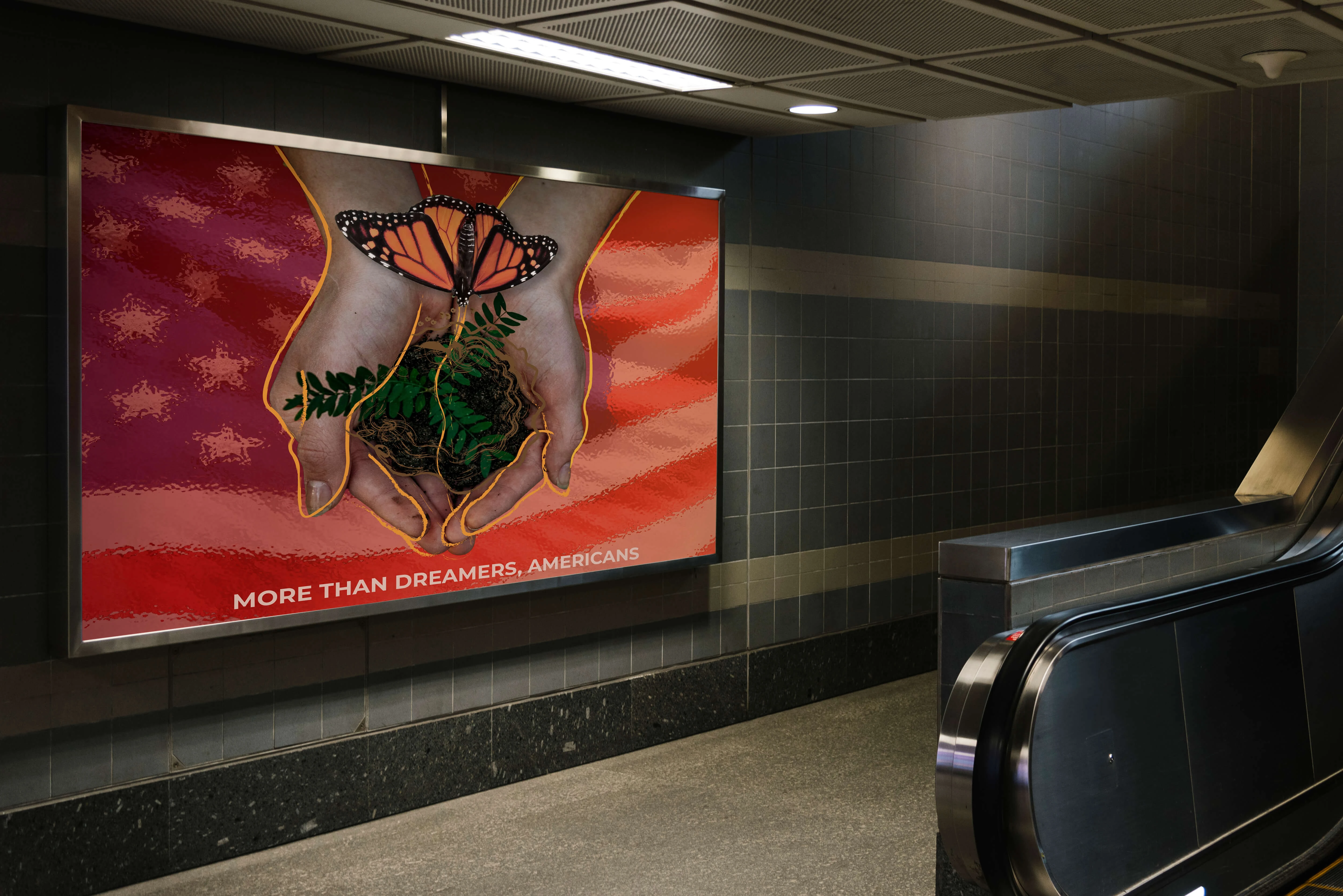
Created in response to the Trump administration’s attempt to dissolve the DACA policy, this campaign aimed to inspire students and their supporters to turn fear into empowerment through bold, inclusive, and emotionally charged visuals. The challenge was to go beyond information and build a visual movement that embodied strength, hope, and identity while advocating for equality and justice.
- PACKAGING DESIGN
- VISUAL BRANDING
- STATIONERY
- CONTENT CREATION
- SOCIAL JUSTICE CAMPAIGN
01 | Laying the Foundation Stage
Moodboard

Moodboard for DACA Campaign’s visua branding and packaging design
Requirements: changing the negativity of immigrants in the USA
Mood/Tone: Bold and empowering tone, inspiring DACA students and their supporters to take action. The visuals incorporates elements of diversity and inclusivity, reflecting the campaign's commitment to social justice. The color palette is bright and eye-catching, while also conveying a sense of hope and optimism
WHY A MOODBOARD?
Moodboards help me center that visual energy and inspiration in one place, guiding the creative direction of the entire project. Research can get overwhelming until something like this is created for quick access.

02 | Unleashing the Creative Chaos Stage
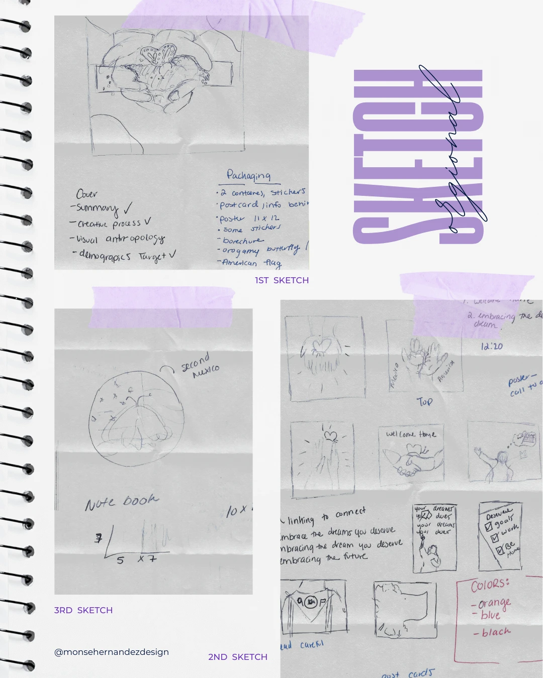
Sketching

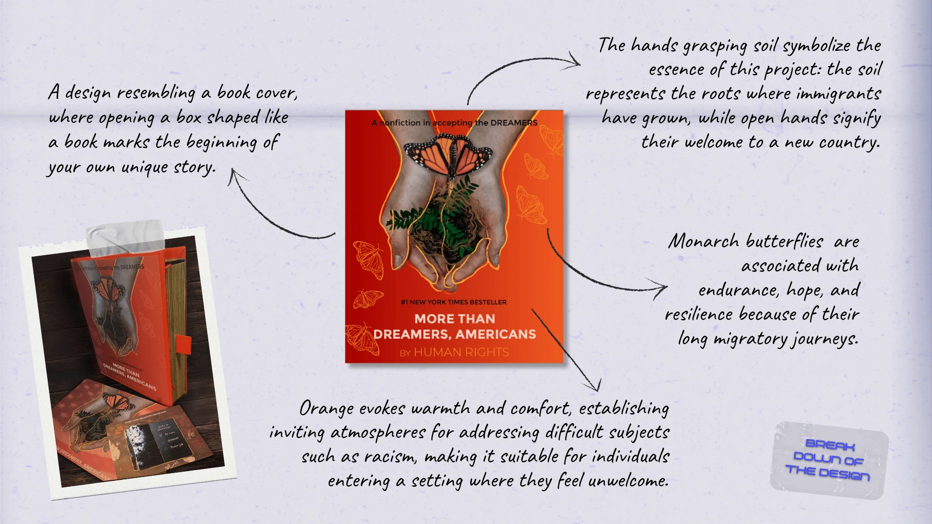
1st Sketch: Some times playing with words is half of it. That’s why you’ll see two lists below the image. One of my first ideas was a monarch butterfly resting on dripping soil. The combination of hands and the butterfly immediately stood out as powerful symbols, and from there, they became the heart of the entire campaign.
2nd Sketch: As I continued sketching and brainstorming, more and more imagery started flowing onto the page. You can see how many ideas took shape, many of which later became key elements in the final branding package. This project sparked a deep emotional connection, and I found myself flooded with strong, symbolic visuals that felt meaningful and necessary to explore.
3rd Sketch: By the third sketch, I was fully immersed in researching what DACA represented and refining the message behind the visuals. The connection between Mexico and the U.S. became central to the concept, grounded once again by the monarch butterfly to symbolizing resilience, migration, and the bridge between two worlds.
03 | The From Chaos to Clarity Stage
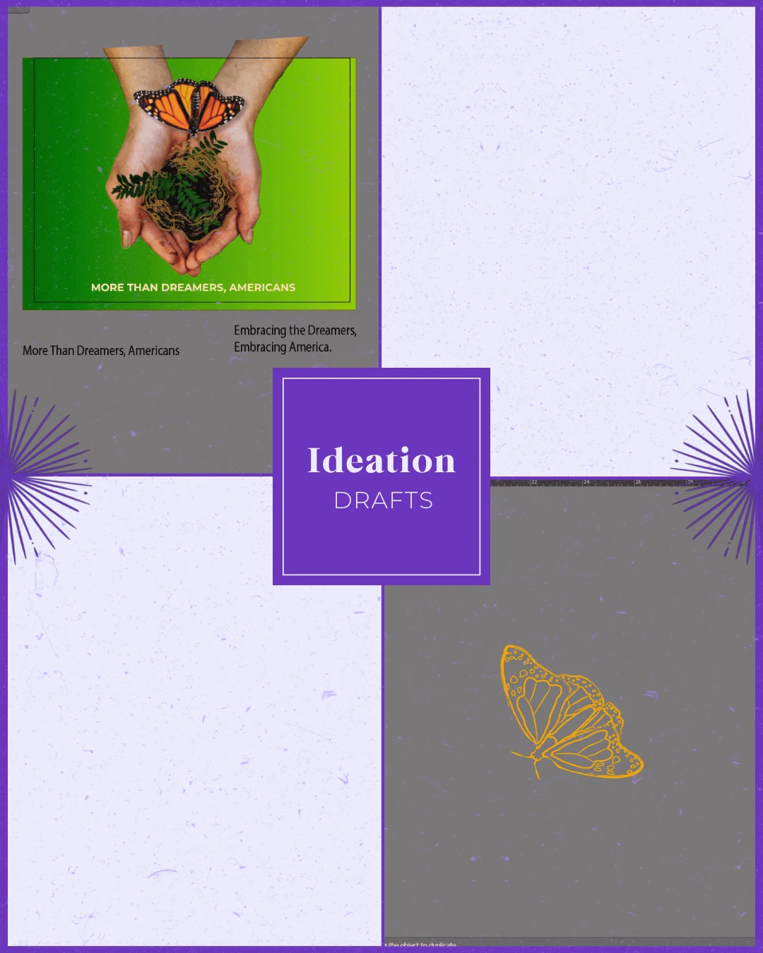
Ideation

The monarch butterfly emerged as the central symbol, representing migration, transformation, and the bridge between two worlds: Mexico and the United States.
Target Audience: The primary target is DACA students and their families along with supporters of immigration reform and social justice. The secondary target is politicians and policymakers.
Brand Personality: Bold, inspiring, and action-driven are the words thaat created this campaign to celebrates courage and identity. It positions DACA students not as victims, but as future leaders of America whose voices demand to be heard.
WHY SHARE THE "UGLY" DRAFTS OF THE PROCESS?
Design is a process of exploration, not instant perfection.
Each draft is a different way of solving a visual problem I worked through. These early stages leave more room for creativity and refinement, making sure the final design is not just visually appealing but intentional and strategic. And believe it or not, these are only a handful of selected drafts (the countless others have been buried deep in my files).


04 | The Grand Reveal Stage
Bringing Concepts to Life
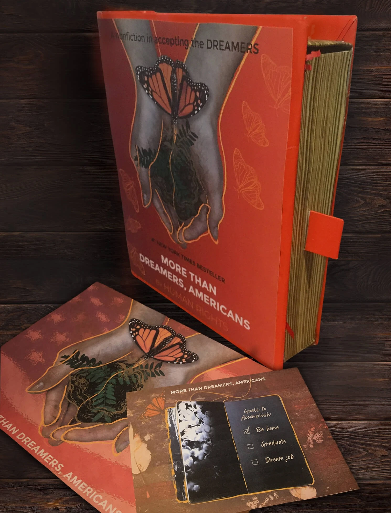
This project holds a special place in my heart because I’m from Mexico, and unlike many of my friends, I had the privilege of coming to this country the "legal" way. That opportunity allowed me to pursue higher education without the constant fear of being reported for simply trying to improve my life. Although More Than Dreamers, Americans is a conceptual project I hope to bring to life someday, it was born from a deeply personal place. After designing the logo for the Dreamer Center at Reedley College, I saw how design can empower communities and amplify underrepresented voices. That experience inspired me to imagine a campaign that could welcome DREAMER students with something meaningful, a symbolic gift that celebrated who they are.
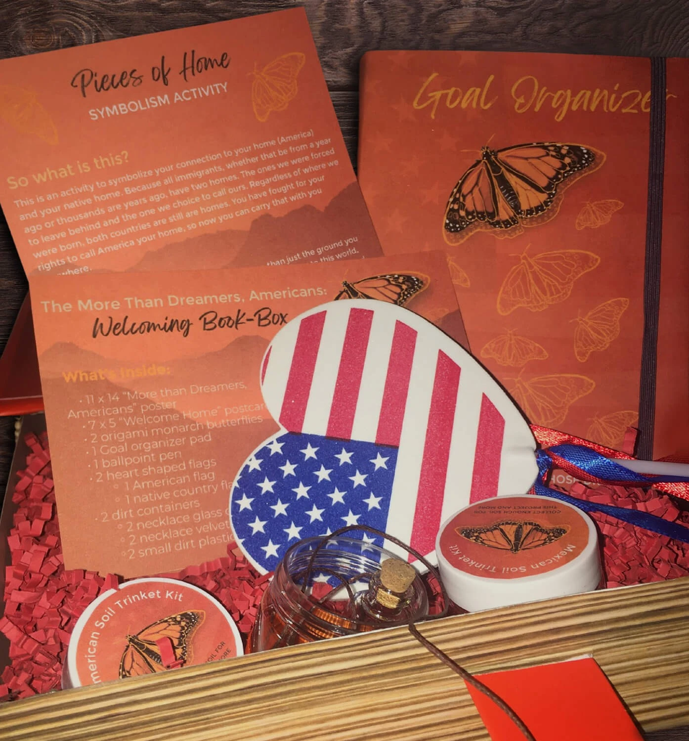
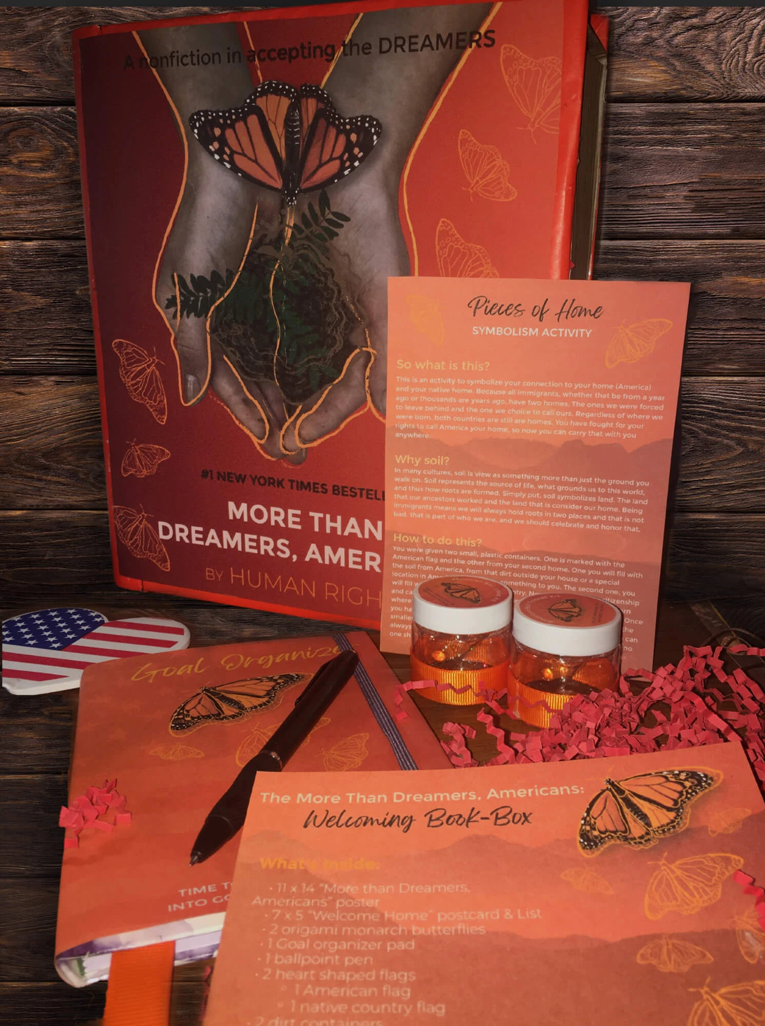
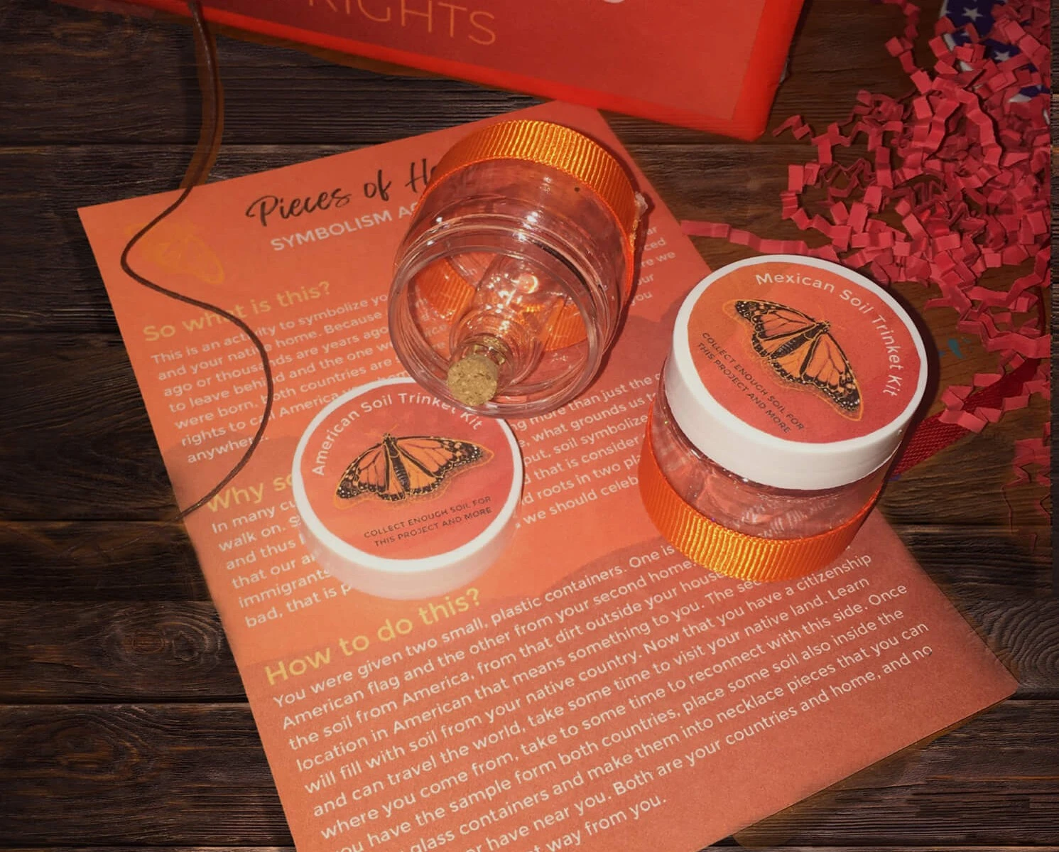
More Than Dreamers, Americans envisions a book-shaped welcome box created for DREAMER students, filled with empowering materials such as goal journals, symbolism cards, and soil kits representing home and heritage. This project became a personal point of pride, as I crafted every detail of the packaging—from measurements to printing—allowing me to fully explore the tactile side of print and packaging design. The campaign’s visual identity is rooted in empathy, empowerment, and cultural pride, centered around an illustration of two hands holding soil as a monarch butterfly emerges, symbolizing migration, growth, and resilience. With a warm palette of saturated oranges and earthy browns, clean typography, and strong symbolism, the design evokes hope and unity. Inspired by the political turmoil surrounding attempts to dismantle the DACA policy, the project aimed to go beyond informational materials, becoming a visual movement that inspires action, celebrates identity, and reflects the strength and belonging of the DREAMER community.
The Breakdown
BONUS STAGE: Behind the Scenes of the Design

WHY SHOWCASE THIS ON THE WEBSITE?
The difference between me and AI (aside from my great style) is that every decision I make has a reason behind it, rooted in research, experience, and an understanding of how each choice reflects the brand, even in the hidden little details. Here’s a glimpse behind the scenes of what that looks like.
Explore More Designs