BE CREATIVE. BE UNIQUE. BE YOUR BRAND.
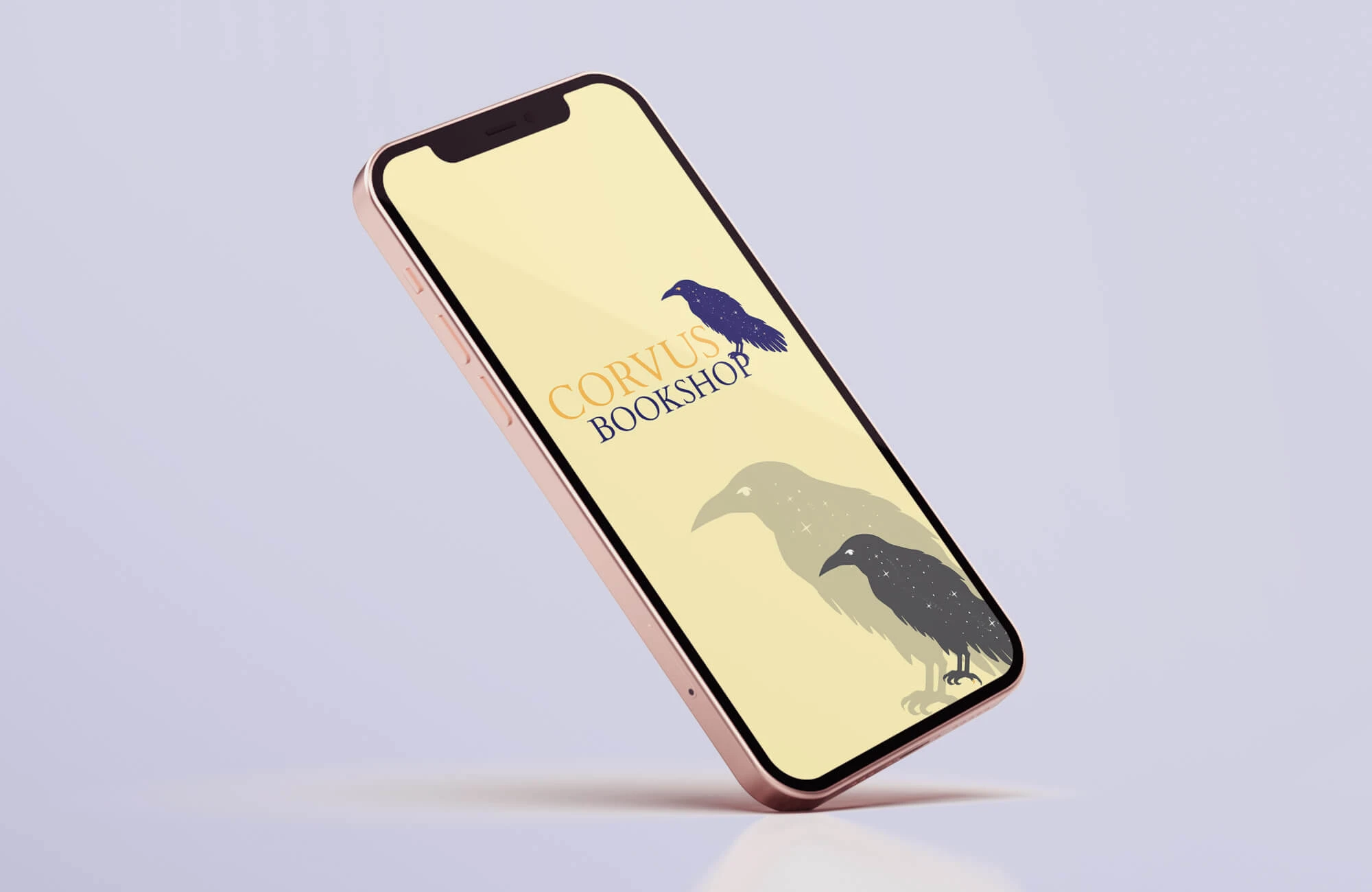
The essence of the occult takes on a refined edge in this bookshop, turning the brand into a gateway of knowledge rather than settling for ordinary Halloween décor.
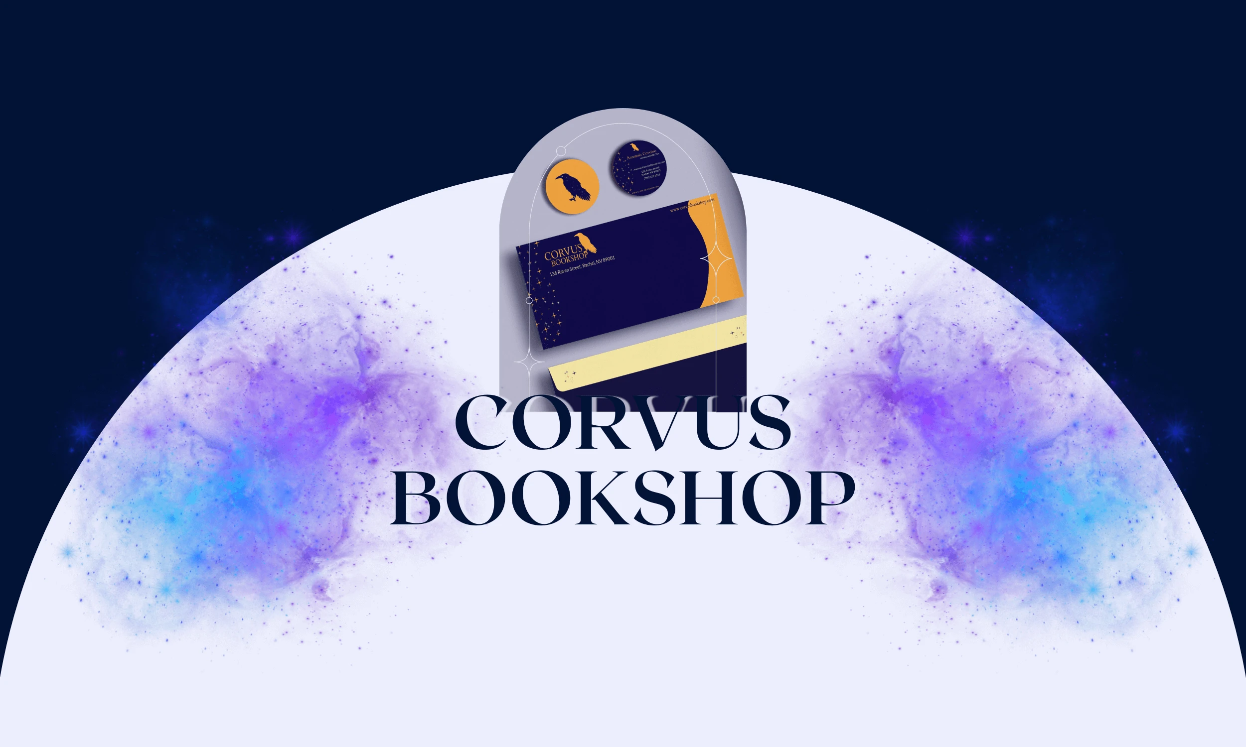
THE CLIENT
THE BRIEF
THE PROJECT
LOCATION: CALIFORNIA, USA
INDUSTRY: OCCULT & BOOK
The challenge was to create a visually compelling brand identity that captured the unique personality of the occult while maintaining a sophisticated image that set it apart from cheap Halloween stores. At its core, the brand identity was designed to support the store’s mission of teaching and self-discovery, encouraging exploration of taboo spiritual subjects without judgment or shame.
- LOGO DESIGN
- BRAND IDENTITY
- PACKAGING DESIGN
- CONTENT CREATION
- MERCHANDISE
- PRINT DESIGN
01 | Laying the Foundation Stage
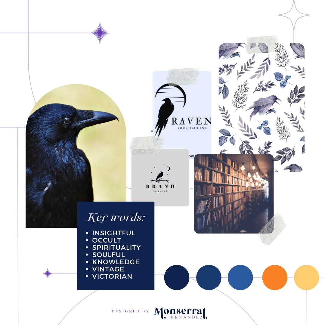
Moodboard

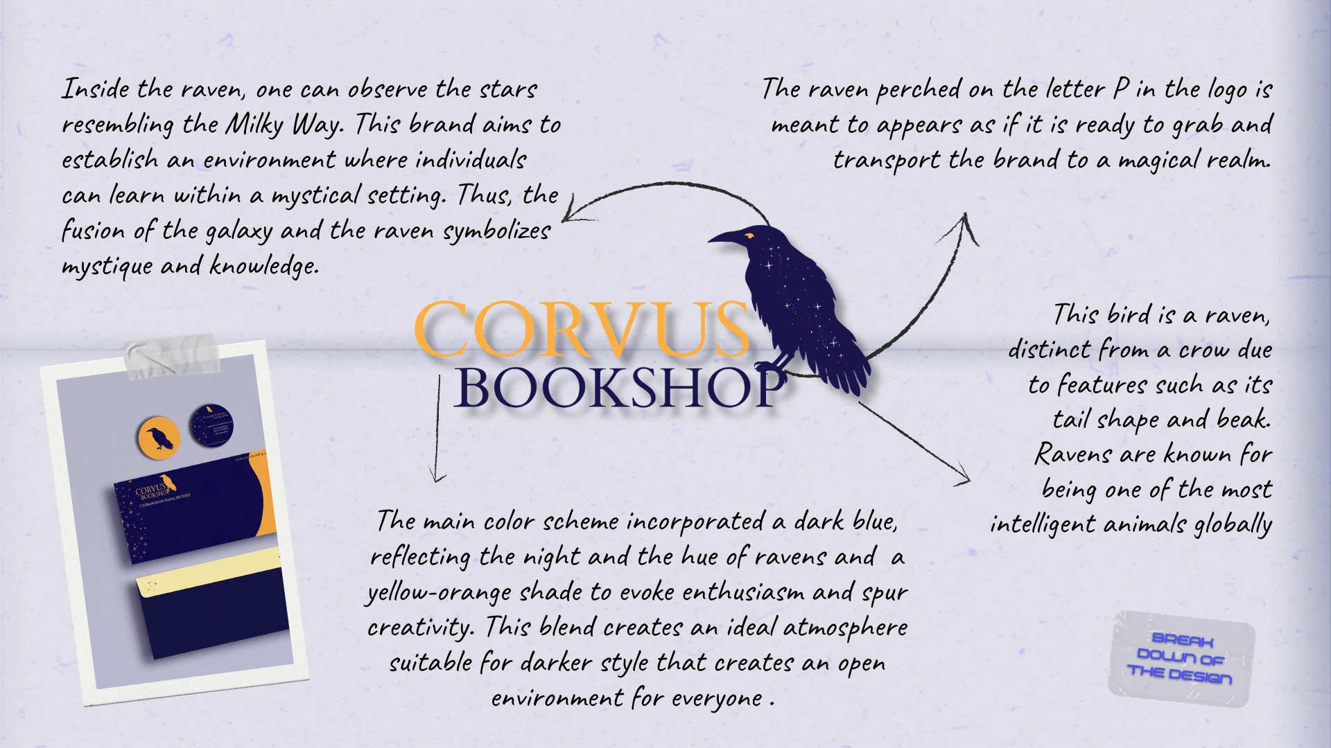
Moodboard for Corvus Bookshop’s logo creation, identity brand, and packaging design
Requirements: present spirituality and the occult in an uplifting manner to promote learning.
Mood/Tone: The style should be mystical, enlightening, and insightful, with a focus on capturing the essence of the occult and spiritual practices. The color palette should be moody and rich, with a mix of deep and vibrant colors to create a unique visual language.
WHY A MOODBOARD?
Moodboards help me center that visual energy and inspiration in one place, guiding the creative direction of the entire project. Research can get overwhelming until something like this is created for quick access.
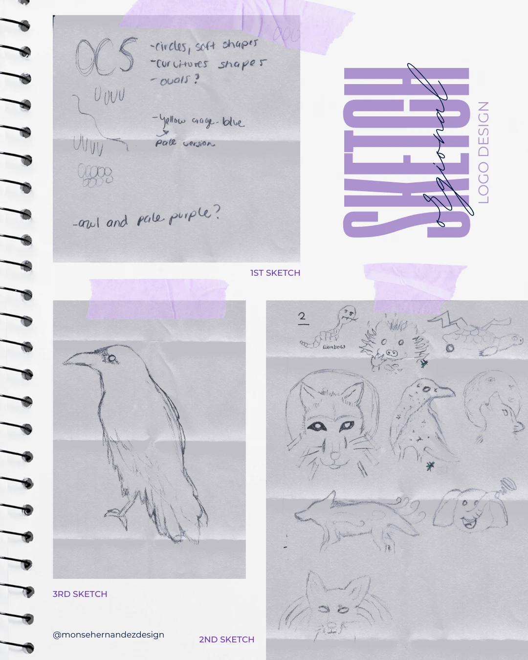
02 | Unleashing the Creative Chaos Stage
Sketching

1st Sketch: As I’ve grown as a graphic designer, I’ve become more aware of how I sketch. My process often starts with words that come to mind, alongside abstract shapes and patterns, like the feathers and circles I explored here. Sketching is my way of thinking and discovering new ideas.
2nd Sketch: Since this brand had no established face or personality, I had the freedom to experiment with different animals and concepts. I sketched over ten variations, and within them, the final logo began to emerge. Sometimes, a brand naturally reveals who it wants to be.
3rd Sketch: Once I realized the raven would define the tone and style of this brand, I refined its shape and experimented with different poses. The moment I sketched the right one, I knew. This sketch became the foundation for the final design in Illustrator.
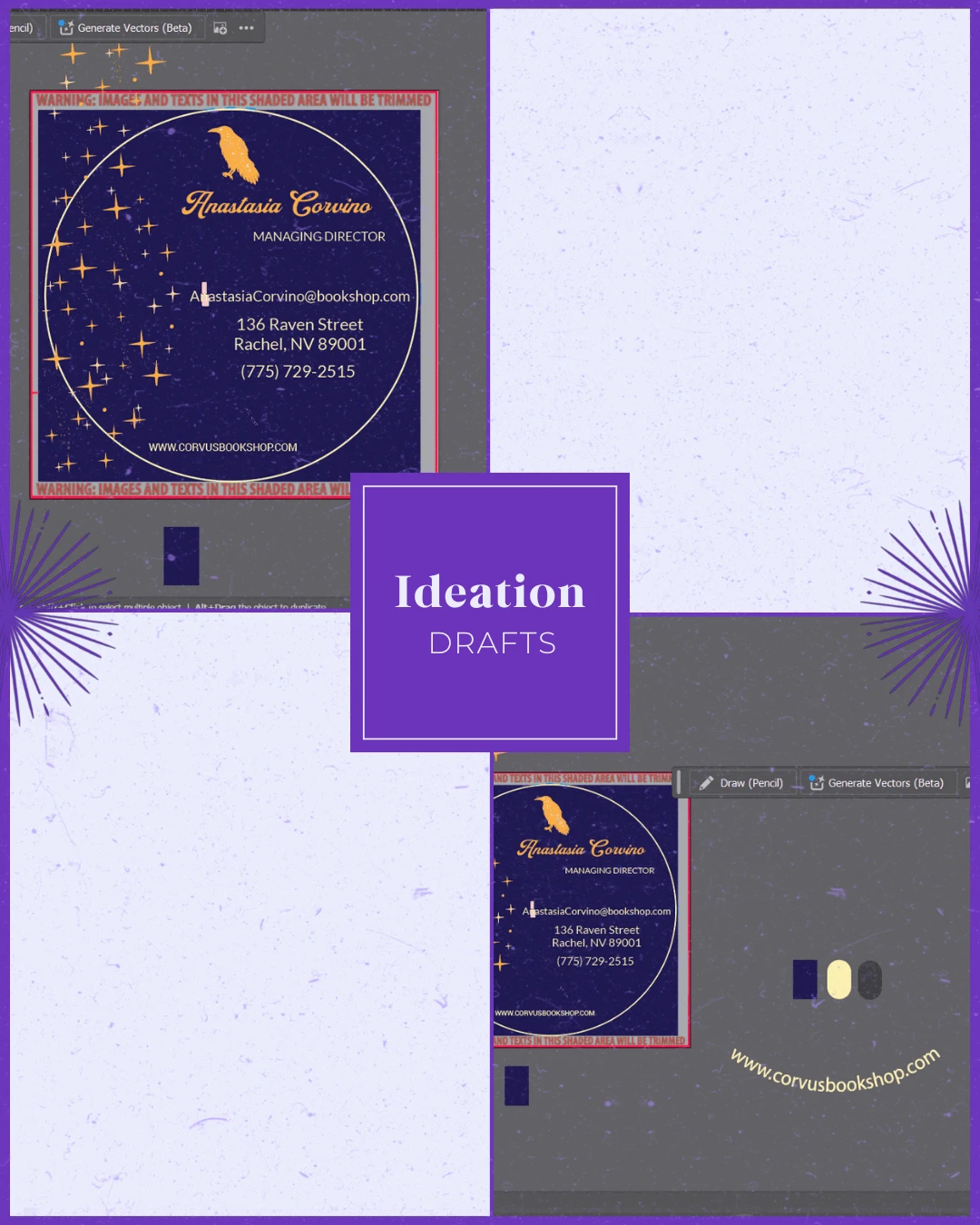
03 | From Chaos to Clarity Stage
Ideation

A mystical brand that specializes in providing educational materials, including books and starter kits, for individuals interested in occult and spiritual practices.
Target Audience: Individuals interested in occult and spiritual practices. They are likely to be young adults or hobbyists who are interested in self-discovery, personal growth, and spirituality.
Brand Personality: Mystical, enlightening, and insightful
WHY SHARE THE "UGLY" DRAFTS OF THE PROCESS?
Design is a process of exploration, not instant perfection.
Each draft is a different way of solving a visual problem I worked through. These early stages leave more room for creativity and refinement, making sure the final design is not just visually appealing but intentional and strategic. And believe it or not, these are only a handful of selected drafts (the countless others have been buried deep in my files).


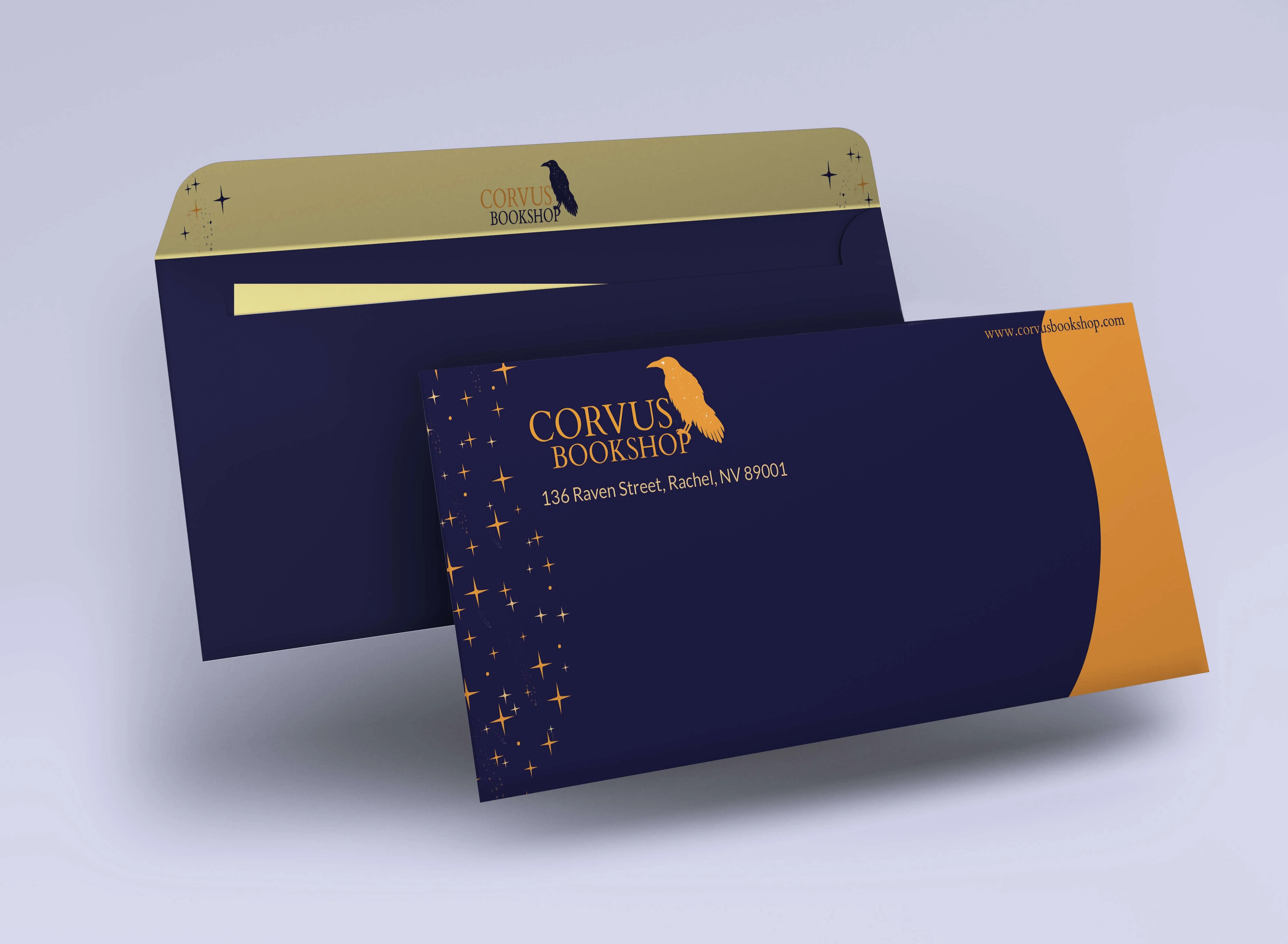
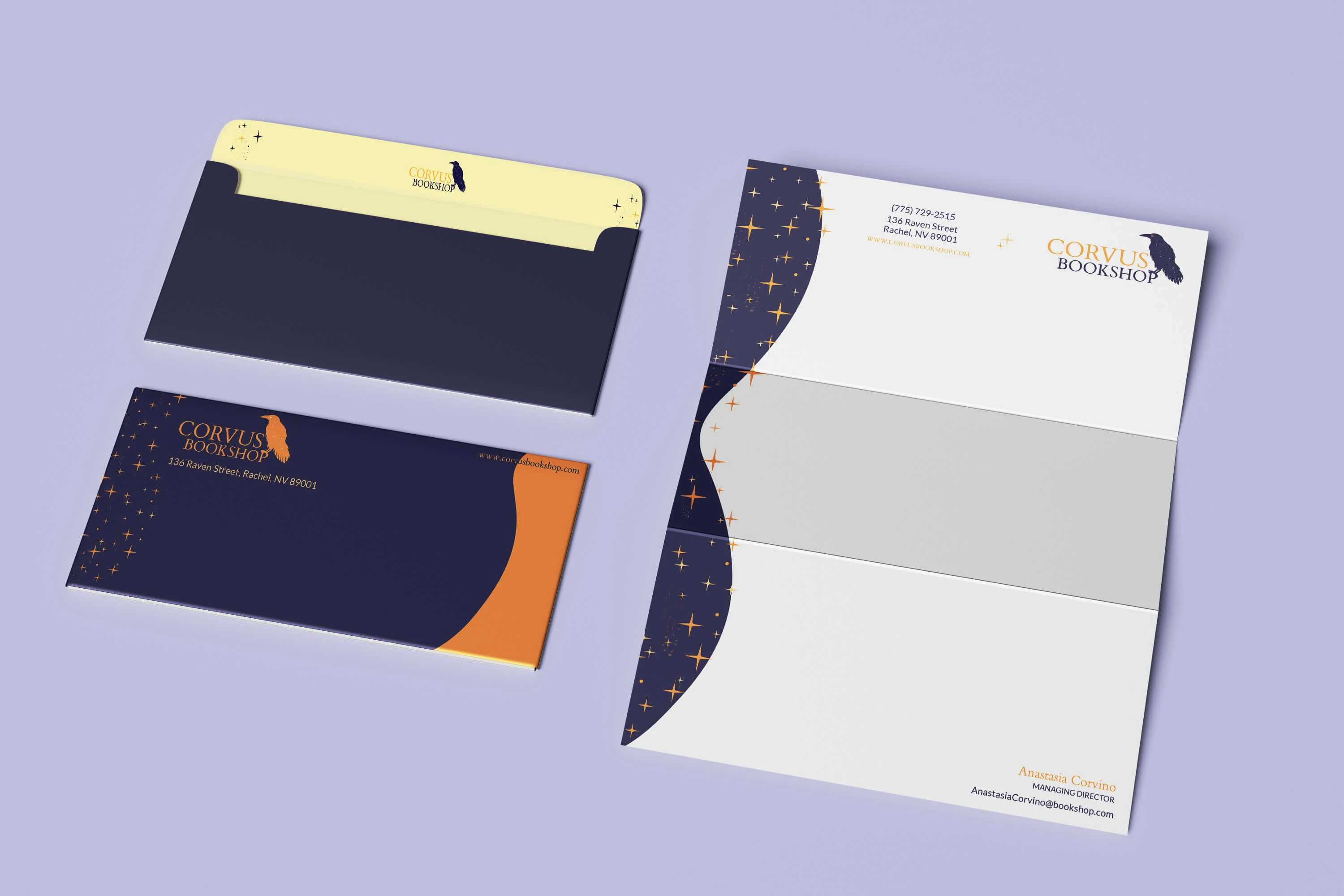
04 | The Grand Reveal Stage
Bringing Concepts to Life
Brutalist, artistic strokes remained central to the brand, with the skull logo developed through expressive brushwork and unique textures to capture its edgy yet captivating personality. Every detail, from the bold logo to dark, moody packaging with vibrant accents, was crafted to resonate with alternative fashion lovers seeking individuality and statement pieces. This brand wasn’t about staying simple or minimalistic; it was about being edgy and imperfect, embracing the rawness of handmade style.
The Breakdown
BONUS STAGE: Behind the Scenes of the Design


WHY SHOWCASE THIS ON THE WEBSITE?
The difference between me and AI (aside from my great style) is that every decision I make has a reason behind it, rooted in research, experience, and an understanding of how each choice reflects the brand, even in the hidden little details. Here’s a glimpse behind the scenes of what that looks like.
Explore More Designs