
BE CREATIVE. BE UNIQUE. BE YOUR BRAND.
Capturing the raw, unvarnished essence of the alien world while reflecting on the mesmerizing storytelling of R. Lee Smith’s Cottonwood
THE CLIENT
THE BRIEF
THE PROJECT
LOCATION: CALIFORNIA, USA
INDUSTRY: SELF-PUBLISHING & BOOKTOK
The project gave the chance to merge print and motion design into a unified storytelling experience. The redesigned cover and cinematic trailer not only elevate the novel visually but also reflect its underlying grit, suspense, and emotional depth by turning this hidden gem into something that feels ready for the screen.
- BOOK COVER REDESIGN
- TITLE SEQUENCE
- MOTION GRAPHICS
- CONTENT CREATION
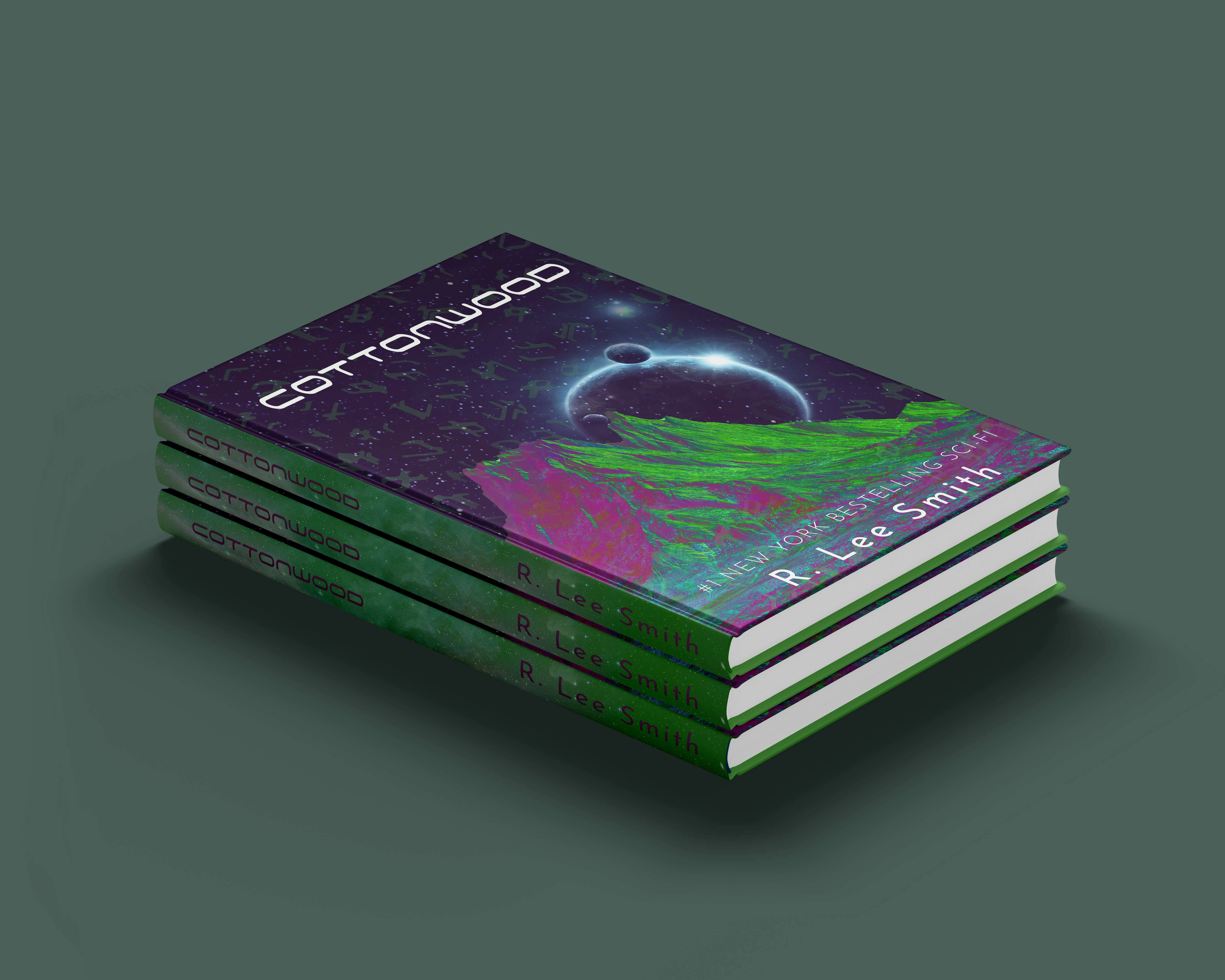
Part I: Book Cover Redesign

01 | Laying the Foundation Stage
Moodboard

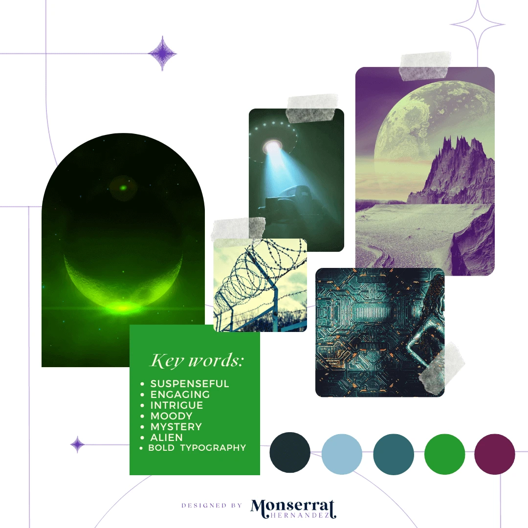
Moodboard for Cottonwood’s full advertisement video campaign and book cover design
Requirements: animated promotional materials that reflect the the writing of R. Lee Smith's
Mood/Tone: The tone is intense, modern, and unapologetically bold, inviting readers to step into a story that challenges perceptions of humanity and survival. The mood comes through in the layered textures and vivid color palette, which clash against the dark cosmic backdrop to create a raw, electric energy that mirrors the book’s tense themes of alien–human conflict.
WHY A MOODBOARD?
Moodboards help me center that visual energy and inspiration in one place, guiding the creative direction of the entire project. Research can get overwhelming until something like this is created for quick access.
02 | Unleashing the Creative Chaos Stage
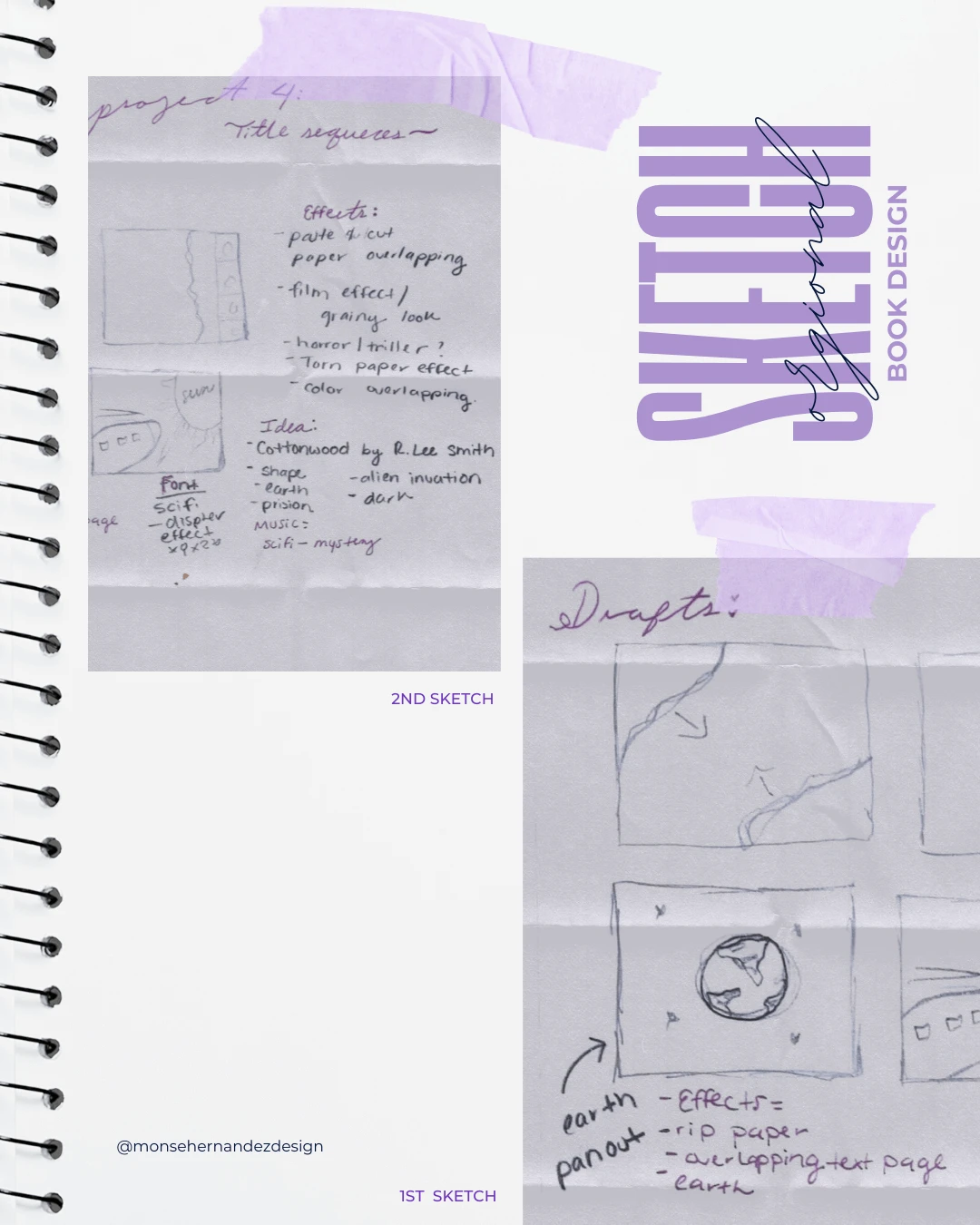
Part I: Book Design Sketch

1st Sketch: These sketches began as part of my design process for turning a book into a visual sequence. As I explored how to compose and design the elements, the sketches evolved into the foundation for the book cover redesign of Cottonwood by R. Lee Smith. The Earth became the central element that sparked the design for both the cover and the sequence.
2nd Sketch: It all started with an alien—an idea I had for a motion picture sequence. In the world of motion graphics, I first imagined this book as a show that could play on Netflix. Sometimes, I have so many ideas that I need to jot them down as points before translating them into sketches. At this stage, I had a clear vision of the concept but only a vague idea of how to visually bring the design to life.
03 | From Chaos to Clarity Stage
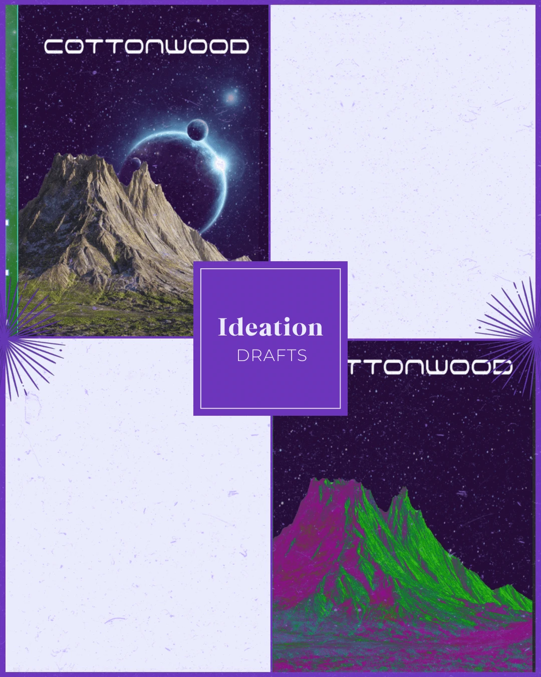
Ideation

Through bold typography, and atmospheric imagery, the cover captures the story’s tone of suspense and human struggle
Target Audience: Science fiction enthusiasts, fans of R. Lee Smith's work, and readers who are interested in exploring the concept of alien invasions and human nature.
Brand Personality: Suspenseful, gritty, and full of intrigue, it leans into a modern, edgy aesthetic that mirrors the raw complexity of humans and aliens interactions.
WHY SHARE THE "UGLY" DRAFTS OF THE PROCESS?
Design is a process of exploration, not instant perfection.
Each draft is a different way of solving a visual problem I worked through. These early stages leave more room for creativity and refinement, making sure the final design is not just visually appealing but intentional and strategic. And believe it or not, these are only a handful of selected drafts (the countless others have been buried deep in my files).
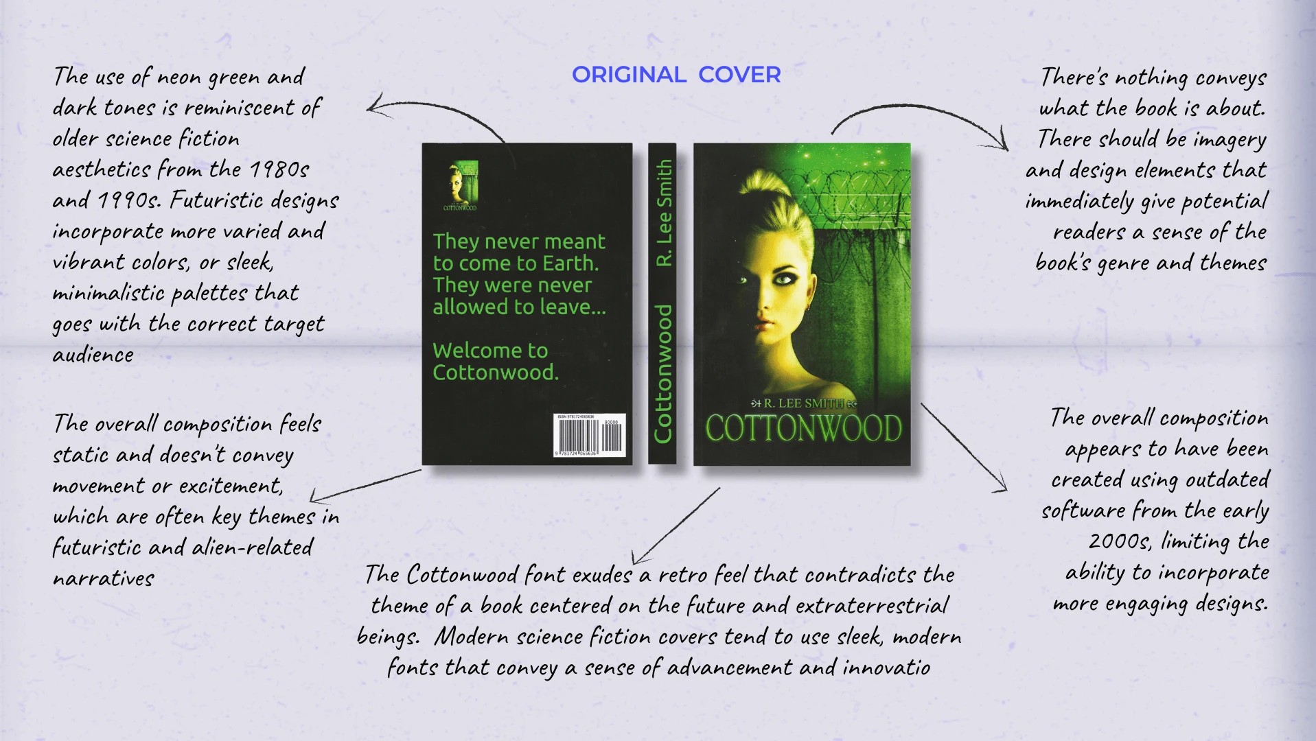
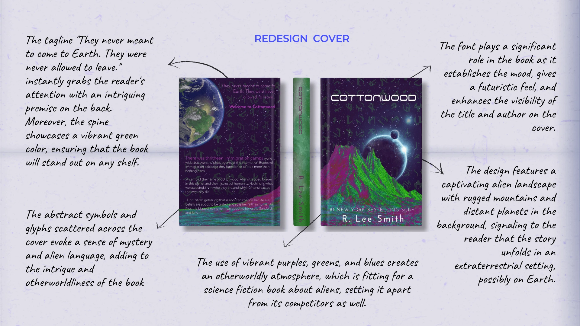
04 | REDESIGN EDITION: Understanding What Works and What Doesn't
The Breakdown

05 | The Grand Reveal Stage
Bringing Concepts to Life
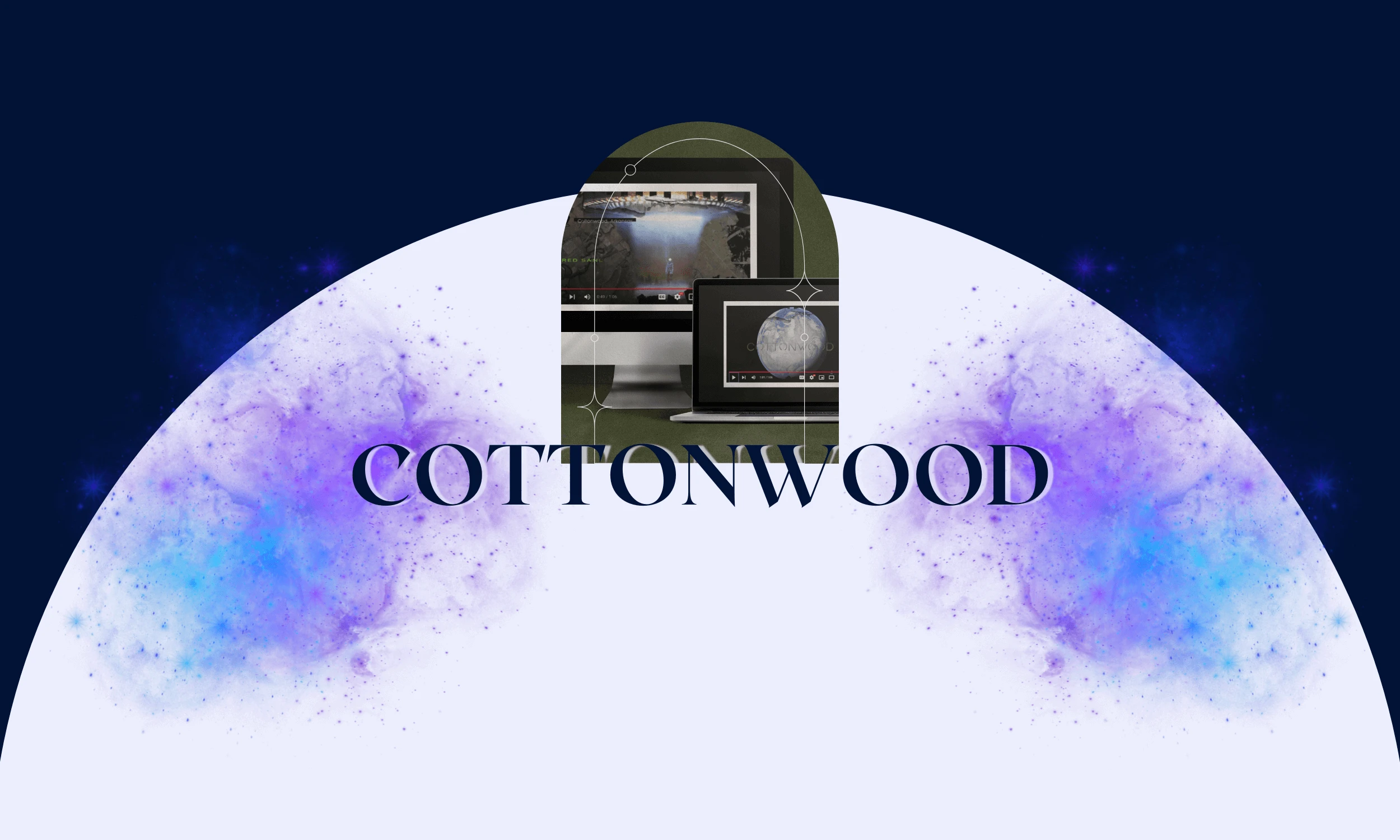
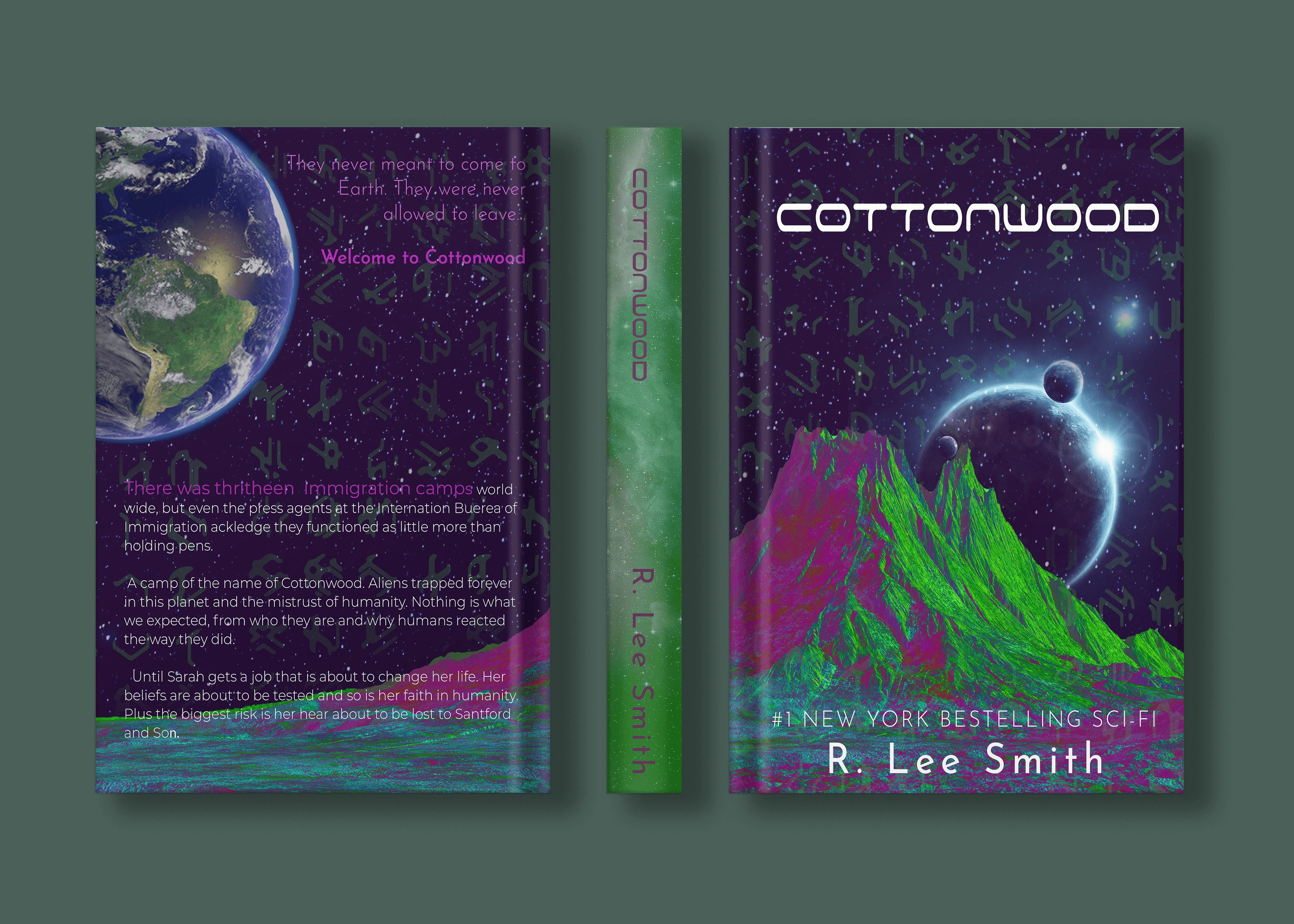
The goal of this project was to reimagine Cottonwood by R. Lee Smith through both a book cover redesign and a cinematic motion trailer. My aim was to honor the novel’s powerful blend of science fiction and social commentary by creating visuals that feel raw, gritty, and immersive. While the world may one day see Cottonwood adapted for film or streaming, I wanted to use my design skills now to give this hidden gem the recognition it deserves.
To reflect the story’s themes, the focuse was on the gritty existence of an extraterrestrial race that came to Earth only to be met with hostility, prejudice, and confinement. Cast into poverty and isolation in Arkansas, these aliens became despised outsiders, feared rather than understood. To capture this atmosphere, I embraced a disheveled, chaotic visual style that mirrored the disorder and turmoil of their world. The end result is a design that doesn’t just illustrate the book but amplifies its voice—bold, cinematic, and unapologetically true to the story’s raw heart.
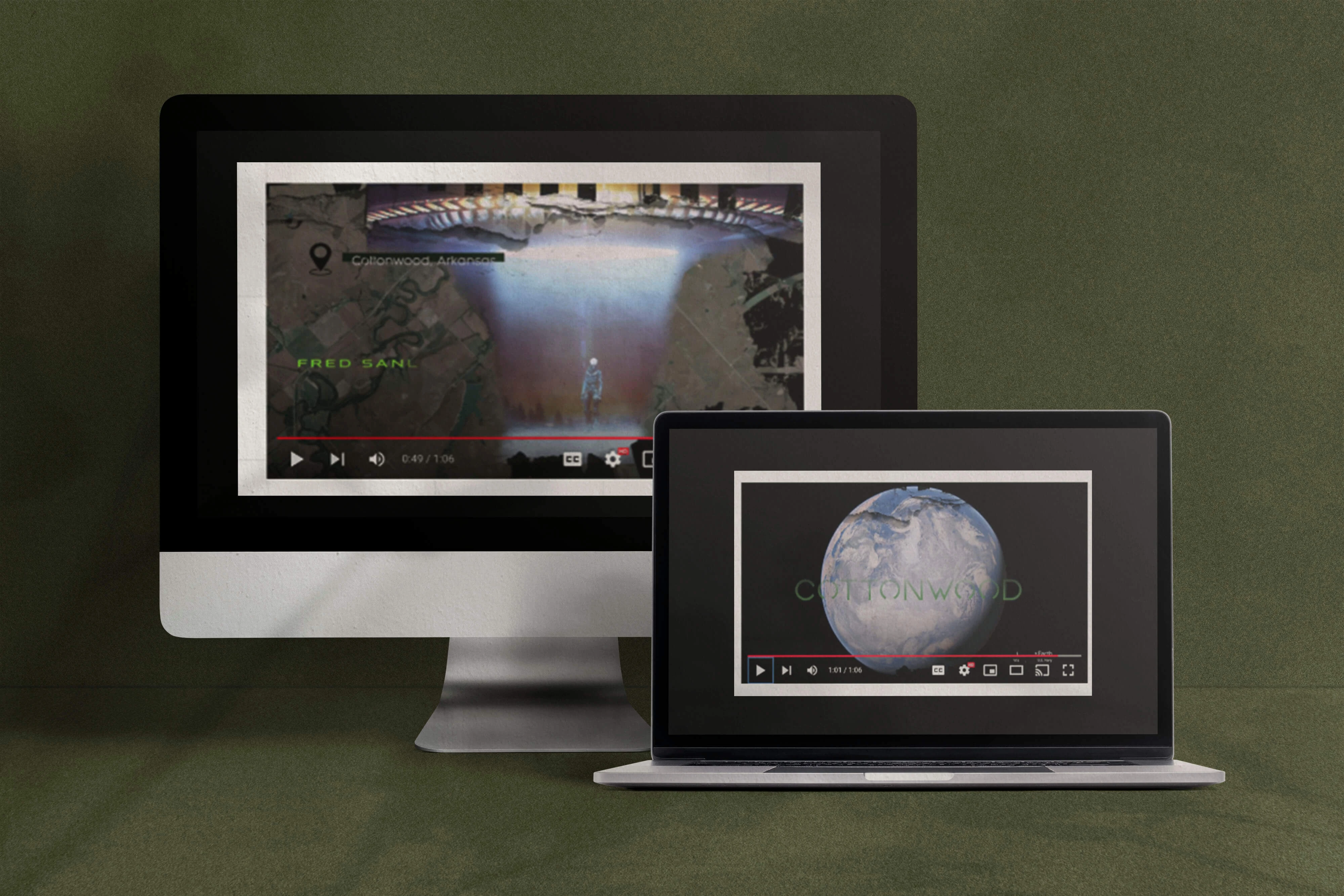
Part II: Promotional Sequence

02 | Unleashing the Creative Chaos Stage
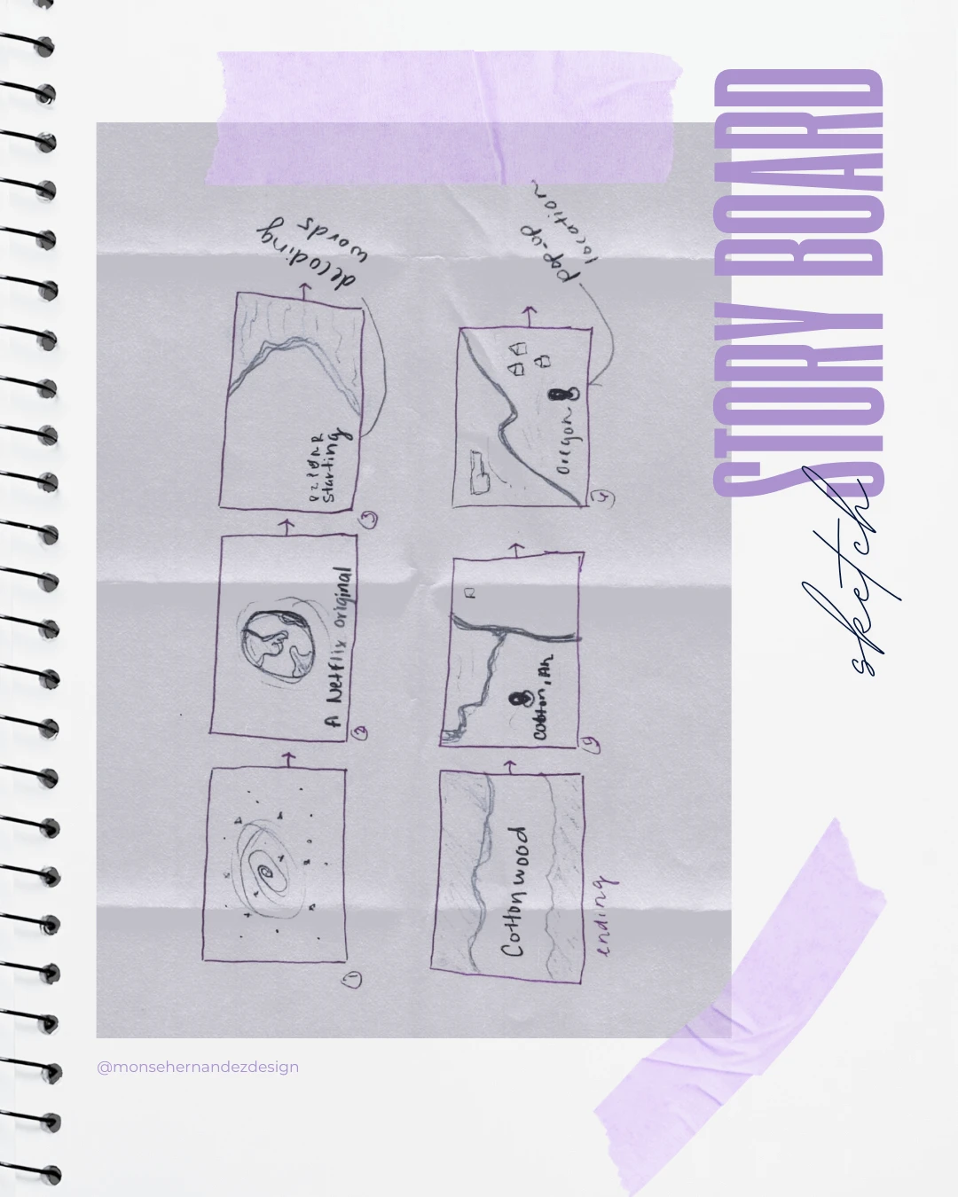
Part II: Sequence Storyboard

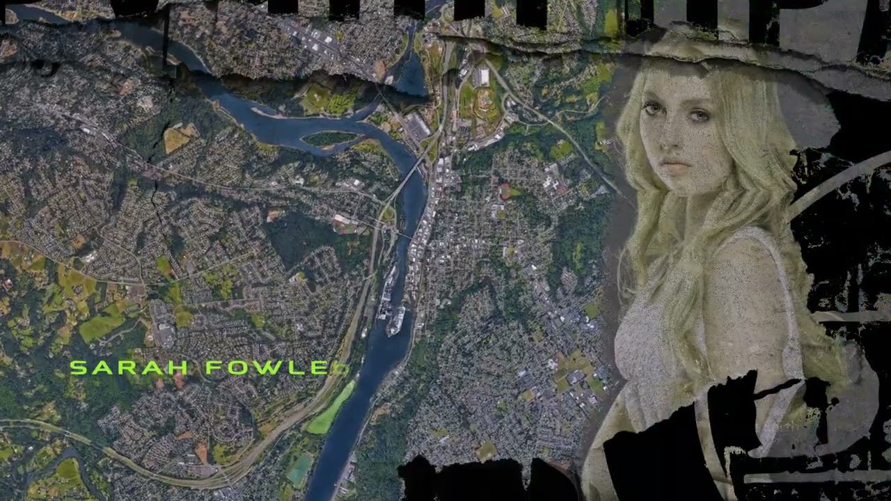
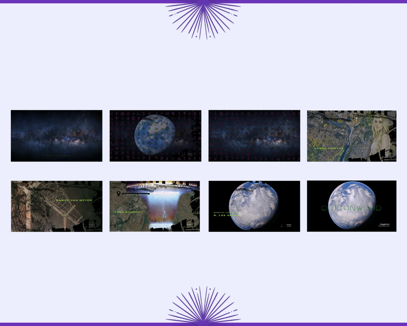
Storyboard: Every second of the sequence mattered, as there was little time between frames to capture the raw intensity of Cottonwood. I designed the visuals to be impactful and dramatic, embracing a slightly chaotic, untidy aesthetic that aligned with the book’s gritty atmosphere. With Earth and sweeping cosmic landscapes at its core, the sequence takes on a cinematic scale, feeling like a frame pulled straight from a Netflix sci-fi epic.
WHAT IS A TITLE SEQUENCE?
My objective was to translate the raw, unvarnished essence of Cottonwood by R. Lee Smith into both static and moving visuals. The redesign of the book cover and the creation of a motion trailer weren’t separate ideas: they were two sides of the same design. To give this hidden gem of a story the epic treatment it deserves, using motion graphic design was used to create the video above.
As I worked through the design, I realized the story’s scale and emotional weight demanded more than a static image. The fonts, colors, and compositions sparked the idea: what if Cottonwood had the cinematic treatment of a Netflix sci-fi epic title sequence? That’s when the motion trailer was born.
03 | From Chaos to Clarity Stage
Part II: Sequence Storyboard

The trailer takes the cover’s design language and expands it into motion. The soundtrack, blending cinematic sci-fi tones with melancholy undertones, amplifies the grit and suspense that permeates the book.
Through bold typography, a minimal yet moody color palette, and atmospheric imagery, the cover captures the story’s tone of mystery, suspense, and human struggle. Expanding this vision into motion graphics, I developed a trailer that layers sweeping shots of Earth, chaotic textures, and dramatic sound to reflect the alien community’s turmoil and humanity’s prejudice.
Explore More Designs