BE CREATIVE. BE UNIQUE. BE YOUR BRAND.
An established brand dedicated to strategic training and coaching, they help leaders refine their leadership style, ensure team alignment, and foster sustainable workplace cultures
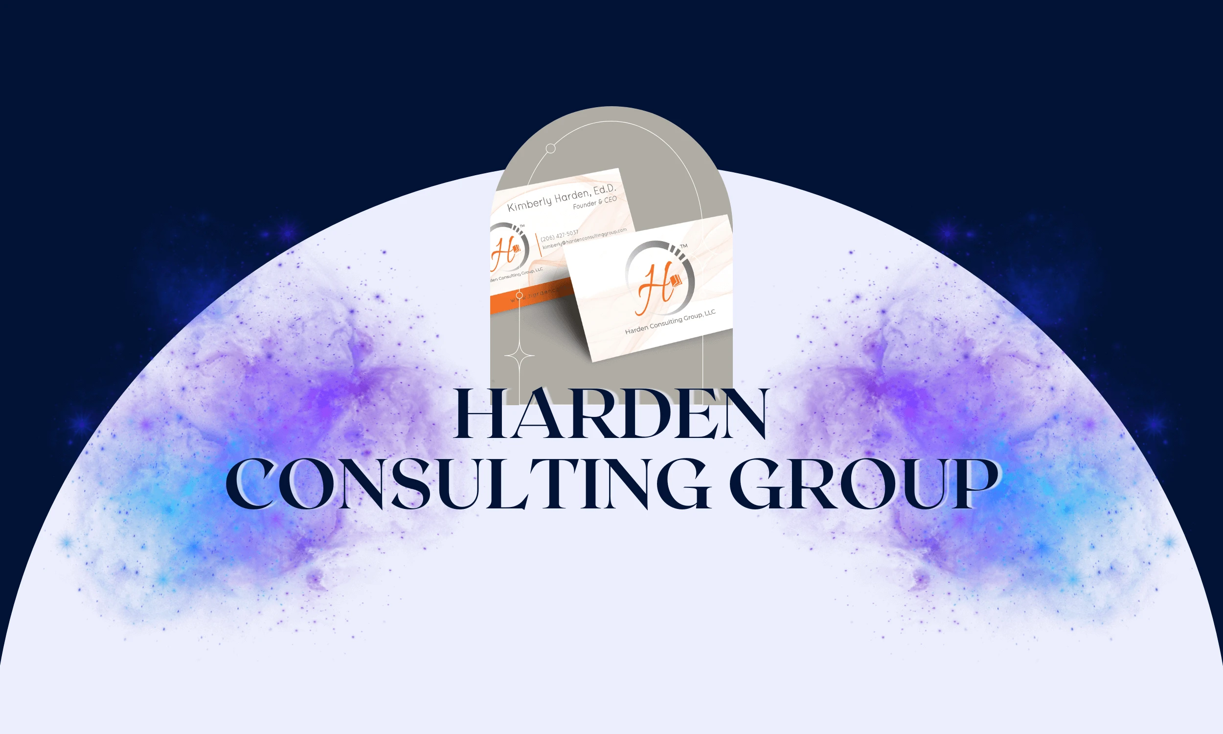
THE CLIENT
THE BRIEF
THE PROJECT
LOCATION: SEATTLE, WA
& CHARLOTTE, NC, USA
INDUSTRY: PROFESSIONAL
TRAINING & CORPORATE
CONSULTING
The company’s full brand identity was developed in close collaboration to accurately reflect its mission and values. At the center is a logo that became the face of the future for this award-winning consulting agency, setting the foundation for a comprehensive identity system and a range of supporting designs. The challenge was to create a brand that not only stood out in a competitive and ever-changing field but also remained timeless and adaptable to shifting political and educational landscapes.
- LOGO DESIGN
- BRAND IDENTITY
- CONTENT CREATION
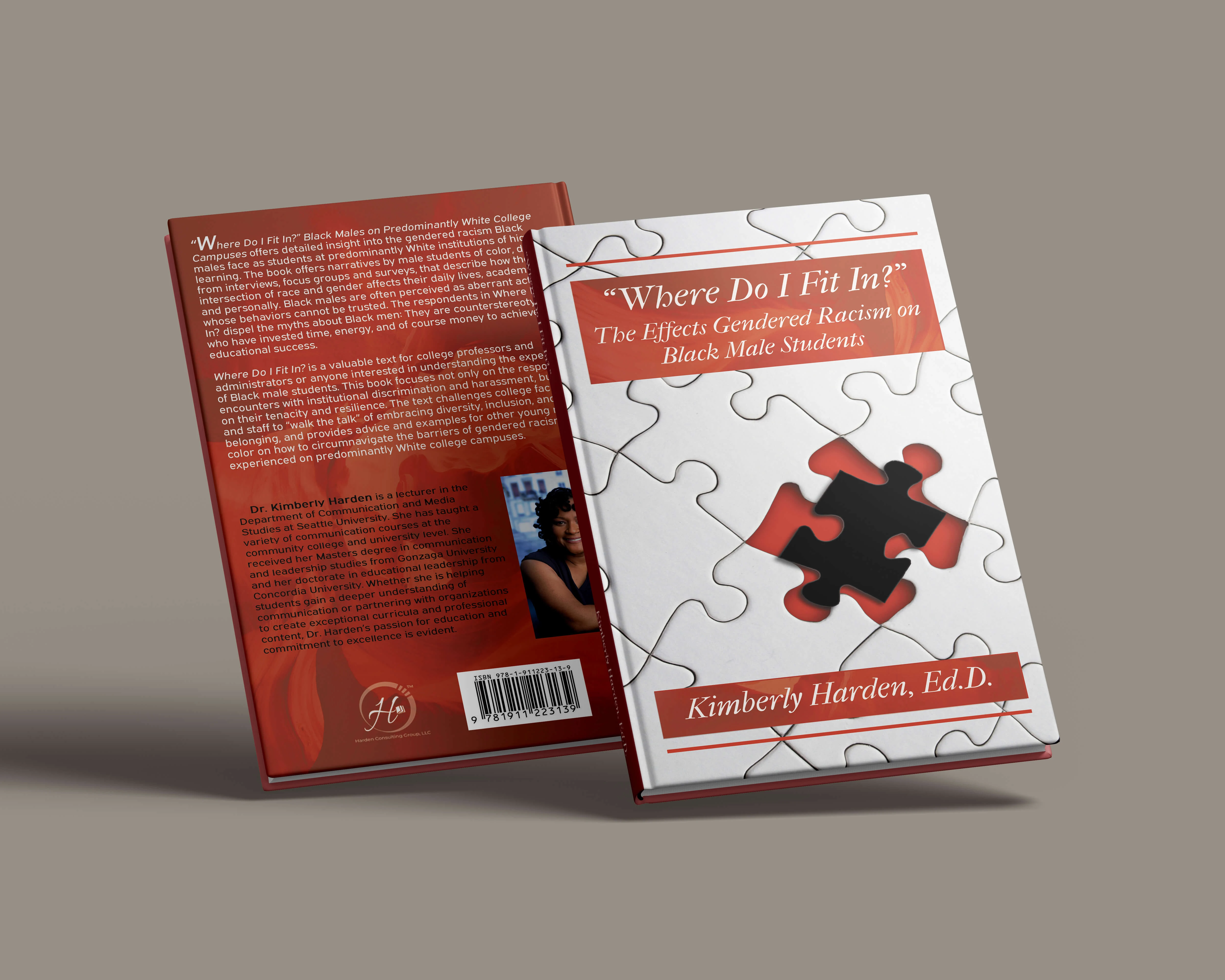
- BOOK COVERS
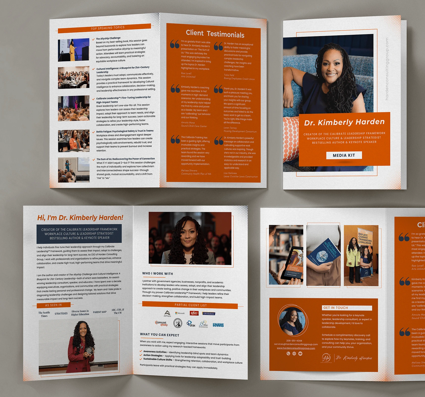
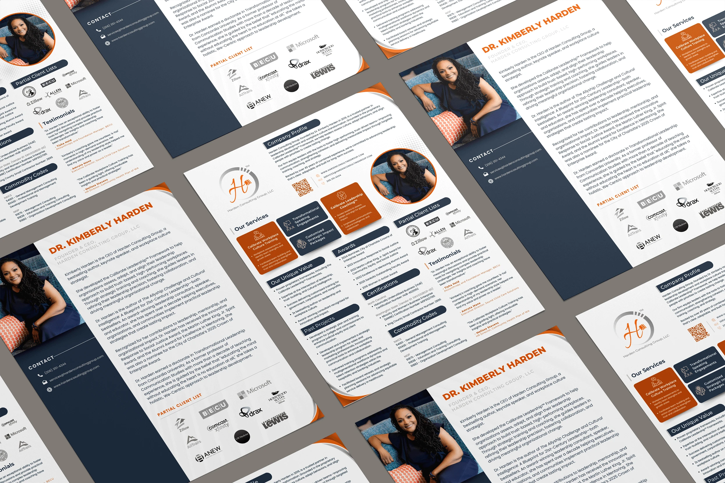
- PRESENTATIONS
- EDUCATIONAL MATERIALS
01 | Laying the Foundation Stage
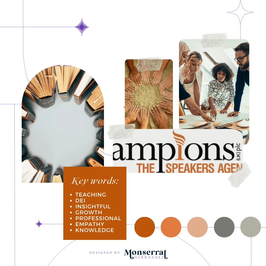
Moodboard

Moodboard for Harden Consulting Group’s logo creation and branding
Requirements: Highlight the personality of the key speaker as the defining voice of this brand
Mood/Tone: To accurately reflect their mission and values in an empathic and professional manner. The bold and bright color palette was specifically significant in achieving that.
WHY A MOODBOARD?
Moodboards help me center that visual energy and inspiration in one place, guiding the creative direction of the entire project. Research can get overwhelming until something like this is created for quick access.
02 | Unleashing the Creative Chaos Stage
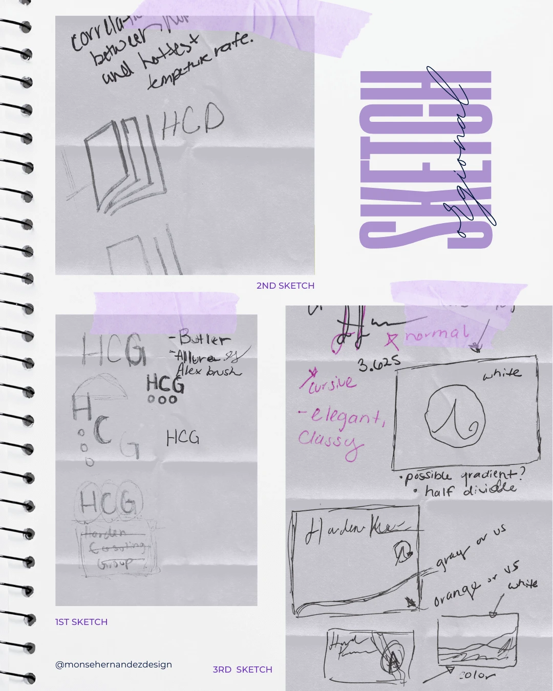
Sketching

1st Sketch: I knew from the start that the words—or even just the letters—needed to be the focal point of this logo. Considering where the brand would be used and its diverse audience, I aimed for something timeless, adaptable, and versatile enough to fit across multiple public speaking and educational markets. Since this was a new business still shaping its identity, the logo had to be a strong foundation for whatever direction it would take
2nd Sketch: While you only see a few ideas here, trust me, there were at least two full pages of sketches that ended up in the trash. But this little book? I scribbled it down in my Astronomy class, and the moment I saw it, I knew it was the one. I refined it, polished it, and in the end, it became the heart of the final logo.
3rd Sketch: By the time I started on the business card, the official logo had already been approved. Now, it was all about making sure it seamlessly fit within the branding. Aligning with the chosen colors, patterns, and overall aesthetic we had carefully crafted.
03 | From Chaos to Clarity Stage
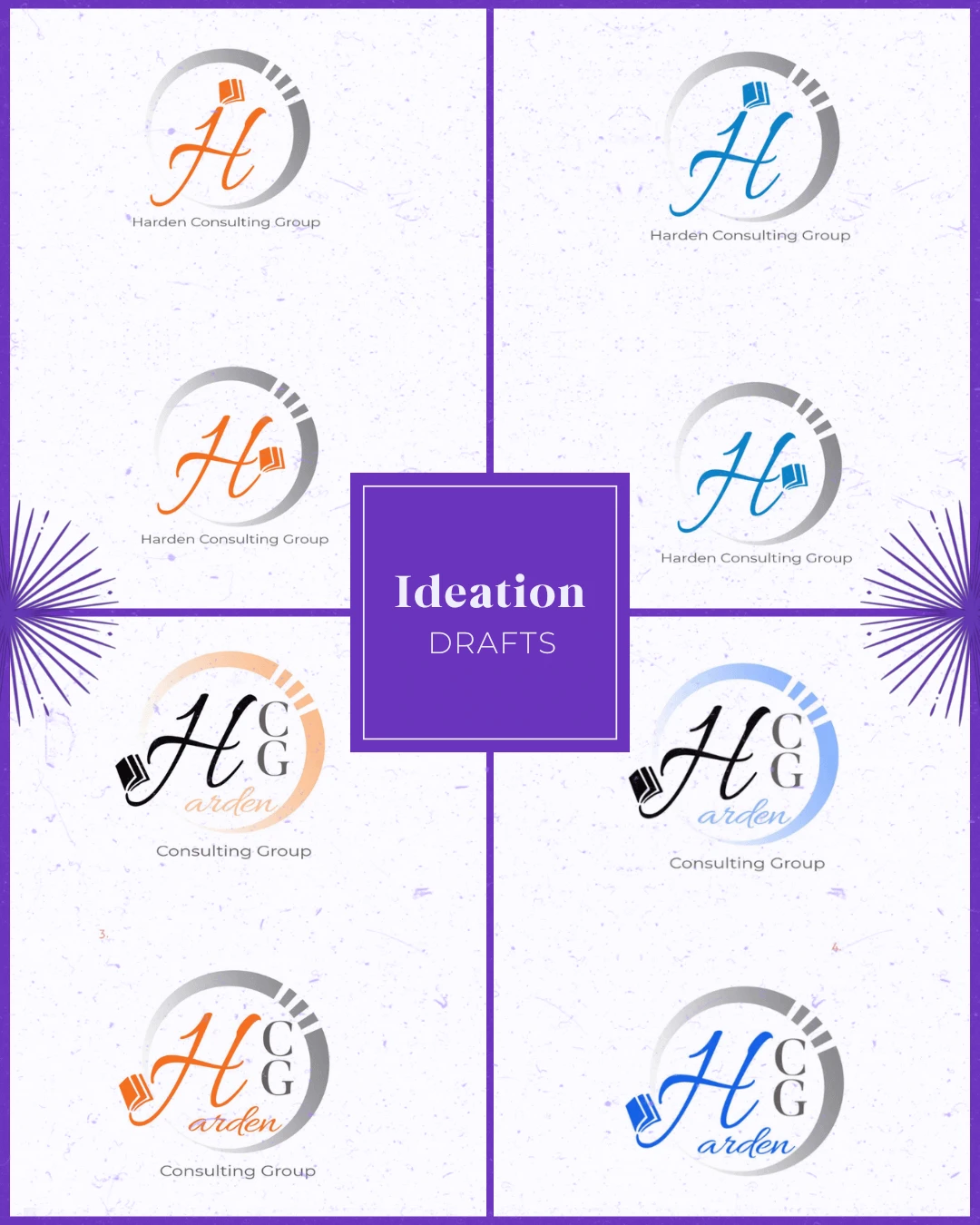
Ideation

An empathetic brand that’s forward-thinking and innovative, always looking for new ways to promote diversity and inclusivity.
Target Audience: Leaders and managers seeking coaching and program implementation support to promote diversity and inclusivity in various types of workplaces
Brand Personality: Empathetic, approachable, and progressive
WHY SHARE THE "UGLY" DRAFTS OF THE PROCESS?
Design is a process of exploration, not instant perfection.
Each draft is a different way of solving a visual problem I worked through. These early stages leave more room for creativity and refinement, making sure the final design is not just visually appealing but intentional and strategic. And believe it or not, these are only a handful of selected drafts (the countless others have been buried deep in my files).


04 | The Grand Reveal Stage
Bringing Concepts to Life
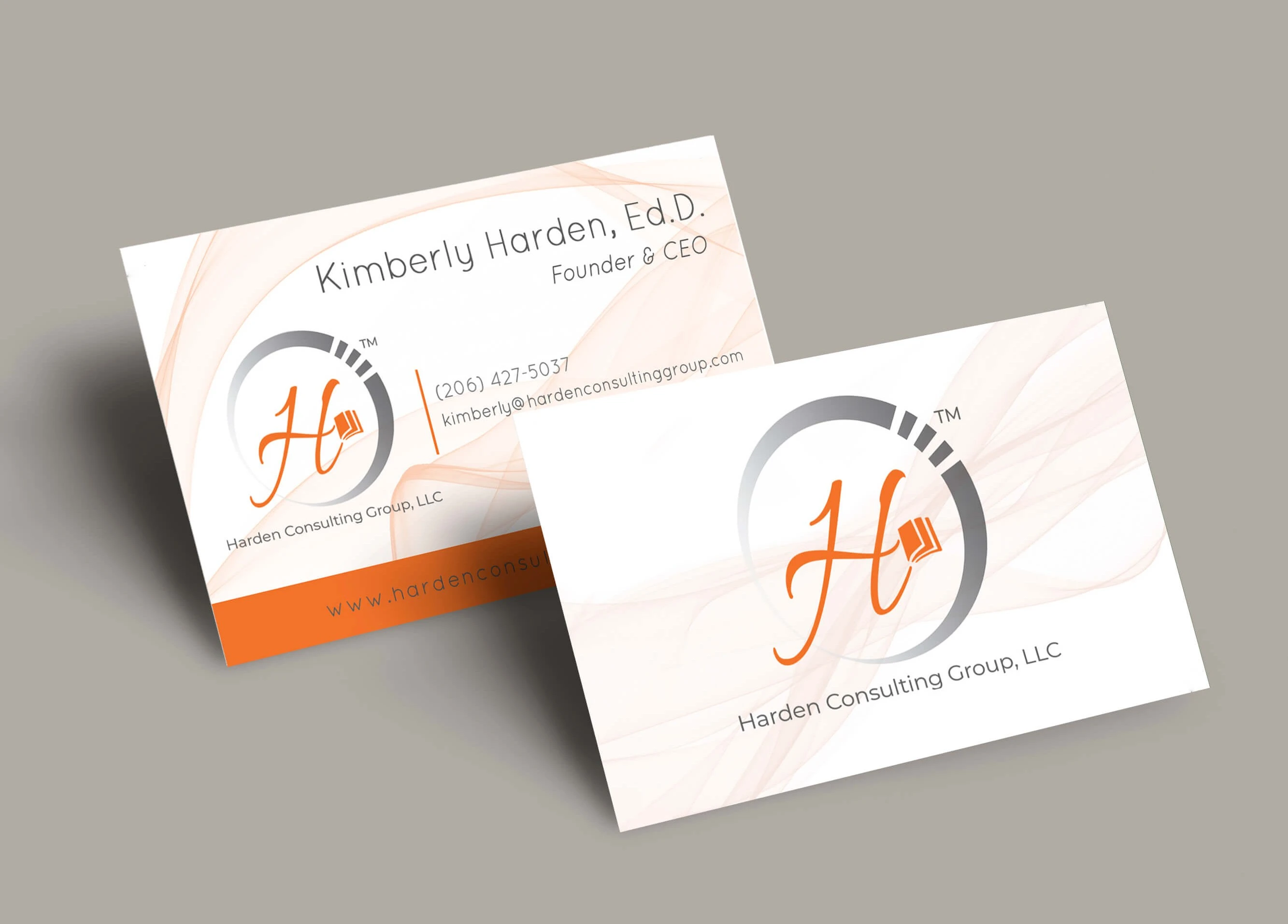
What began as a single project for Harden Consulting Group quickly grew into an ongoing creative partnership that has lasted more than five years. It started with one of my very first logos, a design I spent days refining to make sure it was timeless, adaptable, and strong enough to stand out in the field of DEI speakers while still being flexible to grow with the brand as political and educational landscapes kept shifting. That logo became the foundation for what has now developed into the identity of an award-winning consulting agency. From there, the visual language expanded with color palettes, typography, and brand guidelines that highlighted the approachable, empathetic, and forward-thinking personality of the company.
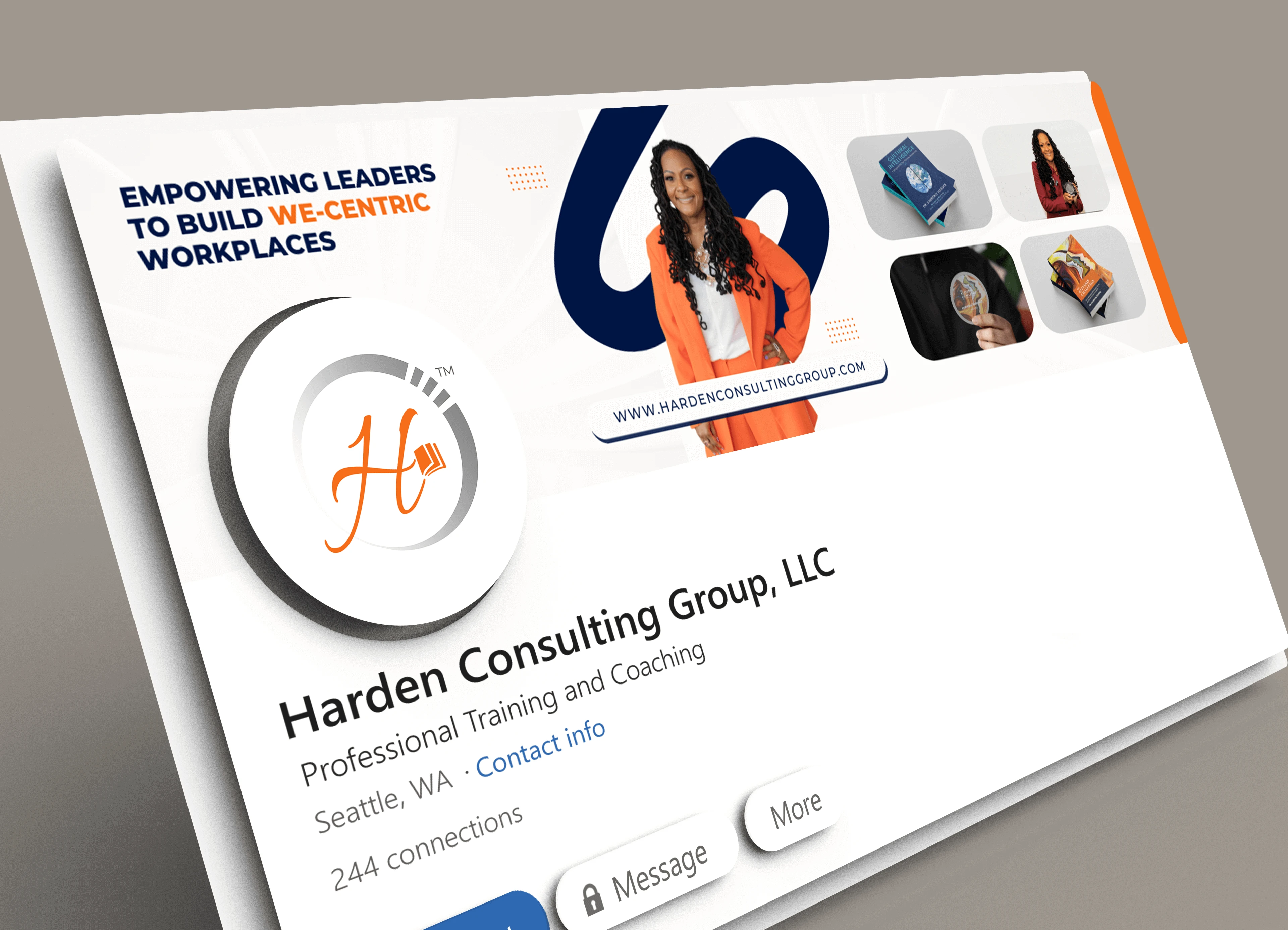
Since then, the collaboration has grown into so much more: infographics, presentations, brand materials, and countless books and educational resources designed to communicate big ideas in clear and engaging ways. Each design has been about building consistency while keeping the visuals fresh, helping Harden Consulting Group connect with leaders at every level. From one book cover mockup to now a full visual system that continues to evolve, supporting their mission to spark inclusivity, equity, and innovation in workplaces everywhere.
The Breakdown
BONUS STAGE: Behind the Scenes of the Design

WHY SHOWCASE THIS ON THE WEBSITE?
The difference between me and AI (aside from my great style) is that every decision I make has a reason behind it, rooted in research, experience, and an understanding of how each choice reflects the brand, even in the hidden little details. Here’s a glimpse behind the scenes of what that looks like.
Explore More Designs