BE CREATIVE. BE UNIQUE. BE YOUR BRAND.
A display font that aims to capture the mystique and enchantment of a haunted forest through its whimsical design.

THE CLIENT
THE BRIEF
THE PROJECT
PASSION PROJECT
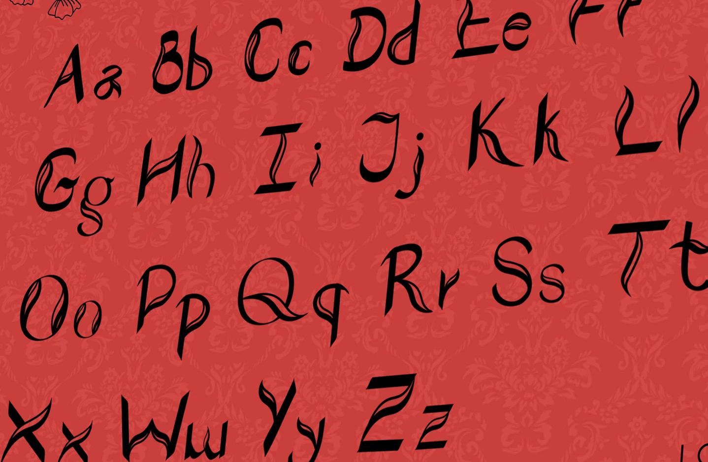
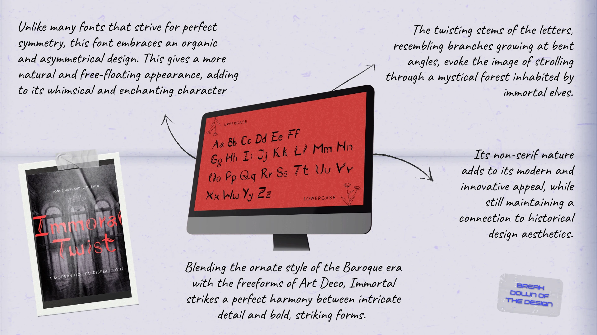
A handcrafted display font blending Baroque and Art Deco elegance with whimsical, forest-inspired forms, created to be both expressive and visually striking. The main challenge was mastering new font-making software and applying precision to design organic, playful letterforms, turning a complex, technical process into a highly creative and rewarding project.
- TYPEFACE
- ILLUSTRATION
- MARKETING MATERIALS
01 | Laying the Foundation Stage
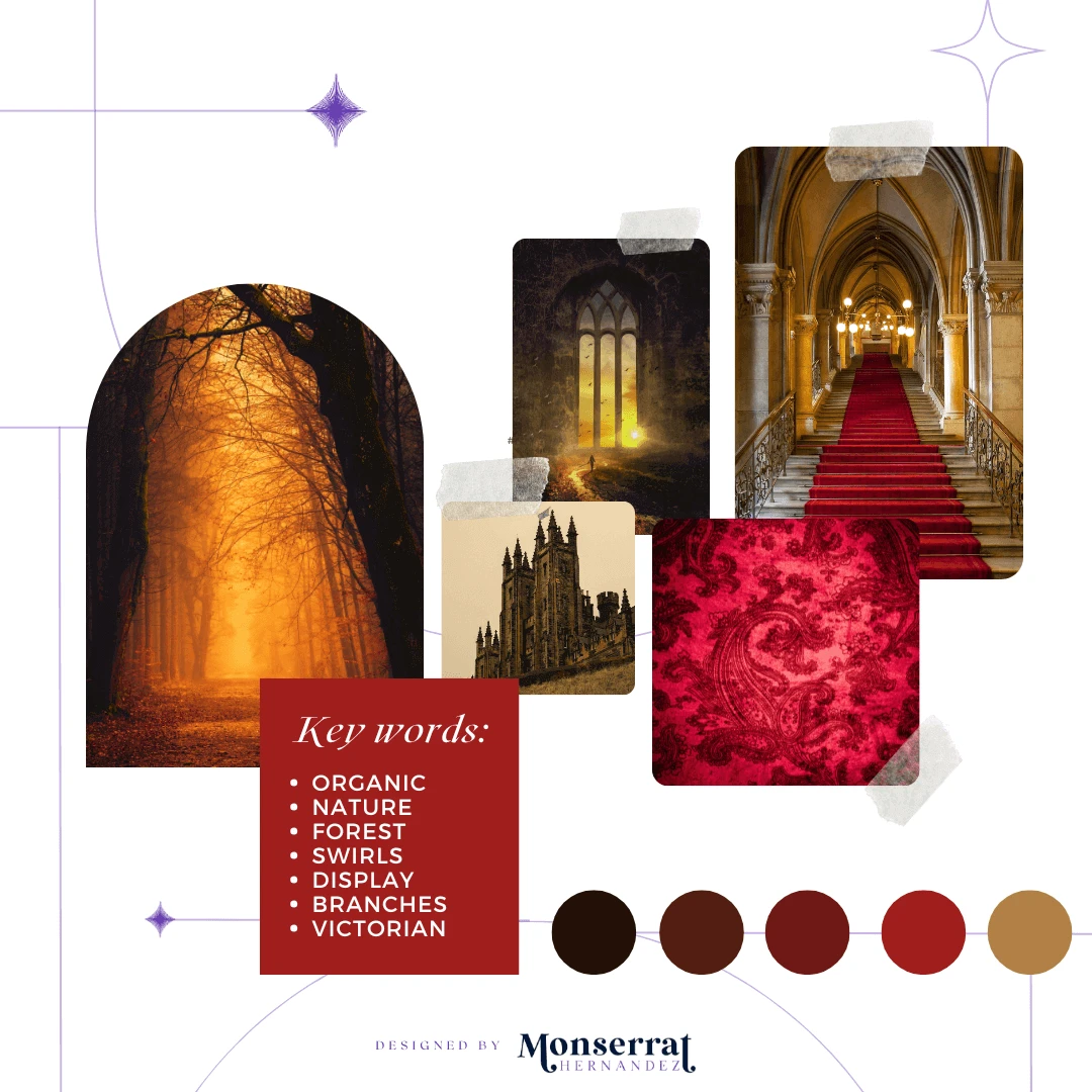
Moodboard

Moodboard for Immortal Font’s illustration and marketing materials
Requirements: Creating your own font, starting with hand-drawn illustrations and transforming them into a fully functional typeface
Mood/Tone: This font carries an artistic, hand-drawn feel with whimsical, organic strokes that create a playful yet elegant mood. Its natural, slightly dramatic style makes it perfect for designs that aim to feel handcrafted, expressive, and visually unique.
WHY A MOODBOARD?
Moodboards help me center that visual energy and inspiration in one place, guiding the creative direction of the entire project. Research can get overwhelming until something like this is created for quick access.
02 | Unleashing the Creative Chaos Stage
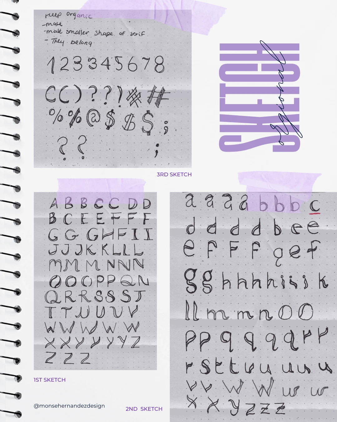
Sketching

1st Sketch: This was my first font, and I knew I wanted something truly unique. The first concept that came to mind was a fluid design with thick and thin lines. The letter "A" was the first to come to life when I put it down on paper—it practically designed itself.
2nd Sketch: The process of designing the lowercase letters for this font was one of the most enjoyable stages of sketching. The curves of the lines, and carefully positioning them to give each letter a unique, Gothic flair, made it a lot of fun to bring the typeface to life.
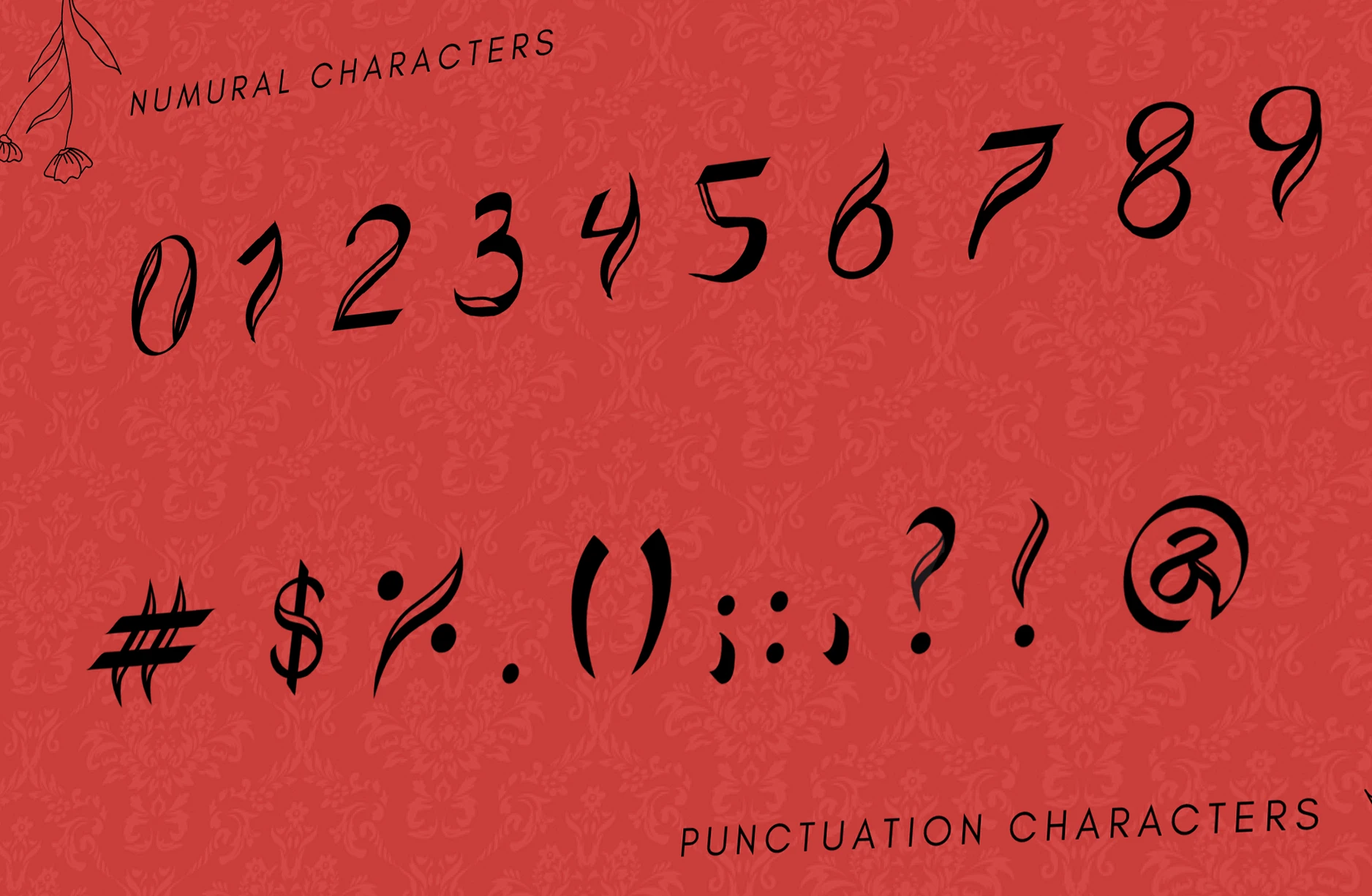
3rd Sketch: Designing numbers was an entirely different challenge, and much trickier than I expected. Numbers already have distinct shapes, so adding the right flair with the lines I had in the font often made them feel off or visually unappealing. Bringing the design into Illustrator was a game changer, helping me refine and fix the numbers until I was happy with how they fit into the overall font.
03 | The From Chaos to Clarity Stage
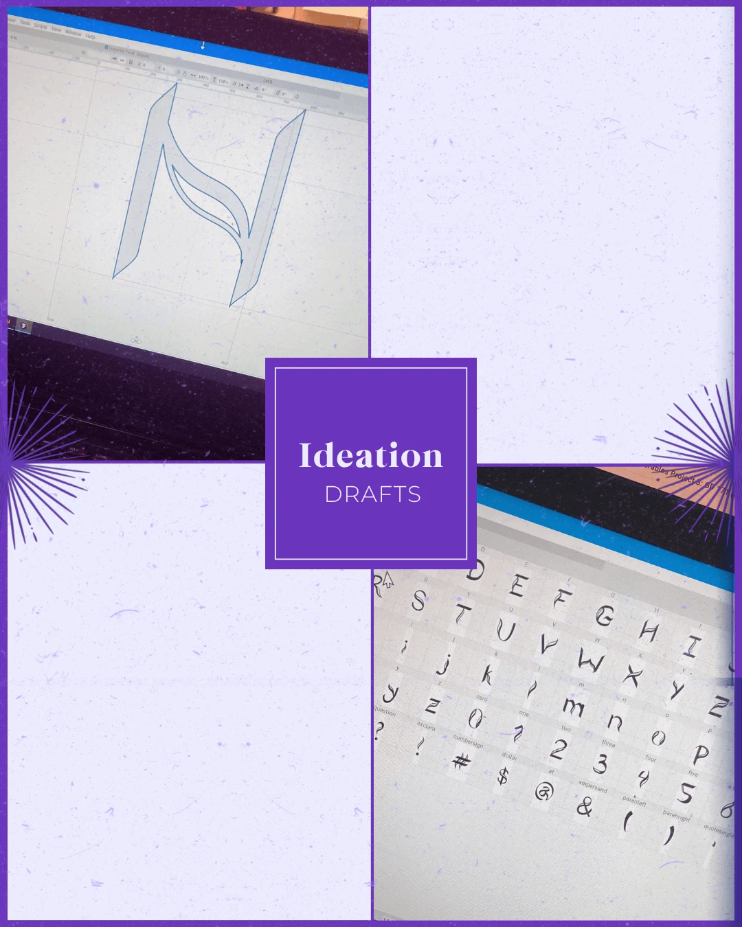
Ideation

The thin, sharp, slightly dramatic strokes add a touch of elegance with a hint of mysterious, almost gothic flair. It has character; somewhere between a handwritten script and an artistic display font.
Target Audience: Artists, designers, and creatives who appreciate handcrafted, expressive typography; small boutique or artisan brands looking for a organic aesthetic or whimsical lifestyle brands such as florists, handmade goods shops, stationery makers, or wellness businesses.
Brand Personality: Artistic, whimsical, and organic, with a handcrafted feel and a touch of elegance. It comes across as expressive, creative, and slightly edgy, giving designs a unique, personal character.rebellious, and unconventional.
WHY SHARE THE "UGLY" DRAFTS OF THE PROCESS?
Design is a process of exploration, not instant perfection.
Each draft is a different way of solving a visual problem I worked through. These early stages leave more room for creativity and refinement, making sure the final design is not just visually appealing but intentional and strategic. And believe it or not, these are only a handful of selected drafts (the countless others have been buried deep in my files).


04 | The Grand Reveal Stage
Bringing Concepts to Life
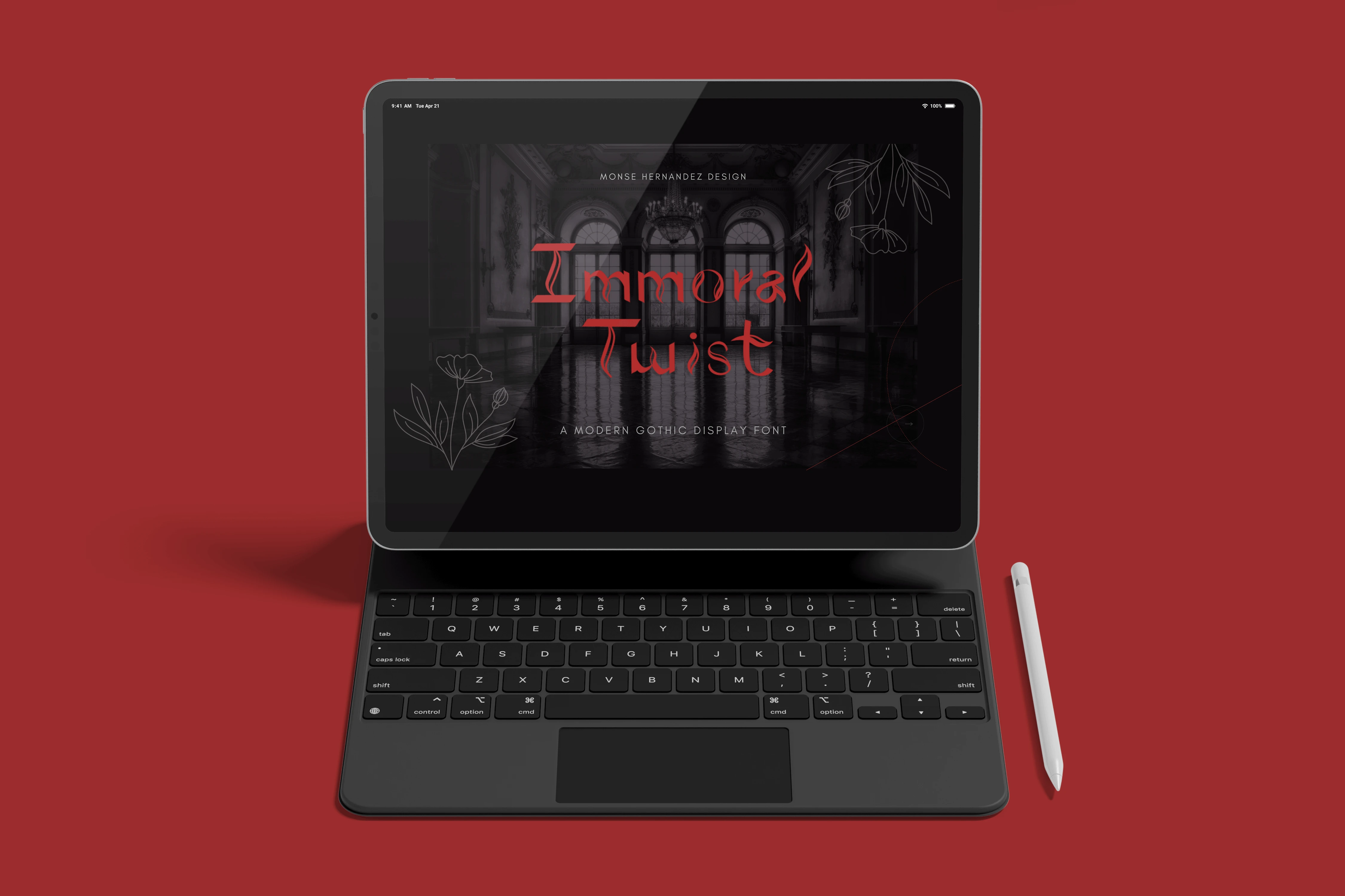
The goal of creating Immortal was to design a unique display font that blended the ornate beauty of Baroque and Art Deco styles with the enchantment of a haunted forest. I wanted each letter to feel alive, organic, expressive, and slightly mysterious. The swirling, branch-like stems and the dramatic contrasts in line weight helped me build a font with a whimsical yet elegant mood. What’s funny is that this project started with me absolutely hating the idea of designing a font. I thought it would be stiff, mathematical, and completely uncreative. But once I realized I could build a font from scratch using illustration, experimentation, and my own imagination, it became one of the most enjoyable projects I have worked on. I learned how to use formulas to make the font functional for users, and I even taught myself new font-creation software, which made the entire process even more rewarding.
Another goal of this design was to create a font that would connect with people who love expressive and handcrafted typography. Immortal has an artistic, whimsical, and slightly rebellious personality that makes it perfect for creatives, boutique brands, and nature-inspired businesses looking for something organic and visually striking. The handcrafted curves and playful details give it a personal and edgy character that stands out from traditional typefaces. From the first “A” that practically drew itself, to the Gothic-inspired lowercase sketches, to the challenge of shaping the numbers in Illustrator, every part of the process helped shape the font’s identity. In the end, Immortal became more than just a typeface. It turned into a creative storytelling tool that brings a sense of enchantment and individuality to any design.
The Breakdown
BONUS STAGE: Behind the Scenes of the Design

WHY SHOWCASE THIS ON THE WEBSITE?
The difference between me and AI (aside from my great style) is that every decision I make has a reason behind it, rooted in research, experience, and an understanding of how each choice reflects the brand, even in the hidden little details. Here’s a glimpse behind the scenes of what that looks like.
Explore More Designs