BE CREATIVE. BE UNIQUE. BE YOUR BRAND.
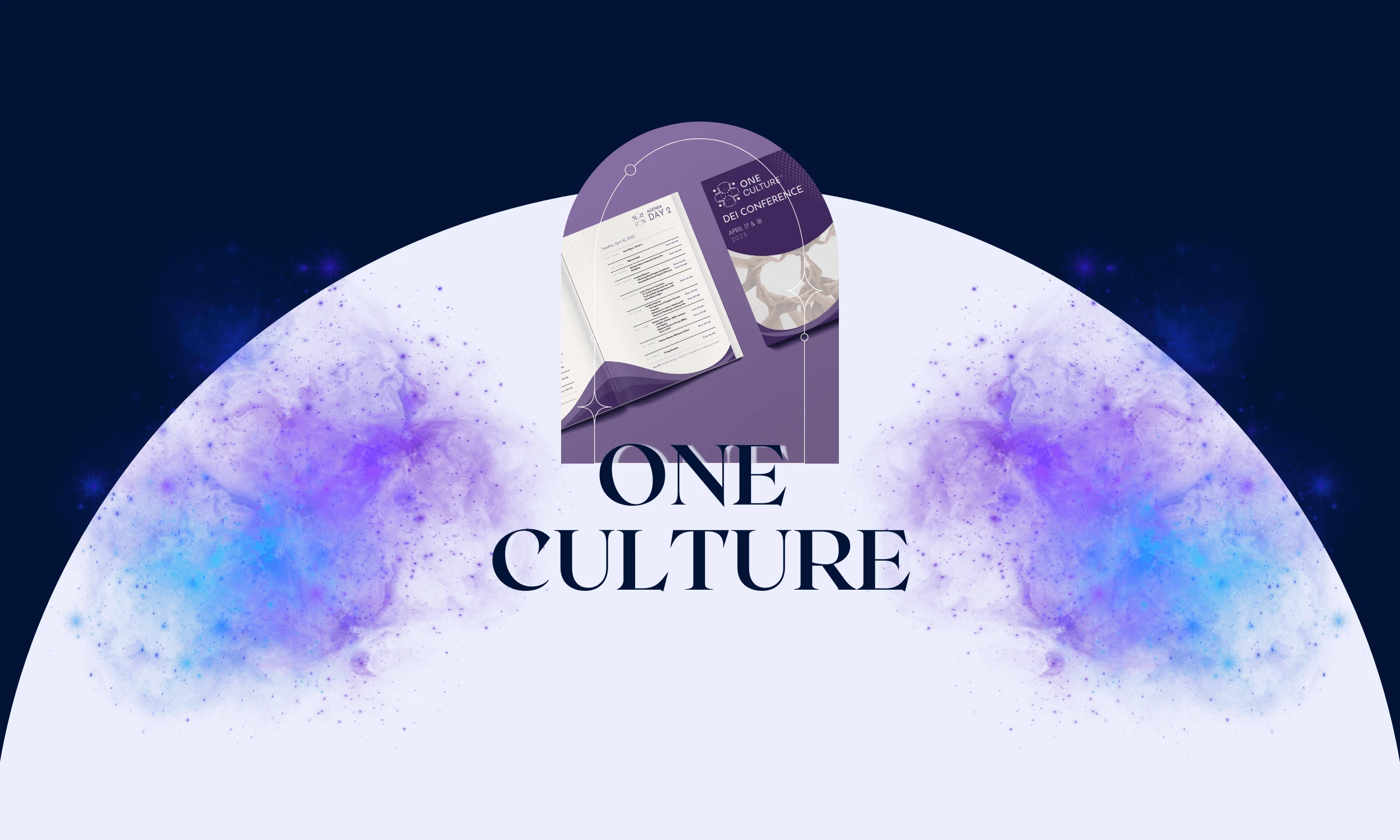
What began as a logo project evolved into a full identity system that supported the One Culture™ DEI Conference, hosted in Seattle, WA by the Harden Consulting Group.
THE CLIENT
THE BRIEF
THE PROJECT
LOCATION: SEATTLE, WASHINGTON, US
INDUSTRY: HR/WORKPLACE-CULTURE CONFERENCES
The logo that became the foundation of a dynamic brand identity applied across merchandise, social media, and event materials. More than just a visual mark, it became a symbol of allyship, inclusivity, and cultural transformation by setting the stage for One Culture™ to expand from a brand concept into a full-scale DEI conference and global movement.
- LOGO DESIGN
- BRAND IDENTITY
- BOOKLET DESIGN
- CONTENT CREATION
- EDUCATIONAL MATERIALS
01 | Laying the Foundation Stage
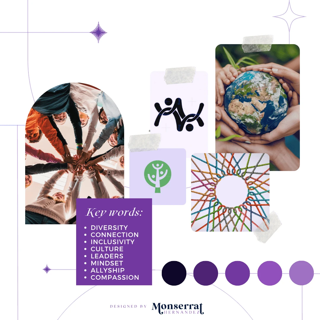
Moodboard
Moodboard for One Culture’s logo creation, educational material, and brand Identity
Requirements: a symbol of unity integrated in the logo
Mood/Tone: The tone of the brand is inspirational, optimistic, and empowering, encouraging individuals to believe in their potential. Its mood is dynamic, inclusive, and forward-thinking, creating an atmosphere that feels both welcoming and progressive.
WHY A MOODBOARD?
Moodboards help me center that visual energy and inspiration in one place, guiding the creative direction of the entire project. Research can get overwhelming until something like this is created for quick access.
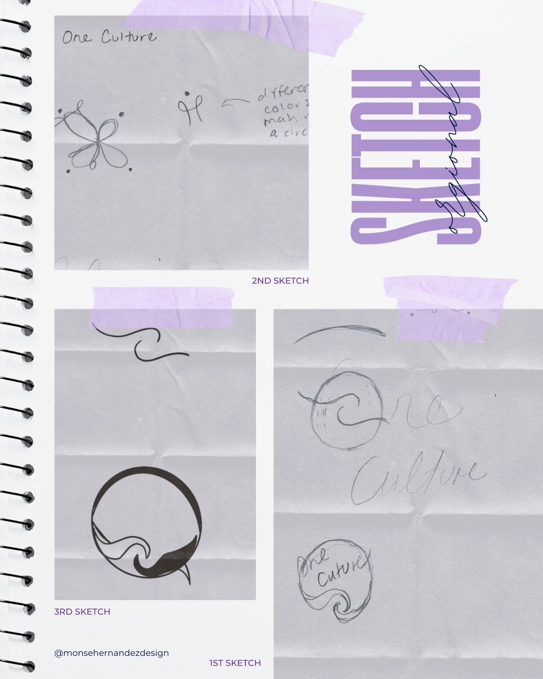
02 | Unleashing the Creative Chaos Stage
Sketching

1st Sketch: The moment the client mentioned turning OneCulture into a logo, I could already see arches and circles forming in my mind’s eye. My first instinct was to experiment with abstract hands. Touching and interconnecting to symbolize unity. I wanted this concept to either fit within or break out of a circular design. The more I explored the idea, the more a simple arch stroke sparked new directions.
2nd Sketch: For my second approach, I explored abstract figures connecting in a circular format. But I didn’t want generic human shapes: I wanted movement and fluidity. As I sketched swirling, dynamic forms, I loved the energy they created. I knew I wanted multiple shapes side by side, and that’s when color became part of the story.
3rd Sketch: Sometimes, I fall in love with multiple ideas, making it tough to choose just one to refine. When that happens, I take a more developed sketch to my iPad to explore further. At first, I liked the strokes I was creating digitally, but I quickly realized they lacked the motion I wanted for the logo.
That version was set aside but in the process, I rediscovered how much I loved the abstract human shapes from my earlier sketches. That realization led to the final design.
03 | The From Chaos to Clarity Stage
Ideation

The brand was designed to help companies move beyond superficial diversity efforts and create lasting, meaningful inclusivity in the workplace.
Target Audience: For corporate leaders, HR and DEI professionals, managers, educators, and change-minded individuals seeking to create inclusive, equitable, and culturally competent workplaces.
Brand Personality: Dynamic, inclusive, and empathetic, it fosters collaboration across cultures while providing credible insights and practical strategies for meaningful DEI and cultural impact.
WHY SHARE THE "UGLY" DRAFTS OF THE PROCESS?
Design is a process of exploration, not instant perfection.
Each draft is a different way of solving a visual problem I worked through. These early stages leave more room for creativity and refinement, making sure the final design is not just visually appealing but intentional and strategic. And believe it or not, these are only a handful of selected drafts (the countless others have been buried deep in my files).
-

-

-

Design in colloboration with Harden Consulting Group's creative team
-

-

-

-

-


04 | The Grand Reveal Stage
Bringing Concepts to Life
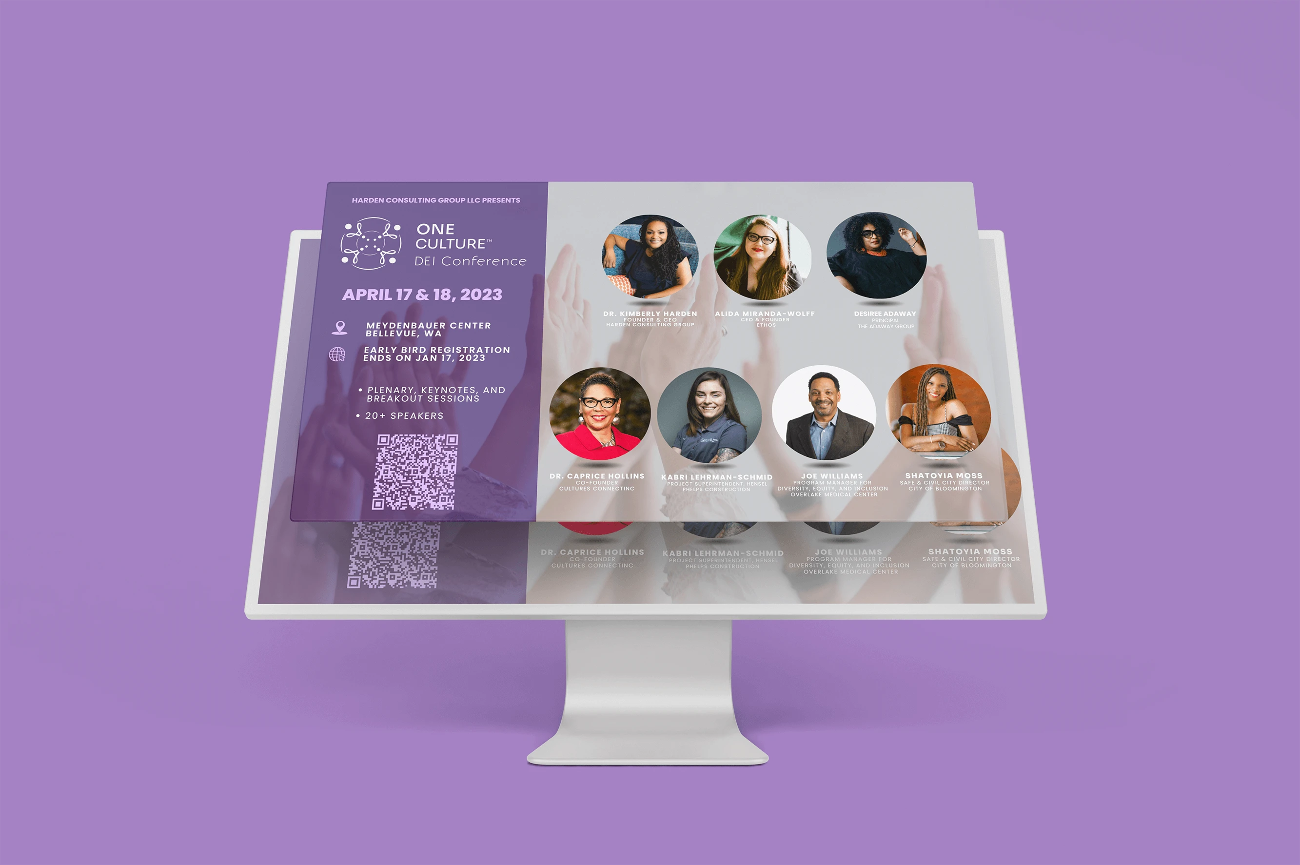
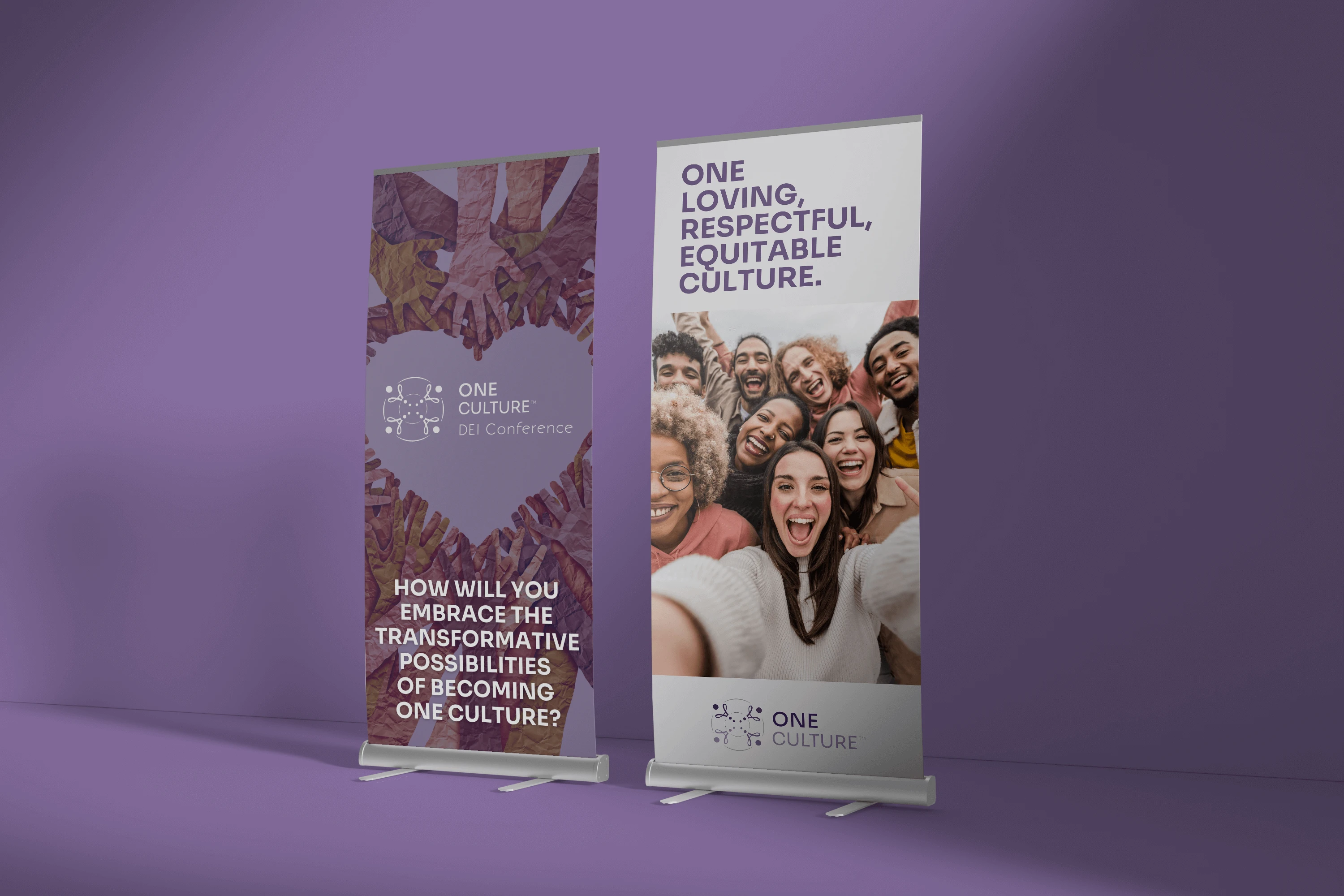
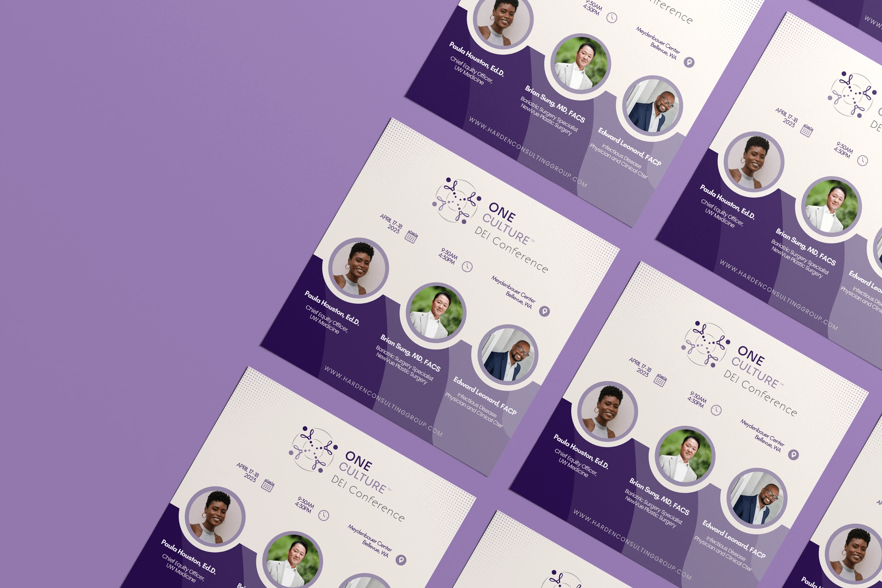
This brand was an absolute pleasure to bring to life because what began as a single logo design quickly grew into something much larger. From a simple mark to a full-scale event, I created the logo, reception booklet, banners, and venue design, while collaborating closely with the creator and web designer to transform that initial concept into a cohesive brand identity applied across multiple platforms. The project became more than just design work. It was also a chance to be part of a team that turned a vision into a tangible experience, culminating in a two-day event where leaders could see and feel what it meant to be One Culture™ in person.
A forward-thinking brand built to empower people through DEI, cultural exchange, and leadership development, One Culture™ expanded into the One Culture™ DEI Conference, held April 17–18, 2023, in Seattle, WA. The brand identity I created symbolized connection and unity, supporting a conference designed to help companies move beyond superficial diversity efforts and create lasting inclusivity in the workplace. With expert-led sessions, actionable strategies, and insights from 20+ thought leaders, attendees gained the tools to overcome common DEI challenges and instead foster success, allyship, and cultural transformation—both in the workplace and in their communities.
Design in colloboration with Harden Consulting Group's creative team.
The Breakdown
BONUS STAGE: Behind the Scenes of the Design
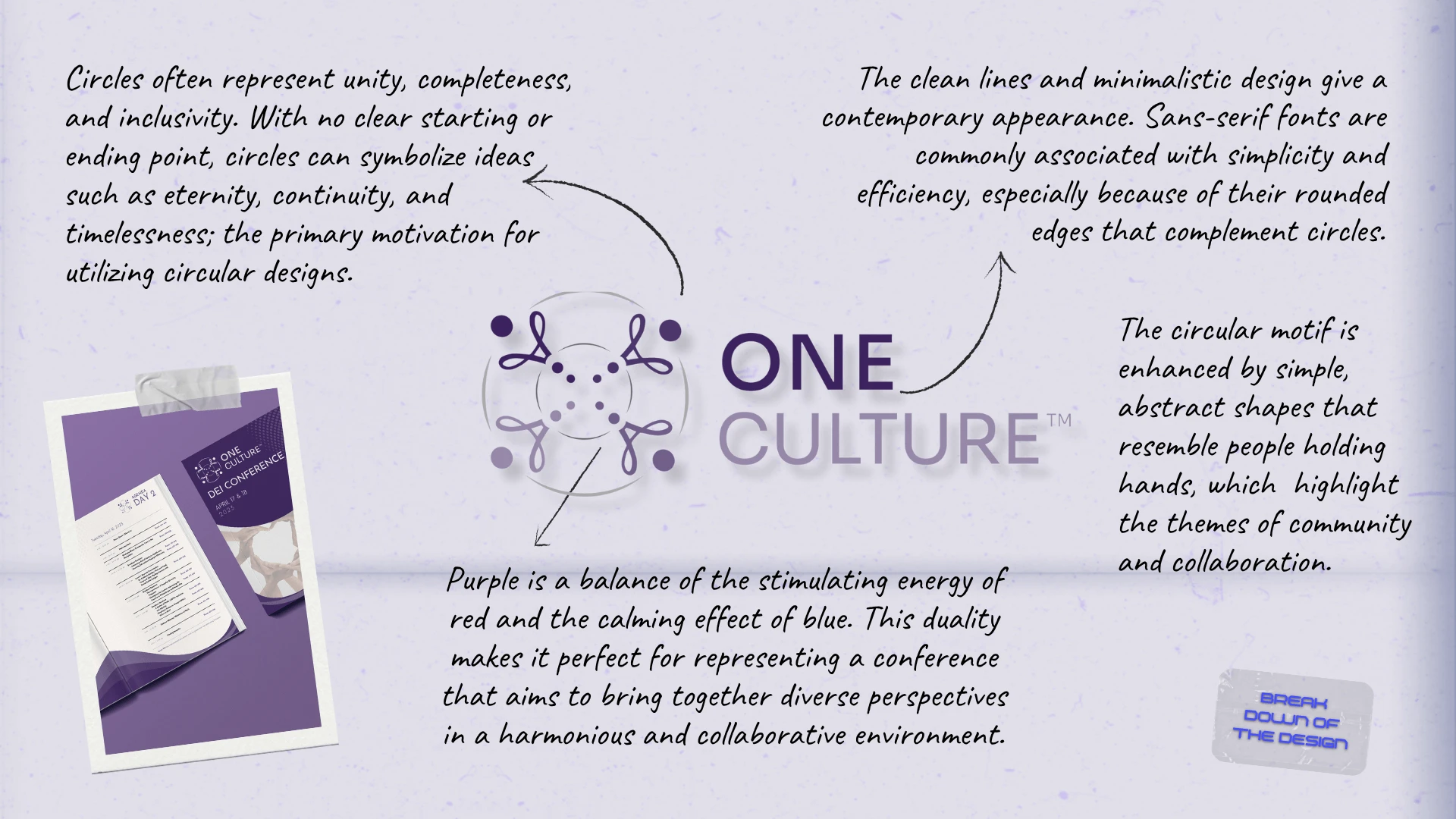
WHY SHOWCASE THIS ON THE WEBSITE?
The difference between me and AI (aside from my great style) is that every decision I make has a reason behind it, rooted in research, experience, and an understanding of how each choice reflects the brand, even in the hidden little details. Here’s a glimpse behind the scenes of what that looks like.
Explore More Designs