BE CREATIVE. BE UNIQUE. BE YOUR BRAND.
The new face of a budding brand weaving cultural pride, fantasy, and artisanal excellence into every handmade creation
THE CLIENT
THE BRIEF
THE PROJECT
LOCATION: LA, CALIFORNIA, US
INDUSTRY: HANDMADE & CRAFTS
Rooted in resin and sculpting yet unbound by a single medium, this budding brand emerges as a celebration of artistry. It was designed to represent more than one craft and to connect with those who seek distinctive, high-quality creations with a touch of fantasy meant to embrace not only the work itself but the creative journey behind it.
- LOGO DESIGN
- BRAND IDENTITY
01 | Laying the Foundation Stage
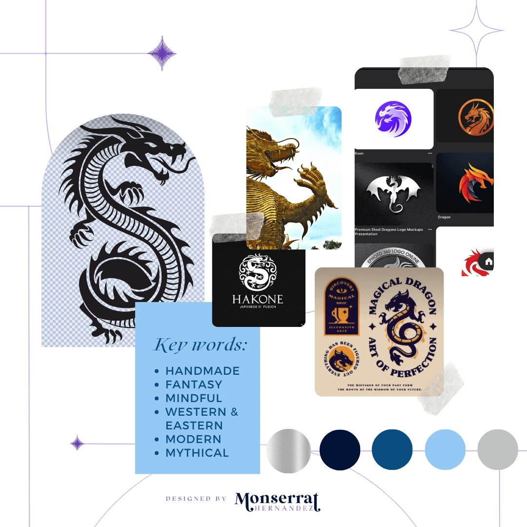
Moodboard

Moodboard for Silvern Fantasy Designs' logo creation and identity brand
Requirements: the use of true blue & fusion of Asian and Western dragon elements
Mood/Tone: It reflects a harmonious blend of pride, modernity, and mystique, while embracing the artistic spirit of creativity. At the same it has an undertone of childlike wonder in trying to discover the fantastical part of their handmade products.
WHY A MOODBOARD?
Moodboards help me center that visual energy and inspiration in one place, guiding the creative direction of the entire project. Research can get overwhelming until something like this is created for quick access.
02 | Unleashing the Creative Chaos Stage
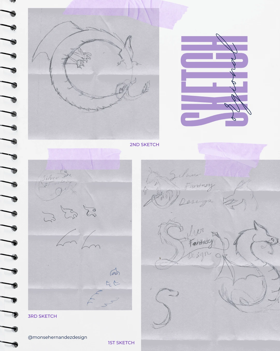
Sketching

1st Sketch: The dragon's shape needed to be integral to the design, so I started by exploring how its body could flow. Could it form an “S”? Could it take on dynamic poses? Experimenting with movement was key.
2nd Sketch: After testing different styles and shapes, the dragon’s body naturally formed into a circular shape, which echoed the infinity snake motif that the client loved.
3rd Sketch: The biggest challenge was translating the vision in my head onto paper. Once the main concept emerged, I experimented with facial expressions and body details to capture the correct dragon. I shifted between a fierce, powerful dragon and a more stylized character. That’s when the true shape of the future logo took form.
03 | From Chaos to Clarity Stage
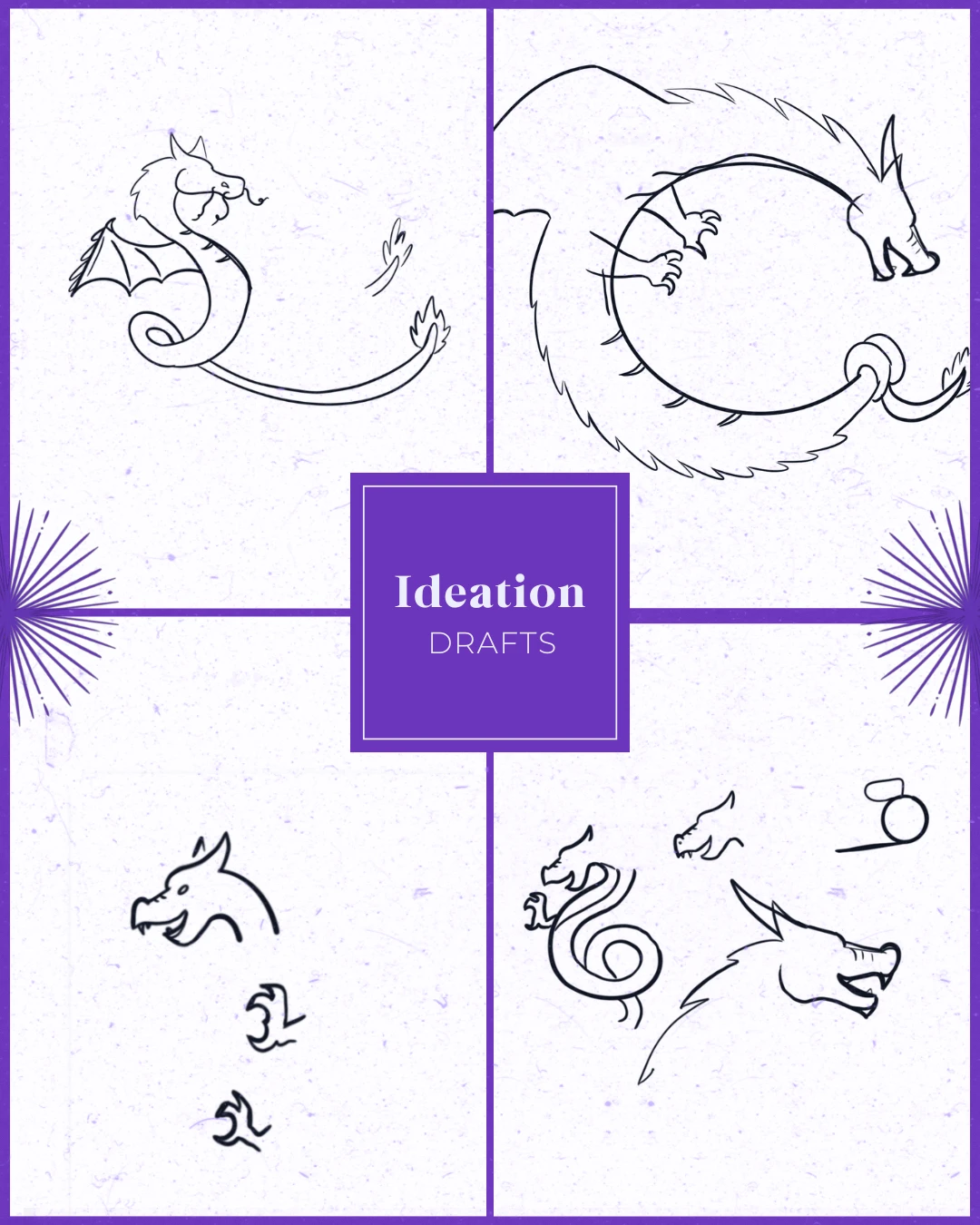
Ideation

Designed to honor cultural heritage while embracing contemporary design, it symbolizes strength, creativity, and imagination.
Target Audience: They embrace the intersection of tradition and modernity, valuing craftsmanship, creativity, and unique pieces that spark cultural connection and a sense of enchantment. This brand resonates with those who appreciate Asian heritage, contemporary aesthetics, and the exploration of new artistic expressions.
Brand Personality: Asian American brand fused with fantastical contemporary perspective, demonstrating a commitment to craftsmanship, creativity, and the exploration of new media.
WHY SHARE THE "UGLY" DRAFTS OF THE PROCESS?
Design is a process of exploration, not instant perfection.
Each draft is a different way of solving a visual problem I worked through. These early stages leave more room for creativity and refinement, making sure the final design is not just visually appealing but intentional and strategic. And believe it or not, these are only a handful of selected drafts (the countless others have been buried deep in my files).

04 | The Grand Reveal Stage
Bringing Concepts to Life
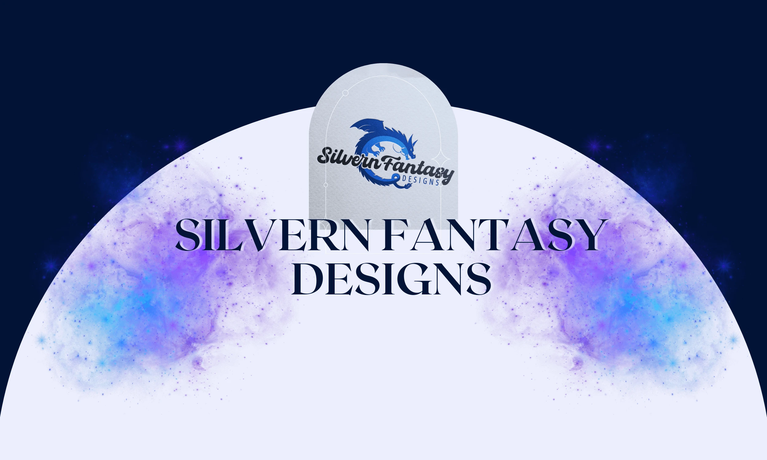
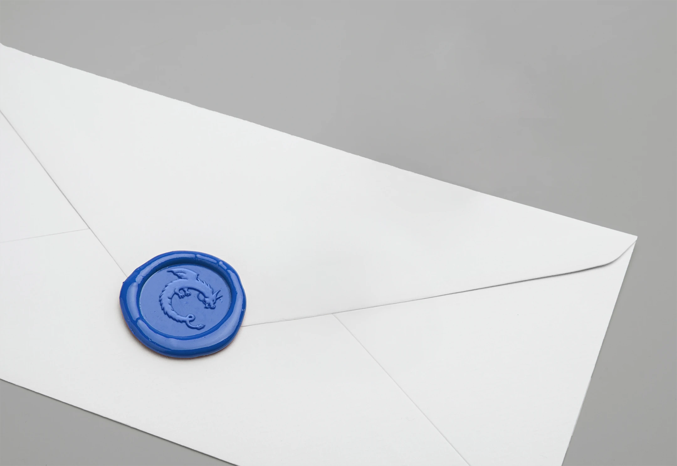
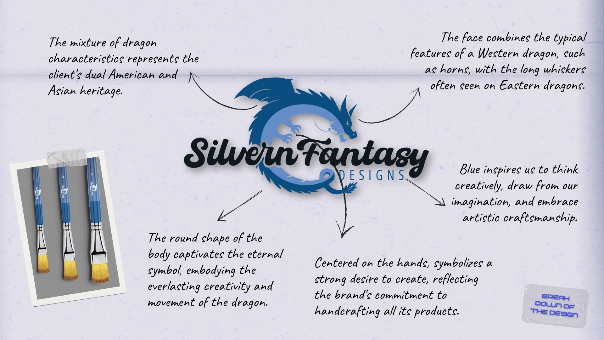
The creation of this modern dragon logo—one of my proudest designs to date—honors the traditional Asian dragon while introducing a contemporary twist that fuses Asian and Western dragon elements, reflecting the Asian American background of the brand’s owner. It embodies cultural pride, creativity, and imaginative exploration, while also remaining versatile enough to represent future handmade products of all kinds. With fantasy and mystique as the brand’s predominant themes, the logo takes shape as a unique dragon design in bold true blue, symbolizing strength, artistry, and innovation.
Rooted in resin and sculpting but not limited to any single medium, the brand is a true celebration of artistry. Focused on inspiring and captivating those who appreciate distinctive, high-quality creations, it continues to push boundaries by following the creative soul and exploring new techniques. Each piece is envisioned as a fantastical design that blends creativity with craftsmanship, resulting in unique, one-of-a-kind works of art meant to be cherished by everyone.
The Breakdown
BONUS STAGE: Behind the Scenes of the Design

WHY SHOWCASE THIS ON THE WEBSITE?
The difference between me and AI (aside from my great style) is that every decision I make has a reason behind it, rooted in research, experience, and an understanding of how each choice reflects the brand, even in the hidden little details. Here’s a glimpse behind the scenes of what that looks like.
Explore More Designs