BE CREATIVE. BE UNIQUE. BE YOUR BRAND.
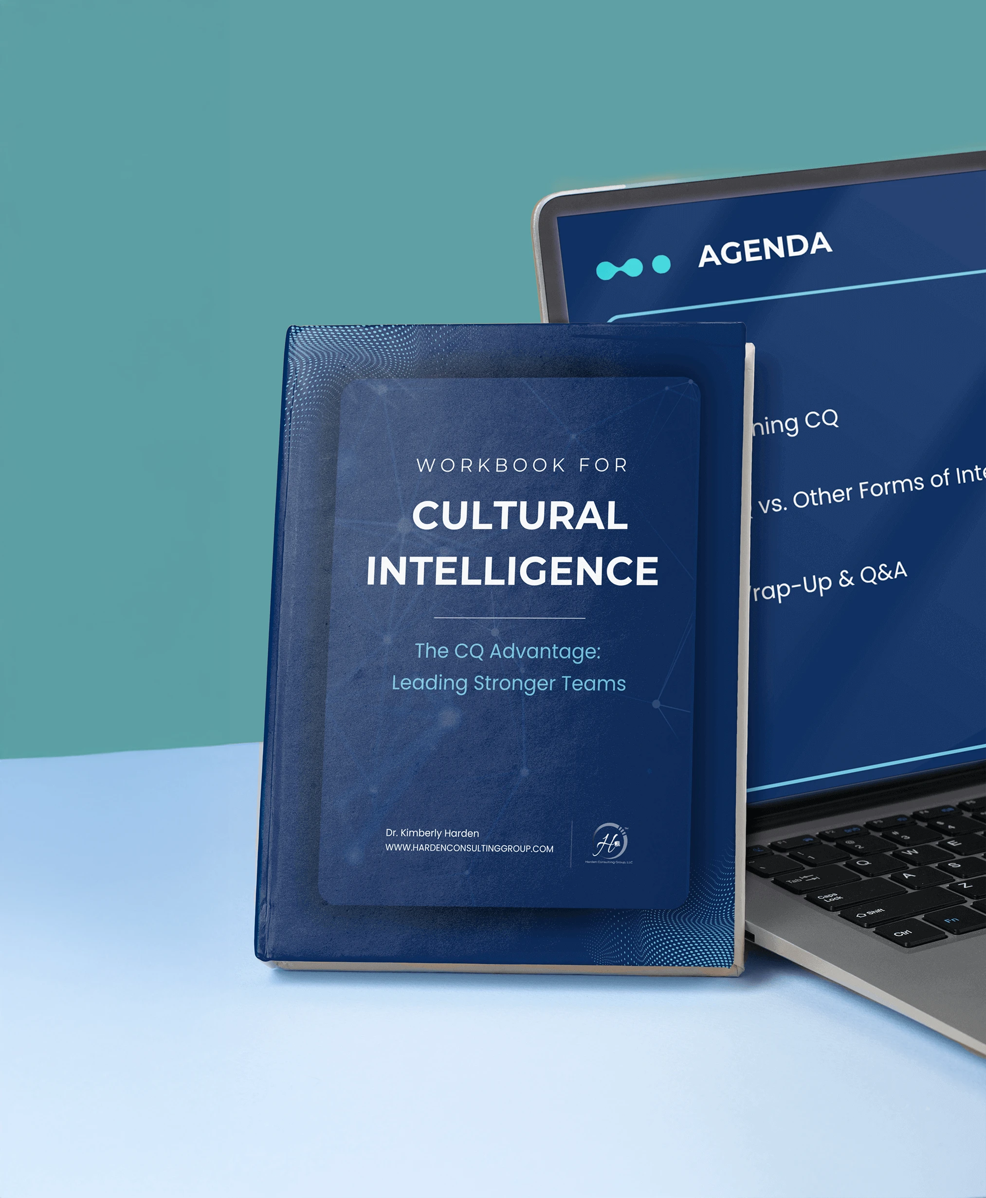
What began as a single book cover grew into a full visual identity, transforming the concept of cultural intelligence into an interactive learning experience that went beyond the page.

THE CLIENT
THE BRIEF
THE PROJECT
LOCATION: SEATTLE, WA
& CHARLOTTE, NC, USA
INDUSTRY: PROFESSIONAL
TRAINING, PUBLIC SPEAKING,
& CORPORATE CONSULTING
The design needed to convey professionalism, compassion, and authority while visualizing the abstract idea of cultural intelligence: a concept emerging as conversations around DEI became more complex and restricted. What began as a compelling idea for a book cover evolved into a full visual identity, shaping countless educational and promotional materials that support the guide’s groundbreaking message.
- BOOK COVER DESIGN (Paperback & eBook)
- VISUAL IDENTITY
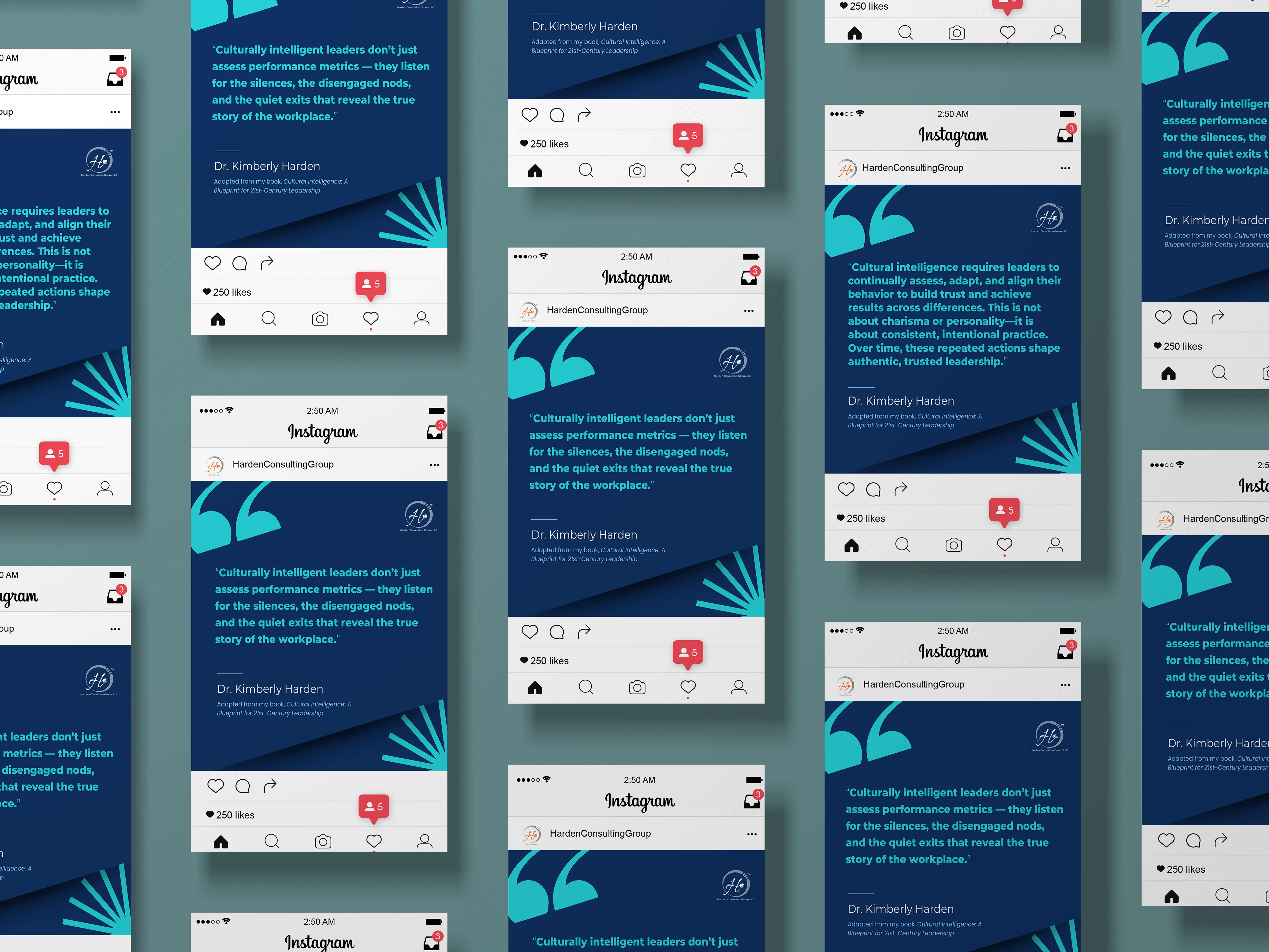
- SOCIAL MEDIA BRANDING
- EDUCATIONAL MATERIALS
- INFOGRAPHIC ELEMENTS
01 | Laying the Foundation Stage
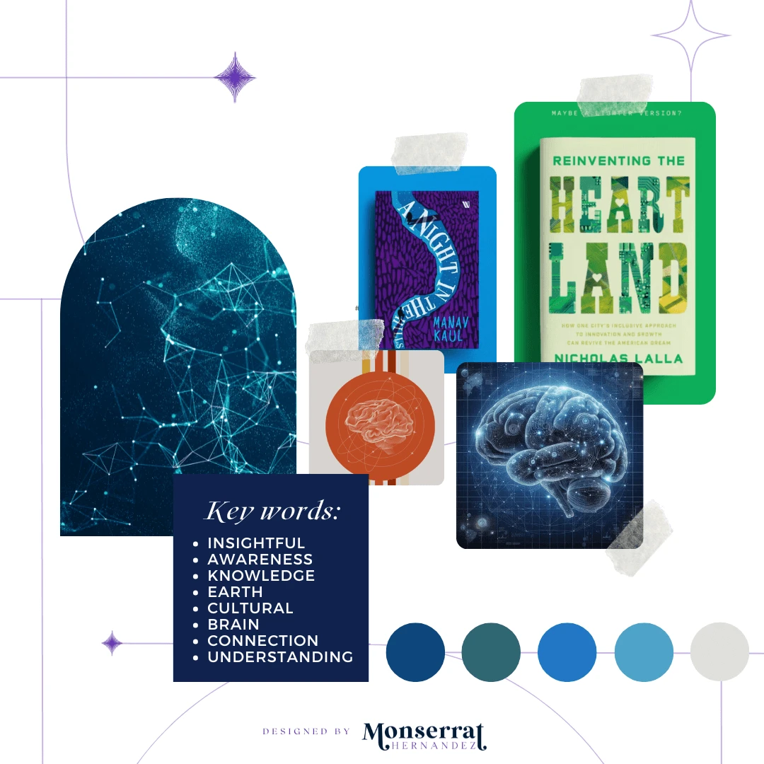
Moodboard

Moodboard for Cultural Intelligence's book cover, promotional materials, and educational designs
Requirements: translate the concept of cultural intelligence into a clear and impactful visual element
Mood/Tone: Authoritative, knowledgeable, and compassionate. The design amplifies the author’s voice as a trusted educator and leader, guiding readers through a new way of thinking about workplace intelligence.
.
WHY A MOODBOARD?
Moodboards help me center that visual energy and inspiration in one place, guiding the creative direction of the entire project. Research can get overwhelming until something like this is created for quick access.


After four designs were explored and a final one selected, I was proud of the result and ready to move it into paperback and ebook formats. But six months later, the book had evolved from a simple concept into a full guide on cultural intelligence. From this point on, you will see VERSION ONE AND VERSION TWO of that journey. Sometimes designs take a live of their own and we are not done until they are ready to be done. And as the designer you just hold on tight and see where it leads you.

02 | Unleashing the Creative Chaos Stage
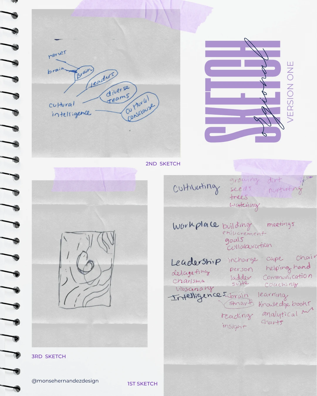
Sketching, Version I

1st Sketch: How do you visually represent something that doesn’t yet exist? The hardest part was giving form to a concept I’d never seen before, one that was just emerging after DEI was marked as “too woked” to discuss. So, I went back to the basics: charts and words. Keywords and ideas slowly started shaping the picture in my mind.
2nd Sketch: I continued this word exercise until it helped my creative brain start building the visual foundation. “Brain” quickly stood out as the anchor concept, becoming the core of the entire design direction.
3rd Sketch: Although I had the freedom to imagine what “cultural intelligence” could look like, the client envisioned something abstract and fluid. The first image that came to mind was a series of overlapping, intertwining lines forming a brain with an organic representation of connection and thoughts.
02 | Unleashing the Creative Chaos Stage
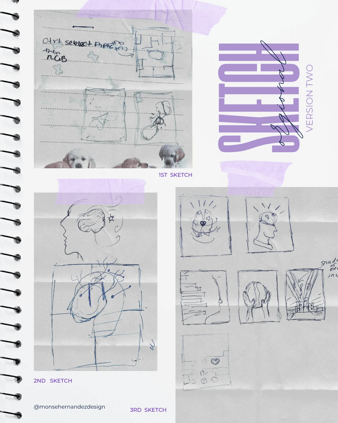
Sketching, Version 2

1st Sketch: This time, I had to let go of the original ideas I’d spent countless hours on and start fresh. Unlike the first round, it was easier to get into the right headspace because the author and I now shared a clear vision of what this book was meant to become.
It was about making the book impactful—something bigger than just a story. The brain became the main character. That’s why you’ll find my rough sketches in a small notebook rather than my art one—because inspiration often strikes in the real world, not just in the studio.
2nd Sketch: Once the idea started to take shape in my mind, my creative brain took over. I experimented with various styles and visual directions, inching closer to merging the brain and the Earth into one cohesive symbol.
3rd Sketch: Returning to research and drawing inspiration from designers whose modern book covers balance professionalism with artistry, I let those ideas shimmer in my brain for a bit. From those sketches, six concepts emerged, and two of them were fully developed for client presentations. One of those would become the final, defining design for the book cover.

03 | The From Chaos to Clarity Stage
Ideation

Communicates innovation and leadership while fostering openness, learning, and connection across diverse perspectives.
Target Audience: People who are drawn to alternative fashion and culture. They are looking for unique, handmade jewelry that reflects their individuality and personal style.
Brand Personality: Professional, insightful, and forward-thinking, with a strong emphasis on compassion, clarity, and authority.
Version 1: The first version focused on visualizing something abstract, with no existing references for “cultural intelligence,” leaving the concept open and reflective. We went through five additional drafts before narrowing it down to a final design. Only for the book’s concept to change drastically six months later.
Version 2: The book had evolved into something more powerful, requiring a complete design revamp. Letting go of old ideas made space for a bolder, more defined vision like turning the brain and earth into the central symbol. The final designs were about exploring different styles and settings to align with the client’s new vision for their book.
WHY SHARE THE "UGLY" DRAFTS OF THE PROCESS?
Design is a process of exploration, not instant perfection.
Each draft is a different way of solving a visual problem I worked through. These early stages leave more room for creativity and refinement, making sure the final design is not just visually appealing but intentional and strategic. And believe it or not, these are only a handful of selected drafts (the countless others have been buried deep in my files).



***Key information has been removed from the visuals to protect the author’s intellectual property, but the designs can still be viewed to demonstrate the work.
04 | The Grand Reveal Stage
Bringing Concepts to Life
The project began as a book cover for an author seeking a visual anchor while completing her manuscript. Over six months, it grew into a year-long creative journey, spanning multiple phases, deadlines, and deliverables. As the book evolved from a reflective concept into a practical guide, the design underwent a complete transformation. This evolution is evident in the two final versions (comprising eight finished book covers in total) and the numerous drafts produced along the way, demostrating how design often follows unexpected paths before arriving at its final form.
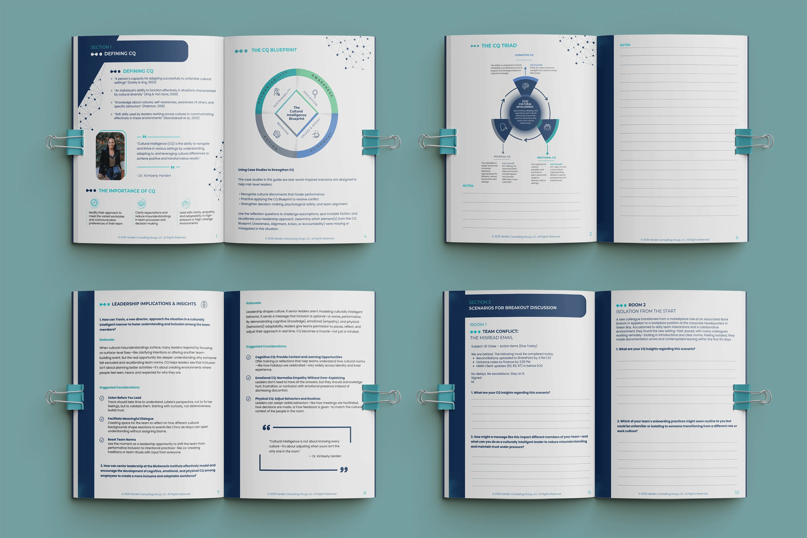
The project challenged me to translate an abstract concept into a clear and compelling visual identity. Initially intended as just a book cover, it grew into supporting presentations, workshops, and a workbook to help readers apply what they learned. Key ideas were also distilled into infographics used throughout the book and companion materials. Ultimately, what started as a simple design evolved beyond that, enabling the author to create a course and guide for organizations across the U.S.
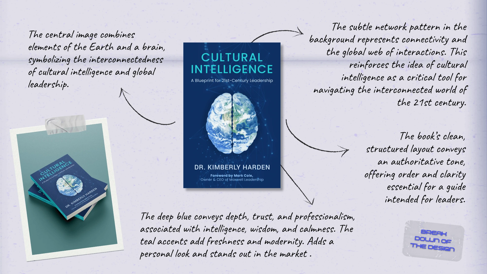
The Breakdown
BONUS STAGE: Behind the Scenes of the Design


WHY SHOWCASE THIS ON THE WEBSITE?
The difference between me and AI (aside from my great style) is that every decision I make has a reason behind it, rooted in research, experience, and an understanding of how each choice reflects the brand, even in the hidden little details. Here’s a glimpse behind the scenes of what that looks like.
