BE CREATIVE. BE UNIQUE. BE YOUR BRAND.
A beacon of love and care for a higher level of learning, nurturing inclusivity and empowerment for students with disabilities in university.

THE CLIENT
THE BRIEF
THE PROJECT
LOCATION: FRESNO, CALIFORNIA, USA
INDUSTRY: PROFESSIONAL TRAINING & CORPORATE CONSULTING
A collaborative endeavor between the T.A.R.G.E.T program and Fresno State University's Rehabilitation Counseling Department. The main objective was: to redesign the program's brochure and establish a new brand identity that would harmoniously coexist alongside Fresno State University's logo without overshadowing it.
- LOGO DESIGN
- BRAND IDENTITY
- WEB DESIGN
- STATIONARY
01 | Laying the Foundation Stage
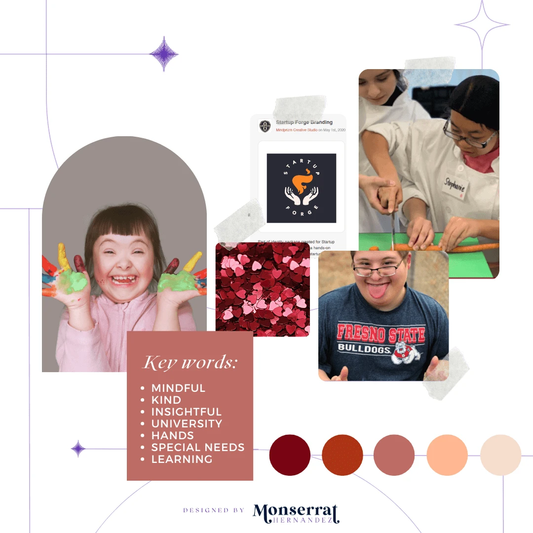
Moodboard

Moodboard for T.A.R.G.E.T.'s logo creation, stationary, and future website
Requirements: brand cohesion with Fresno State University
Mood/Tone: welcoming, supportive, and empowering.
WHY A MOODBOARD?
Moodboards help me center that visual energy and inspiration in one place, guiding the creative direction of the entire project. Research can get overwhelming until something like this is created for quick access.
02 | Unleashing the Creative Chaos Stage
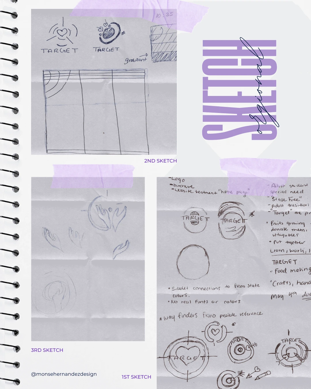
Sketching

1st Sketch: With so many brand requirements to consider, the creative process can feel overwhelming. That’s why my sketches often include words to help me me work through ideas visually and conceptually. The first page was a mix of notes and rough, chaotic sketches.
2nd Sketch: A logo is the heart of a brand, and since this project involved full branding, I needed to ensure the logo could inspire the entire visual identity. Would it provide enough direction? Would I love working with it? Exploring multiple designs helped me find the right foundation.
3rd Sketch: After sketching countless logo variations, I realized the initial concept was too close to a store brand. Moving beyond the simple "target with love" idea led me to incorporate hands, shifting the focus to care, connection, and warmth. That’s when the brand’s true essence took shape.
03 | The From Chaos to Clarity Stage
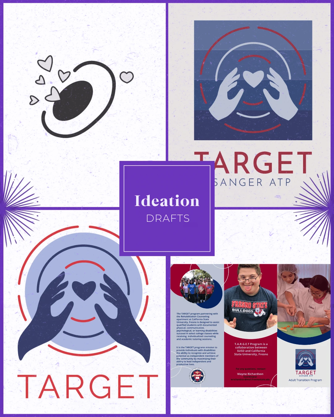
Ideation

Uniting care, connection, and inclusivity, this program is about a warm, empowering visual system that harmonizes with Fresno State University’s brand while celebrating support and accessibility in higher education.
Target Audience: Students with physical, communicative, psychological, or learning disabilities who are seeking support to succeed in their college life. Additionally, the brand may atarget faculty, staff, and administrators involved in student support services at Fresno State.
Brand Personality: It emphasizes the importance of personalized support, academic excellence, and the overall well-being of the students it serves.
WHY SHARE THE "UGLY" DRAFTS OF THE PROCESS?
Design is a process of exploration, not instant perfection.
Each draft is a different way of solving a visual problem I worked through. These early stages leave more room for creativity and refinement, making sure the final design is not just visually appealing but intentional and strategic. And believe it or not, these are only a handful of selected drafts (the countless others have been buried deep in my files).


04 | The Grand Reveal Stage
Bringing Concepts to Life
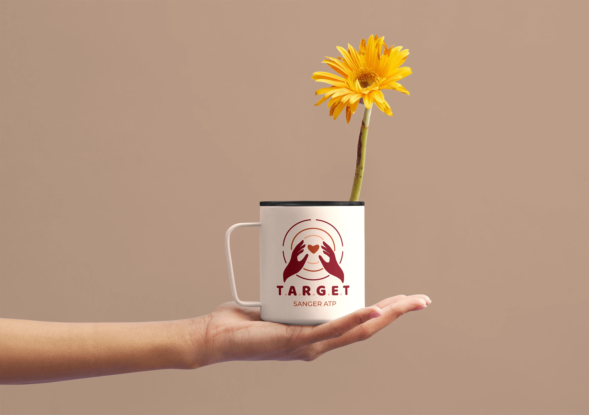
This project marked the second time I redesigned this brand; first as part of a Fresno State competition where students were invited to create its visual identity, and later as a personal portfolio piece. I chose to revisit it because I wasn’t fully satisfied with my original submission. The first version was heavily influenced by the existing brand colors, which limited my creative direction and didn’t fully capture the essence of the program. This redesign became my opportunity for redemption to refine what I knew was a strong concept and transform it into a logo that truly represented the brand. By introducing a brighter, red-centered color palette and improving its adaptability, I created a design that works seamlessly across digital and print applications. Something my first version lacked, making it difficult to extend into materials like brochures and the website.
The new visual identity was thoughtfully crafted to maintain cohesion with Fresno State University’s established look while giving the program its own distinctive voice. The updated color palette was chosen to convey happiness, playfulness, and calmness—creating a sense of warmth and inclusivity. Complemented by more playful motifs, the design fosters a welcoming, supportive atmosphere that reflects the program’s mission to help students discover the tools and resources they need to succeed.

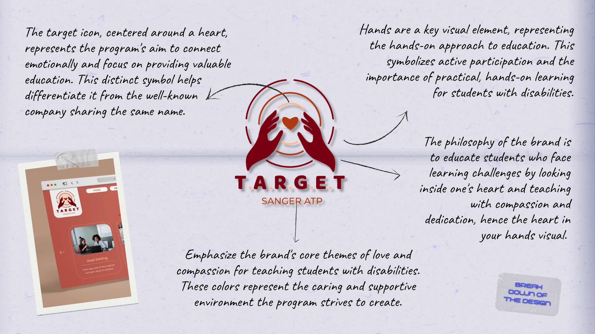
The Breakdown
BONUS STAGE: Behind the Scenes of the Design

WHY SHOWCASE THIS ON THE WEBSITE?
The difference between me and AI (aside from my great style) is that every decision I make has a reason behind it, rooted in research, experience, and an understanding of how each choice reflects the brand, even in the hidden little details. Here’s a glimpse behind the scenes of what that looks like.
Explore More Designs