BE CREATIVE. BE UNIQUE. BE YOUR BRAND.
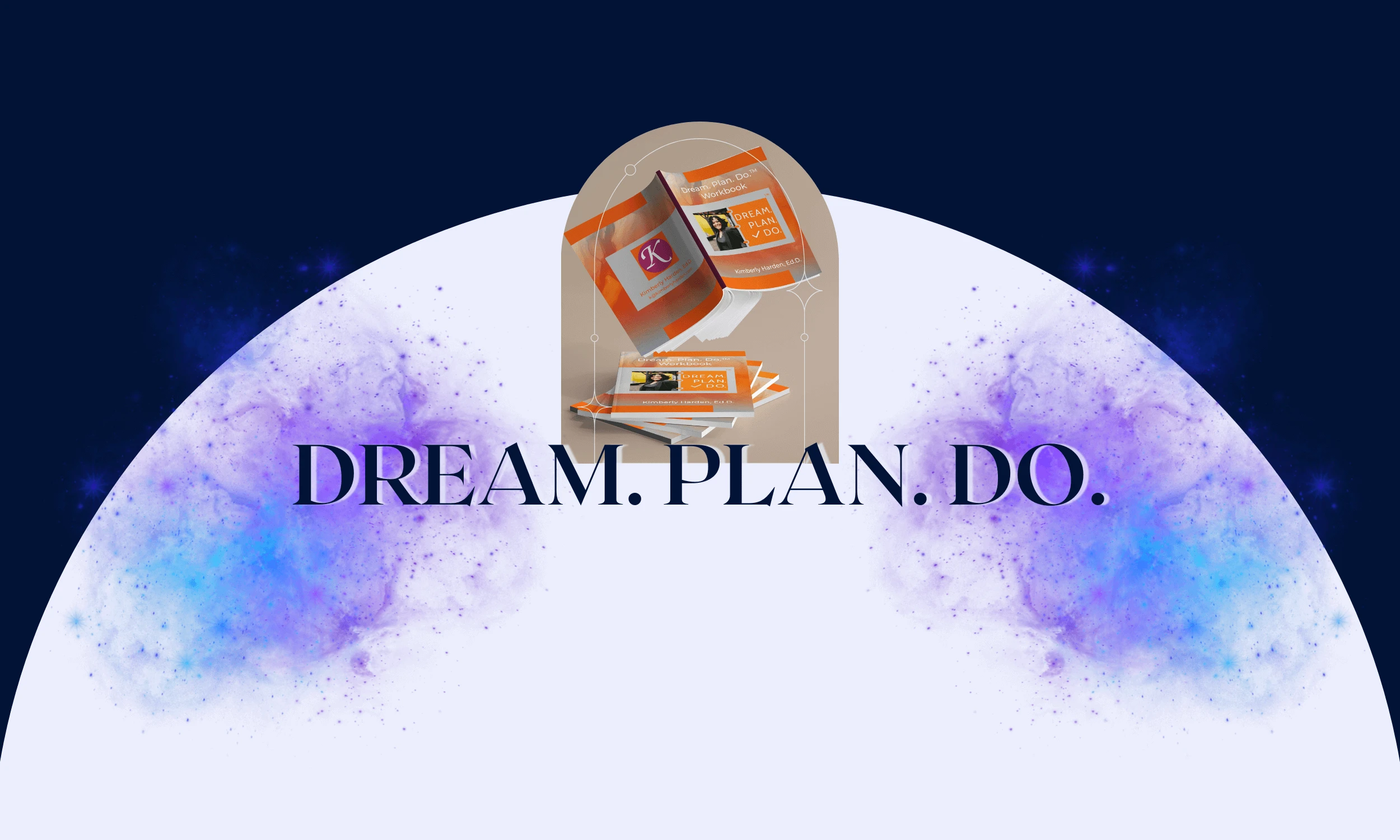
A sub-brand for the Harden Consulting Group that provides individuals with the necessary tools to achieve their dreams through a personal, methodological, and empowering approach
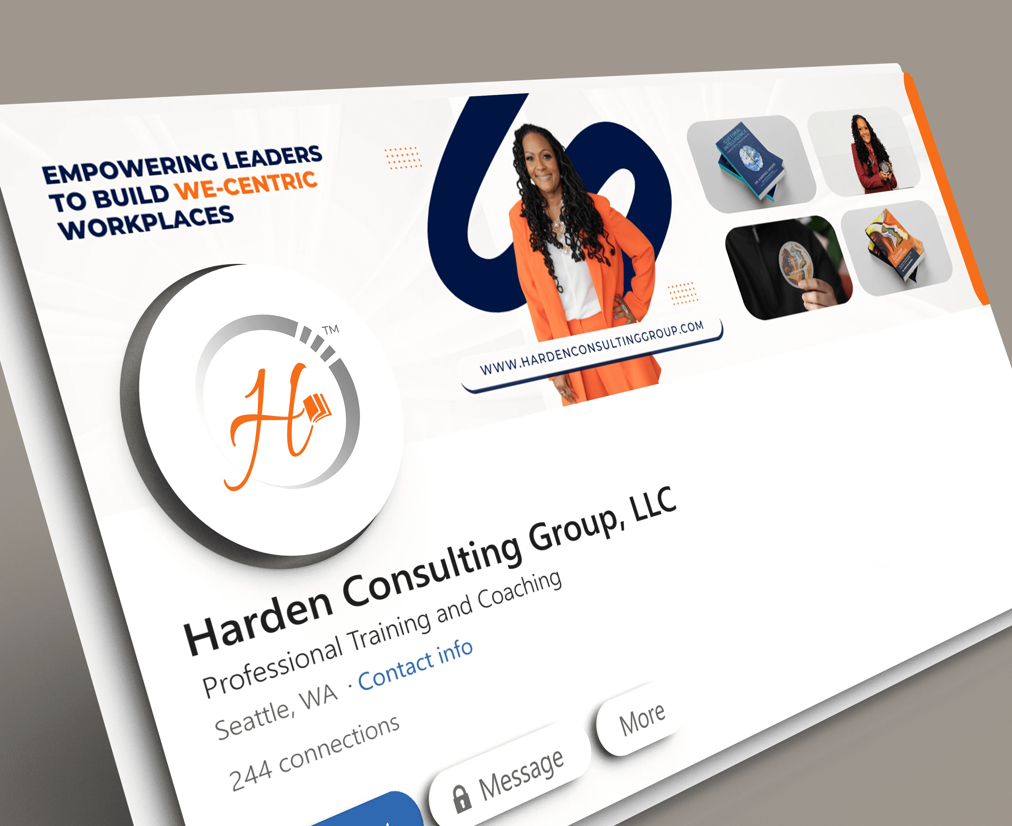
THE CLIENT
THE BRIEF
THE PROJECT
LOCATION: WASHINGTON, USA
INDUSTRY: PERSONAL GROWTH & CONSULTING SERVICES
Designed to empower individuals in their personal growth journey through a clear, methodological, and motivating visual identity. By combining strong typography, supportive graphics, and interactive workbook materials, the goal was to create a trustworthy and inspiring brand that guides people with confidence toward achieving their dreams.
- LOGO DESIGN
- BRAND IDENTITY
- PRINT DESIGN (BOOKLETS & WORKSHEETS)
- INTERACTIVE EBOOKS
01 | Laying the Foundation Stage
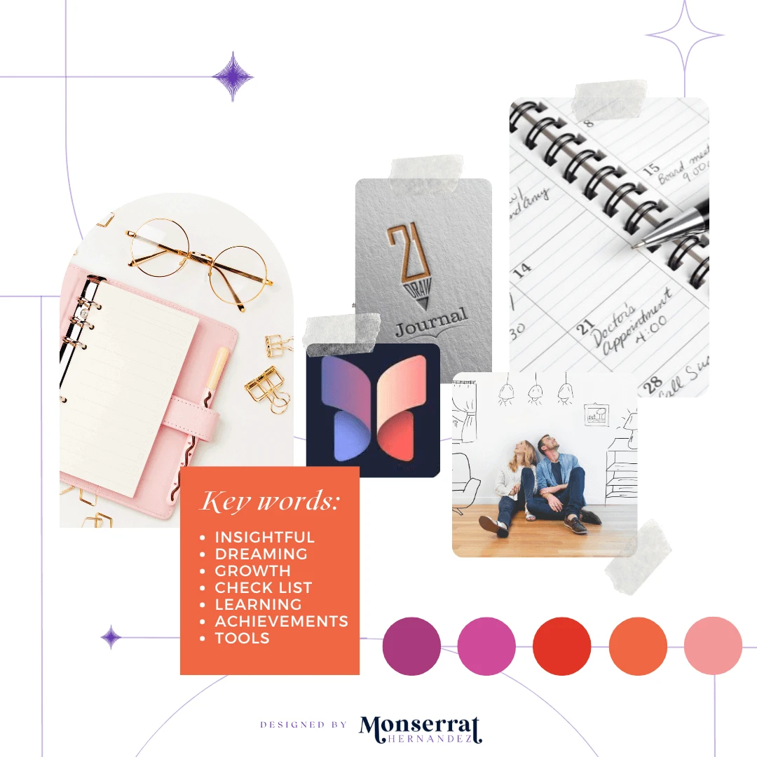
Moodboard

Moodboard for Dream. Plan. Do.’s logo creation, educational material, and ebook designs
Requirements: designs that empower finishing goals & are easy to navigate
Mood/Tone: The brand’s tone is uplifting and inspiring, encouraging individuals to believe in their ability to achieve their goals while remaining clear and methodical to build trust through a step-by-step process. Modern yet approachable, it strikes a balance between encouragement and clarity.
WHY A MOODBOARD?
Moodboards help me center that visual energy and inspiration in one place, guiding the creative direction of the entire project. Research can get overwhelming until something like this is created for quick access.
02 | Unleashing the Creative Chaos Stage
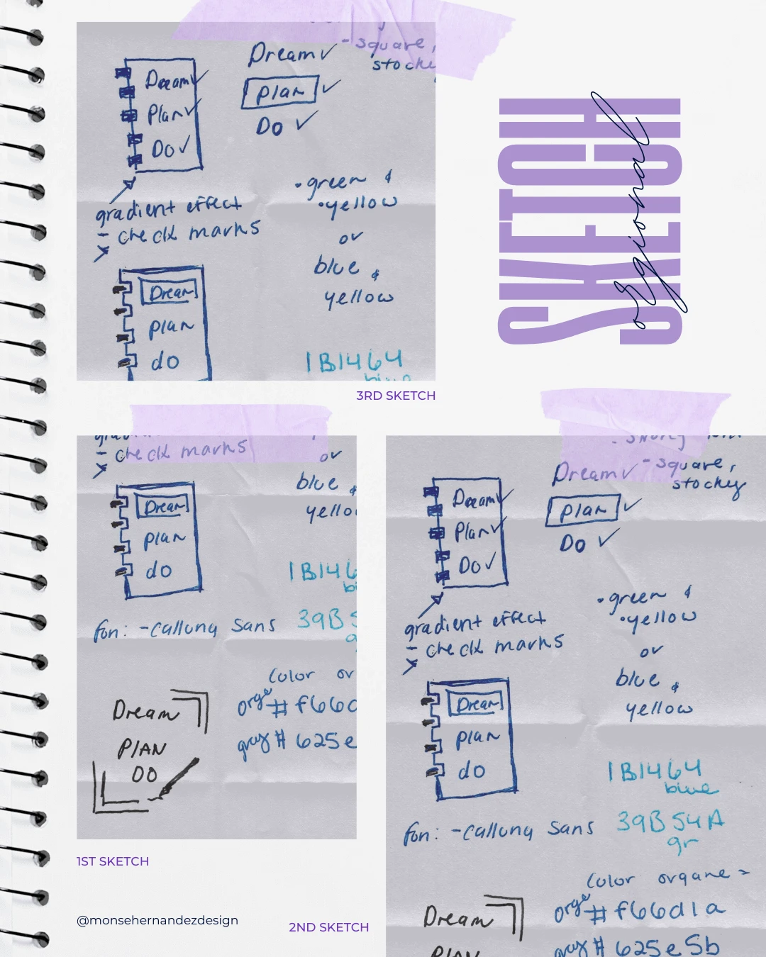
Sketching

1st Sketch: Sometimes, a font is all a logo needs. For this design, I let the typography take the lead, with only minimal graphics for support. It’s one of those moments when I found the perfect font that helped me carry the entire design effortlessly.
2nd Sketch: In a single drawing, you can already see multiple ideas forming, each shaping the vision for the final look. Even the colors started to come through, guiding the creative process as I explored different possibilities on paper.
3rd Sketch: There are times when a sketch translates almost seamlessly into the final design, needing only refinement and polish. This was one of those rare moments. Looking back at the original drawing, it’s satisfying to see how clearly the final logo was already taking shape from the very first lines.
03 | From Chaos to Clarity Stage
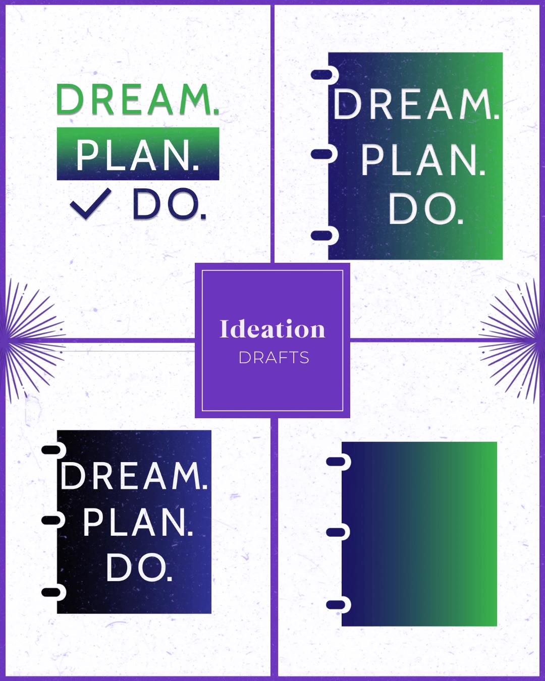
Ideation

To promote personal growth and guidance by providing a more methodological and empowering approach through an interactive workbook.
Target Audience: People who are drawn to alternative fashion and culture. They are looking for unique, handmade jewelry that reflects their individuality and personal style.
Brand Personality: A professional sub-brand with a modern way of thinking that focus on clarity and ease of use, to help individuals achieve their dreams with confidence and enthusiasm.
WHY SHARE THE "UGLY" DRAFTS OF THE PROCESS?
Design is a process of exploration, not instant perfection.
Each draft is a different way of solving a visual problem I worked through. These early stages leave more room for creativity and refinement, making sure the final design is not just visually appealing but intentional and strategic. And believe it or not, these are only a handful of selected drafts (the countless others have been buried deep in my files).


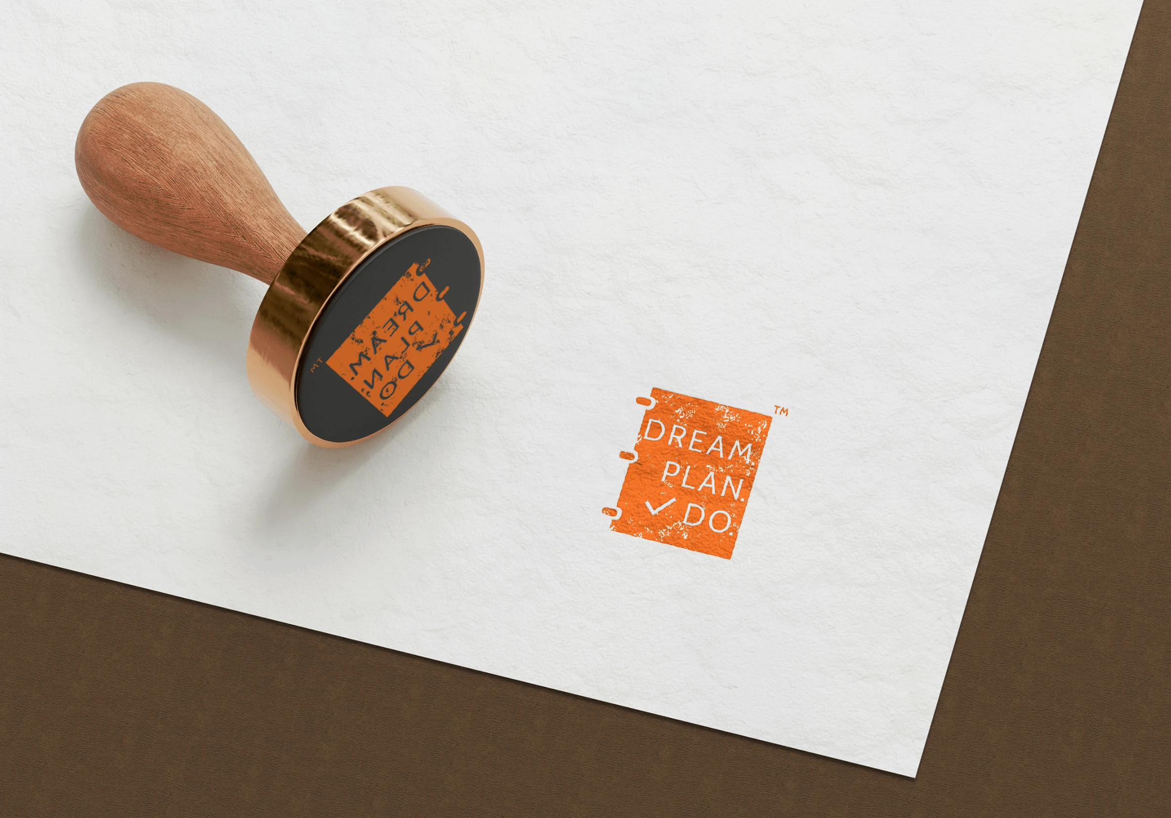
04 | The Grand Reveal Stage
Bringing Concepts to Life
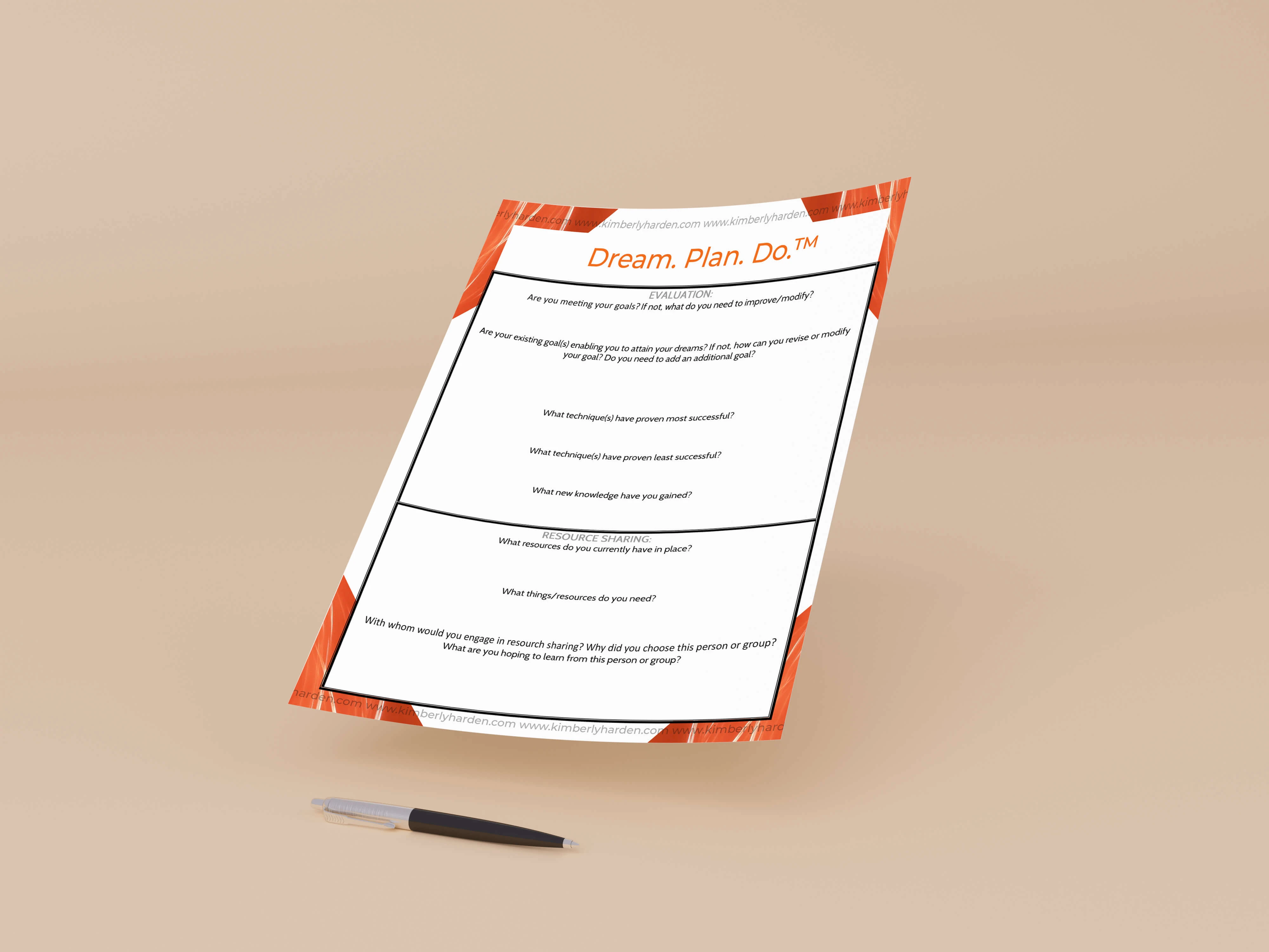
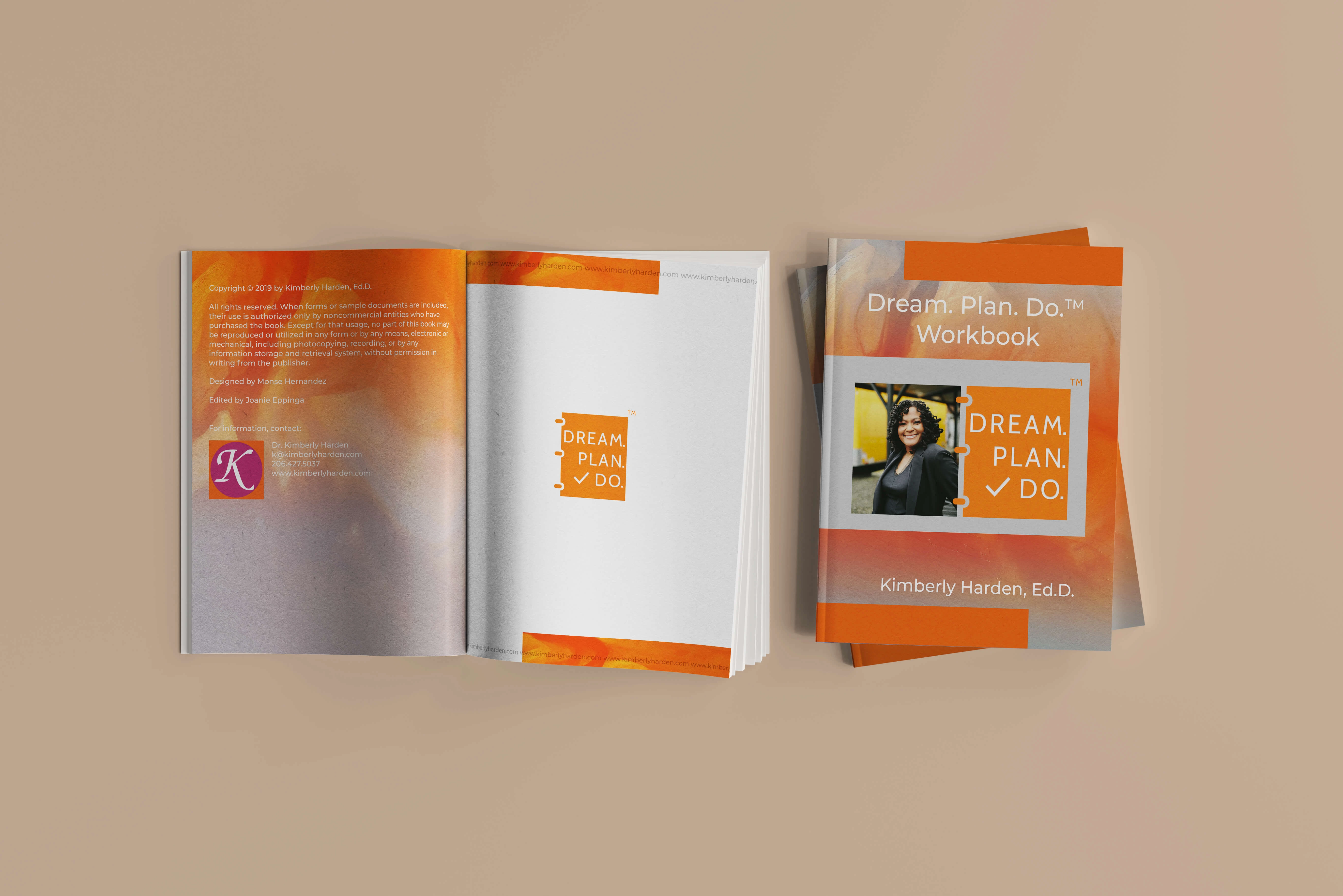
Sometimes it’s easy to forget how quickly technology advances, but the Dream. Plan. Do. project was a reminder of just how new interactive design once felt. This was one of the first projects where individuals were downloading and actively working through an ebook and worksheets. A format that was only starting to be embraced at the time. For Harden Consulting Group, it became a gateway into what educational materials could look like for individuals and firms, blending personal growth with structured, methodological tools. Looking back, I’m still proud of the simplistic, easy-to-use ebooks I created long before platforms like Canva or Adobe Express made worksheets and interactive guides commonplace for online coaches. That project shaped me as a “baby graphic designer,” giving me the foundation to now create in-depth ebooks and educational materials with much more sophistication.
Even six years later, the progress of technology in design should not just be noted but celebrated, because those early projects taught me the value of making PDFs interactive, empowering, and accessible in ways that were ahead of their time. Dream. Plan. Do. showed me that good design isn’t only visual: it can also be interactive, supportive, and transformative for the people who use it. It was a successful project that launched me into a new way of thinking about design, and it allowed the sub-brand to later branch out into unique, modern methods of teaching that moved far beyond simple slides and into a full online environment.
The Breakdown
BONUS STAGE: Behind the Scenes of the Design

WHY SHOWCASE THIS ON THE WEBSITE?
The difference between me and AI (aside from my great style) is that every decision I make has a reason behind it, rooted in research, experience, and an understanding of how each choice reflects the brand, even in the hidden little details. Here’s a glimpse behind the scenes of what that looks like.
Explore More Designs