BE CREATIVE. BE UNIQUE. BE YOUR BRAND.
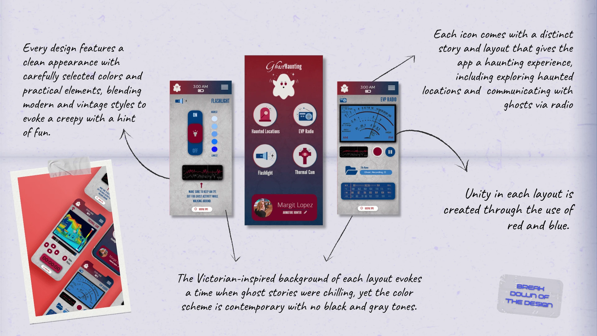
The ultimate blend of playful spookiness and informative exploration strikes the balance between ghost haunting and technology in a simple-to-use app.

THE CLIENT
THE BRIEF
THE PROJECT
PASSION PROJECT
What began as an exploration of icon design evolved into a full-fledged conceptual project focused on developing a functional mobile application from the ground up. This project combines spooky charm, playful visuals, and intuitive UX to create an experience that makes ghost hunting feel accessible and delightfully entertaining for users of all levels.
- UX/IA
- APP DESIGN
- ICON ILLUSTRATION
- LOGO DESIGN
- VISUAL BRANDING
Part I: Icon & Branding

01 | Laying the Foundation Stage
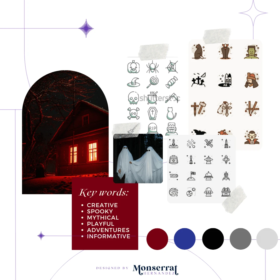
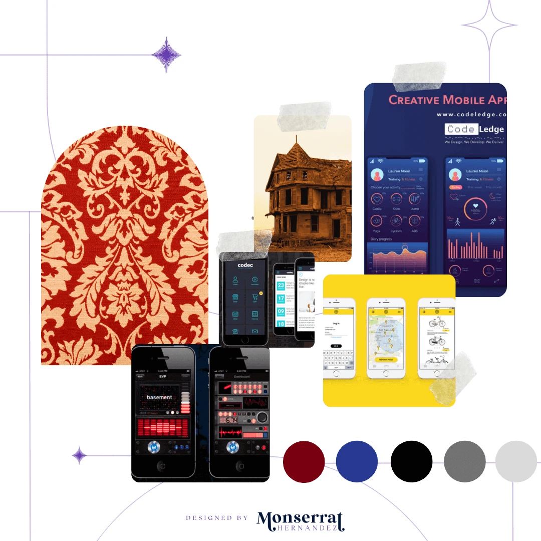
Moodboard

Moodboard for Ghost Haunting App’s icon design and visual branding
Requirements: A logo and icon set that align aesthetically with the brand to be recognizable, and visually appealing across multiple platforms, including smaller formats like iPhone displays.
WHY A MOODBOARD?
Moodboards help me center that visual energy and inspiration in one place, guiding the creative direction of the entire project. Research can get overwhelming until something like this is created for quick access.
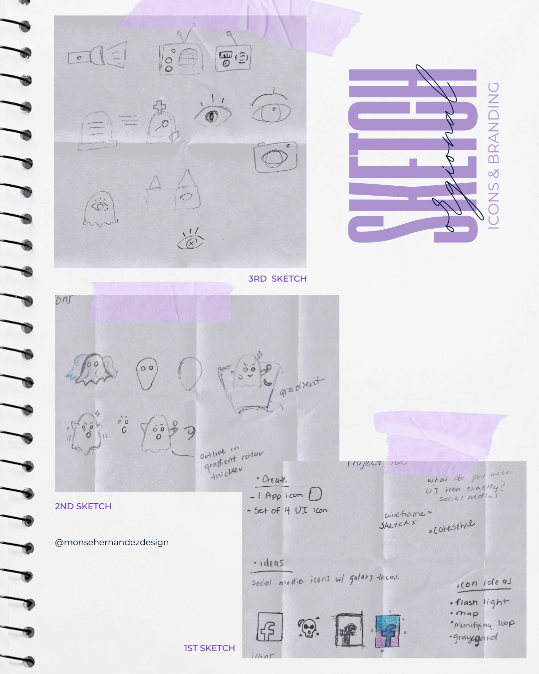
02 | Unleashing the Creative Chaos Stage
Icons & Branding Sketching

1st Sketch: This was my first time designing icons, and among the many random sketches I created, one sparked the idea for my app. The skull adorned with stars and small decorative details, combined with the approaching spooky season, inspired me to design something for fans of the supernatural. From skulls to ghosts, the idea quickly evolved into a ghost-hunting app.
2nd Sketch: The initial sketch introduced a playful little ghost which became the whimsical design for everything. As I began experimenting with colors and styles, I discovered the visual identity and tone that would define the app: fun, mysterious, and full of personality.
3rd Sketch: Once the concept was set, I began sketching additional icons to complement the main design. These not only helped refine the aesthetic but also inspired new ideas for screens and features. Each icon became a gateway to key app functions, helping shape a smooth, engaging, and cohesive user experience.
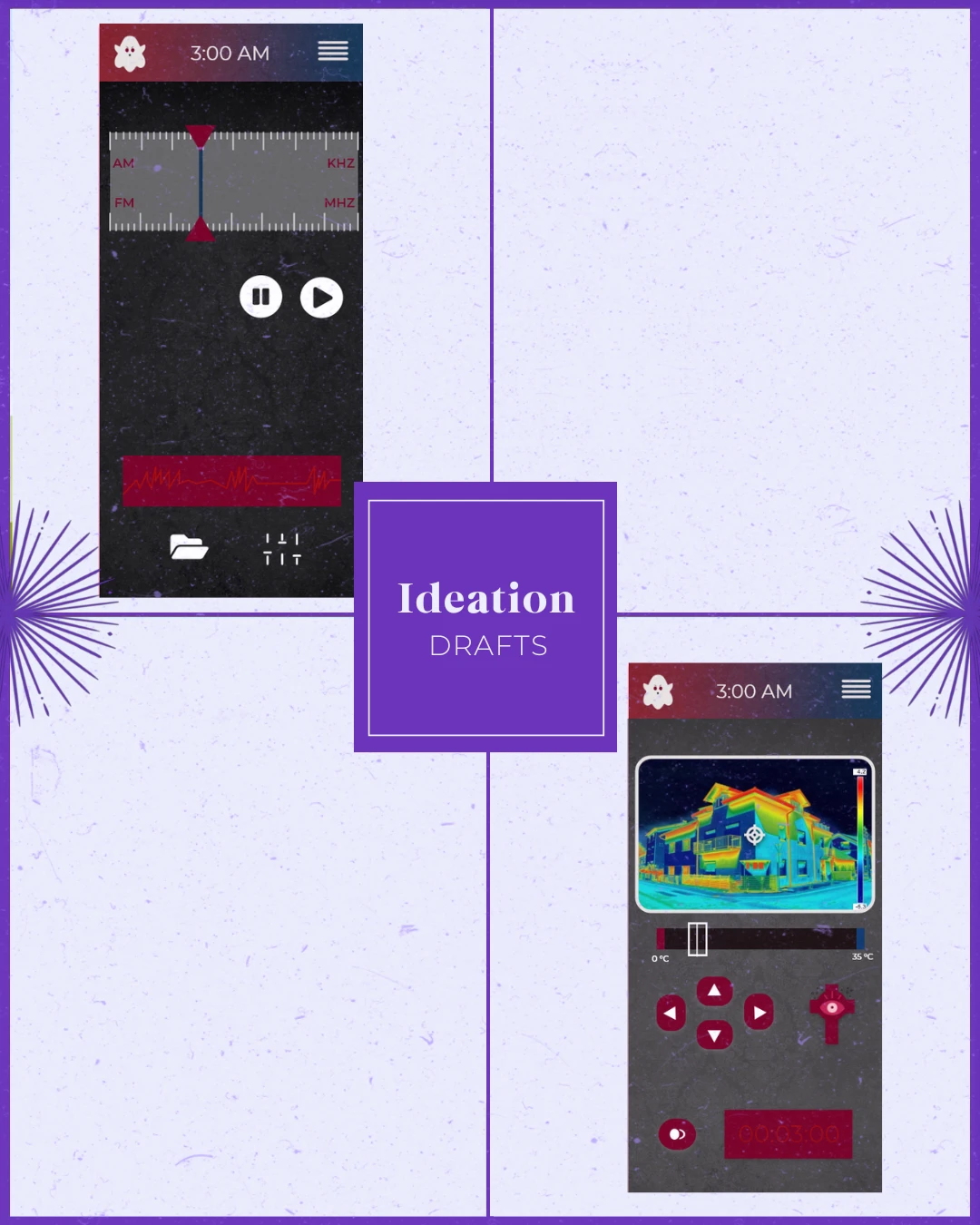
03 | The From Chaos to Clarity Stage
Icons & Branding Ideation

The brand values individuality, creativity, and authenticity for its alternative clientele.
Target Audience: People who are drawn to alternative fashion and culture. They are looking for unique, handmade jewelry that reflects their individuality and personal style.
Brand Personality: Edgy, rebellious, and unconventional.
WHY SHARE THE "UGLY" DRAFTS OF THE PROCESS?
Design is a process of exploration, not instant perfection.
Each draft is a different way of solving a visual problem I worked through. These early stages leave more room for creativity and refinement, making sure the final design is not just visually appealing but intentional and strategic. And believe it or not, these are only a handful of selected drafts (the countless others have been buried deep in my files).
Part II: App Design

01 | Laying the Foundation Stage
Moodboard

Moodboard for Ghost Haunting App’s UI design
Requirements: Ensure the icon branding captures a Victorian-inspired spooky vibe while remaining playful, cohesive, and functional for the app’s overall design.
Mood/Tone: The overall app tone is playful, spooky-cute, and adventurous; blending mystery and fun with a friendly, approachable aesthetic. It transforms ghost hunting into a lighthearted and social experience, inviting users to explore the supernatural.
02 | Unleashing the Creative Chaos Stage
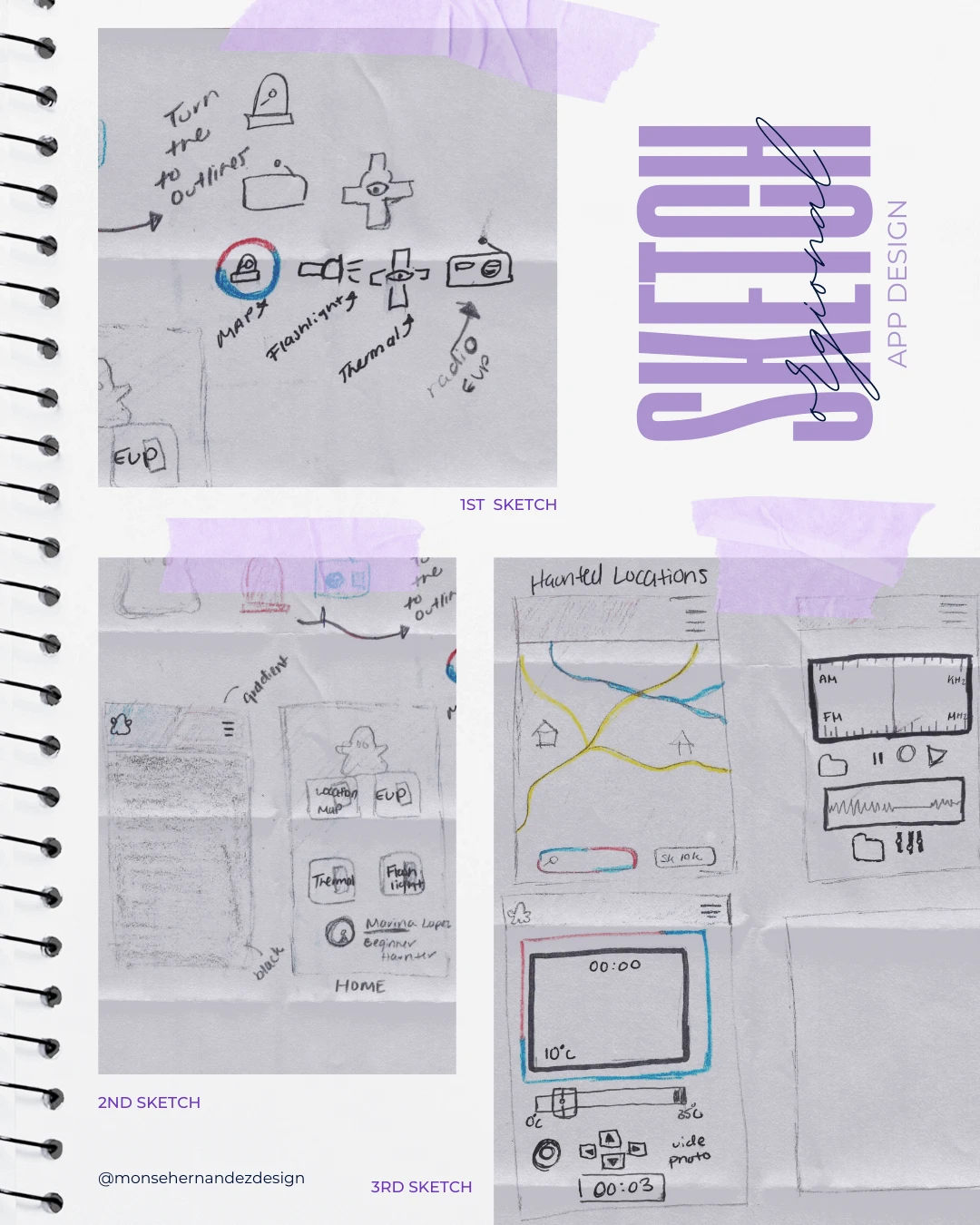
UI & UX Sketching

1st Sketch: In this second round of sketching for the app’s UX/UI design, my goal was to solidify the concept—something that felt both spooky and unexpected. I had already defined the color palette, main ghost design, and supporting icons, which together began shaping the app into a practical solution for ghost-hunting enthusiasts.
2nd Sketch: Designing the home screen became the key to unlocking how the rest of the app would function. Dividing the layout into main tools and a profile screen helped me visualize the user flow and refine the overall structure.
3rd Sketch: Each tool required its own dedicated screen, so I focused on how every button and icon would interact seamlessly. By breaking down each function, I ensured that the tools were not only visually cohesive but also genuinely helpful for users navigating their ghost-hunting adventures.
03 | From Chaos to Clarity Stage
UI & UX Ideation

To provide a user-friendly interface that will enable users to discover and explore haunted locations with ease, but mainly as a new source of fun and exploration.
Target Audience: Includes anyone with an interest in ghost hunting, whether they are beginners or experienced ghost hunters. We will focus on appealing to a wide range of age groups, including teenagers and young adults.
Brand Personality: A playful, engaging, and informative personality with a spooky-cute aesthetic that is both charming and intriguing.

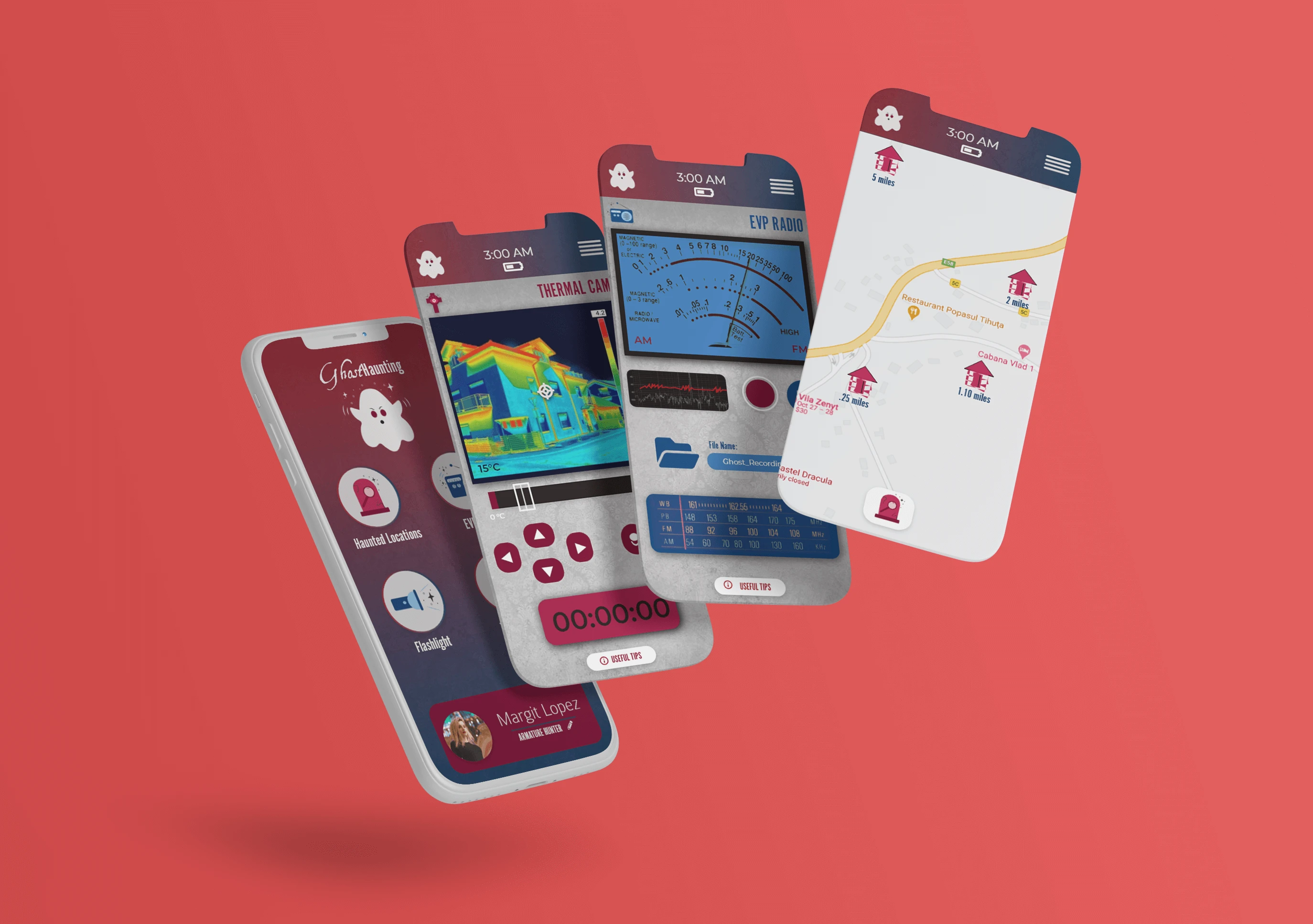
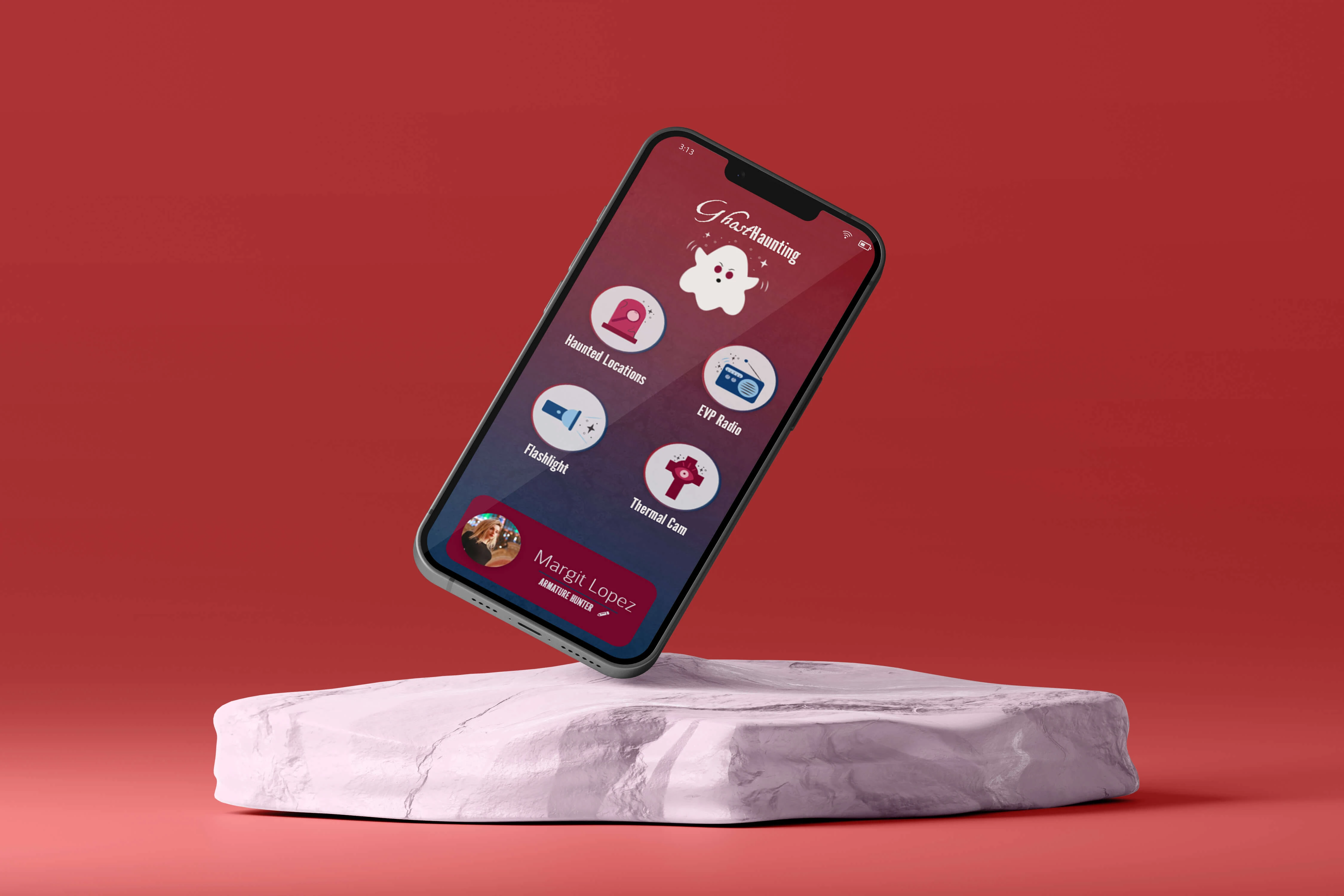
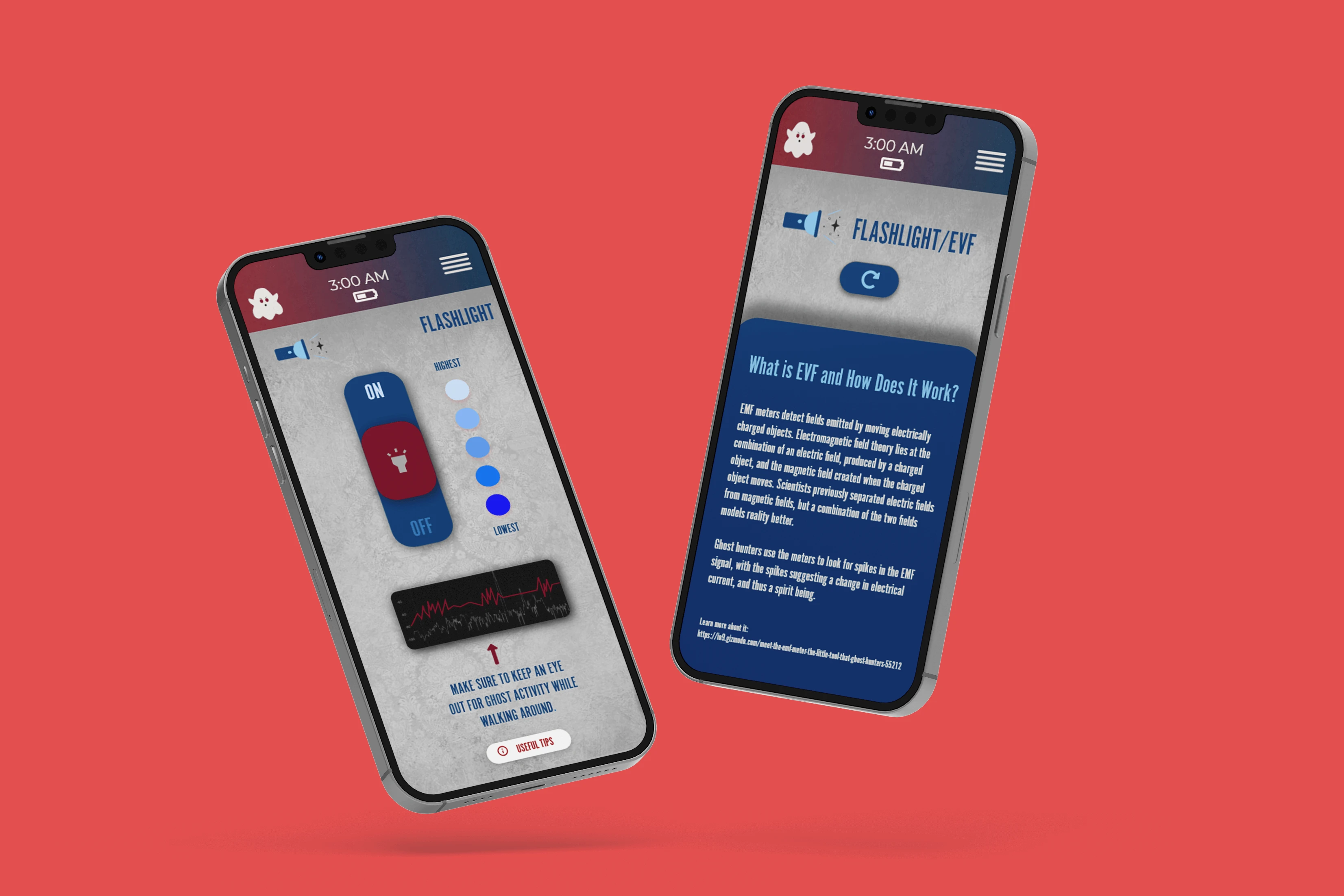
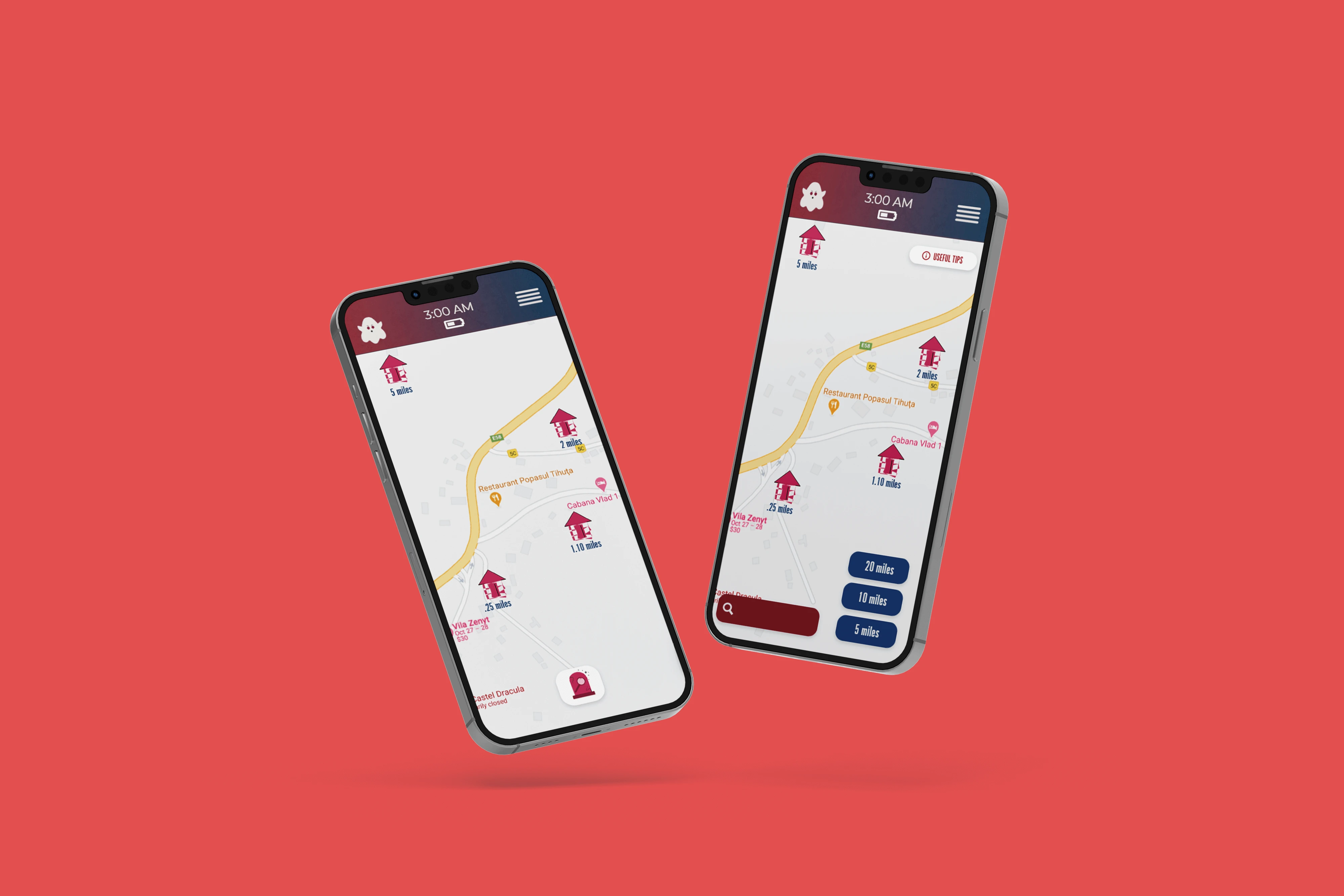
04 | The Grand Reveal Stage
Bringing Concepts to Life
In my pursuit to continually grow as a designer, this project became a key milestone in understanding what it truly takes to design an app by crafting icons to developing each part of the interface. The Ghost Haunting App began with a single sketch: a spooky little skull surrounded by stars that sparked the idea of transforming traditional ghost-hunting gear into a fun, user-friendly digital experience. What started as a seasonal concept quickly evolved into a full-fledged project that blended design, technology, and playfulness. I created every icon from scratch, experimenting with shapes and expressions until the app’s visual language felt both spooky and approachable. The main ghost design became the face of the app, setting the tone for the logo, color palette, and overall aesthetic. By merging dark, mysterious themes with a kawaii charm, I developed a style that broke away from cliché horror visuals and instead invited users to explore the supernatural with curiosity and delight.
As the project progressed, I brought the concept to life through thoughtful UX/UI design—you can also click the link for the full UX case study—refining the interface to ensure every element was intuitive and engaging. I conducted both low- and high-fidelity prototype tests, using feedback to improve usability and introduce key features such as an information icon for beginner users. The result was a cohesive visual identity and seamless user experience: an app that perfectly balances playful spookiness with informative exploration. From the logo to the interactive screens, every design decision reflects one goal: to make ghost hunting accessible, entertaining, and unexpectedly adorable.
The Breakdown
Icons & UI: Understanding the Design

WHY SHOWCASE THIS ON THE WEBSITE?
The difference between me and AI (aside from my great style) is that every decision I make has a reason behind it, rooted in research, experience, and an understanding of how each choice reflects the brand, even in the hidden little details. Here’s a glimpse behind the scenes of what that looks like.
Explore More Designs