BE CREATIVE. BE UNIQUE. BE YOUR BRAND.
Where the vibrant personality of a beading shop comes alive in an online brand that ignites a creative community of buyers and crafters
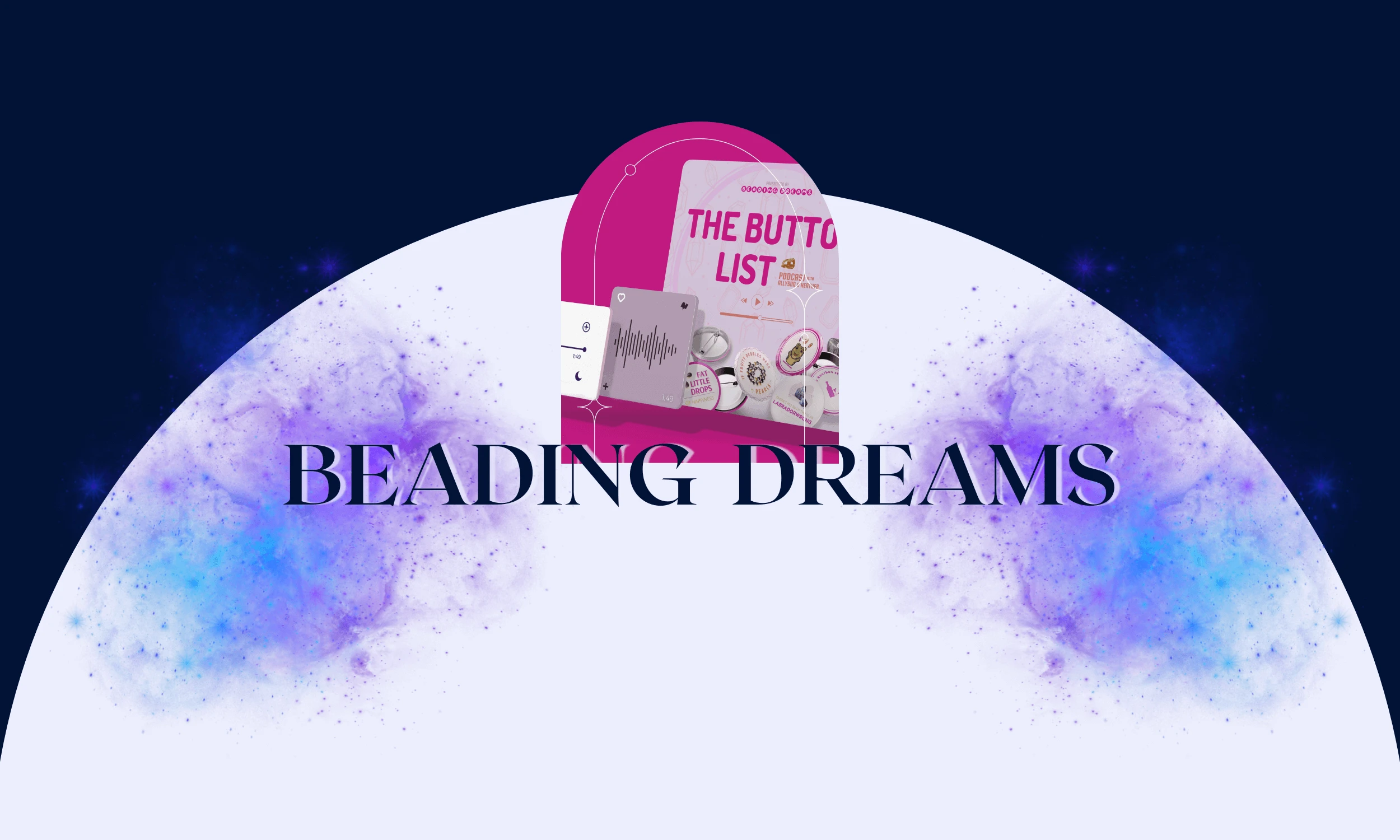
THE CLIENT
THE BRIEF
THE PROJECT
LOCATION: DALLAS, TEXAS, USA
INDUSTRY: JEWELRY & CRAFTS
Captures the brand’s personality through a character that blends semi-realism with playful cuteness while maintaining the visual consistency of the store’s bold pink branding and bead-focused identity. The designs needed adaptability across both digital and physical applications including social media, merchandise, emotes, buttons, and keychains.
- ILLUSTRATIONS
- MERCHANDISE
- CONTENT CREATION
- PODCAST EDITING
- MARKETING
01 | Laying the Foundation Stage
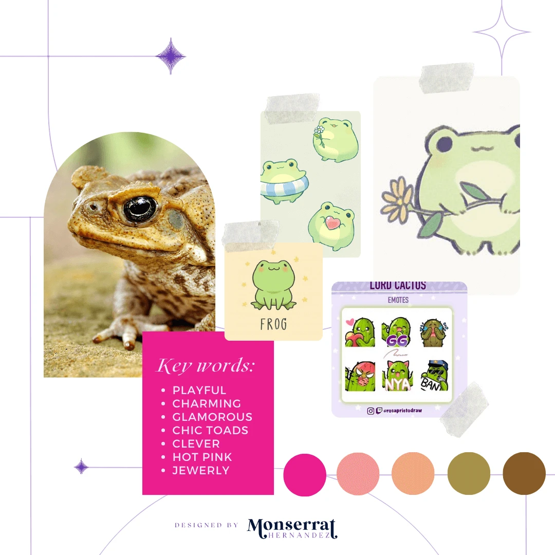
Moodboard

Moodboard for Beading Dreams’ stationery line and store mascot for social media.
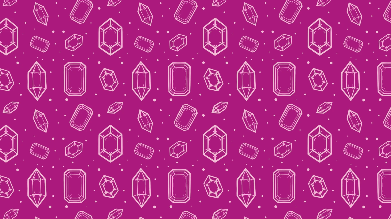
Requirements: brand’s unique hot pink + jewelry-based
Mood/Tone: Whimsical, playful, and enchanting, with a light-hearted, joyful vibe that makes learning about jewelry making feel effortless and fun. This brand embraces the beautiful chaos that comes with being creative..
WHY A MOODBOARD?
Moodboards help me center that visual energy and inspiration in one place, guiding the creative direction of the entire project. Research can get overwhelming until something like this is created for quick access.
02 | Unleashing the Creative Chaos Stage
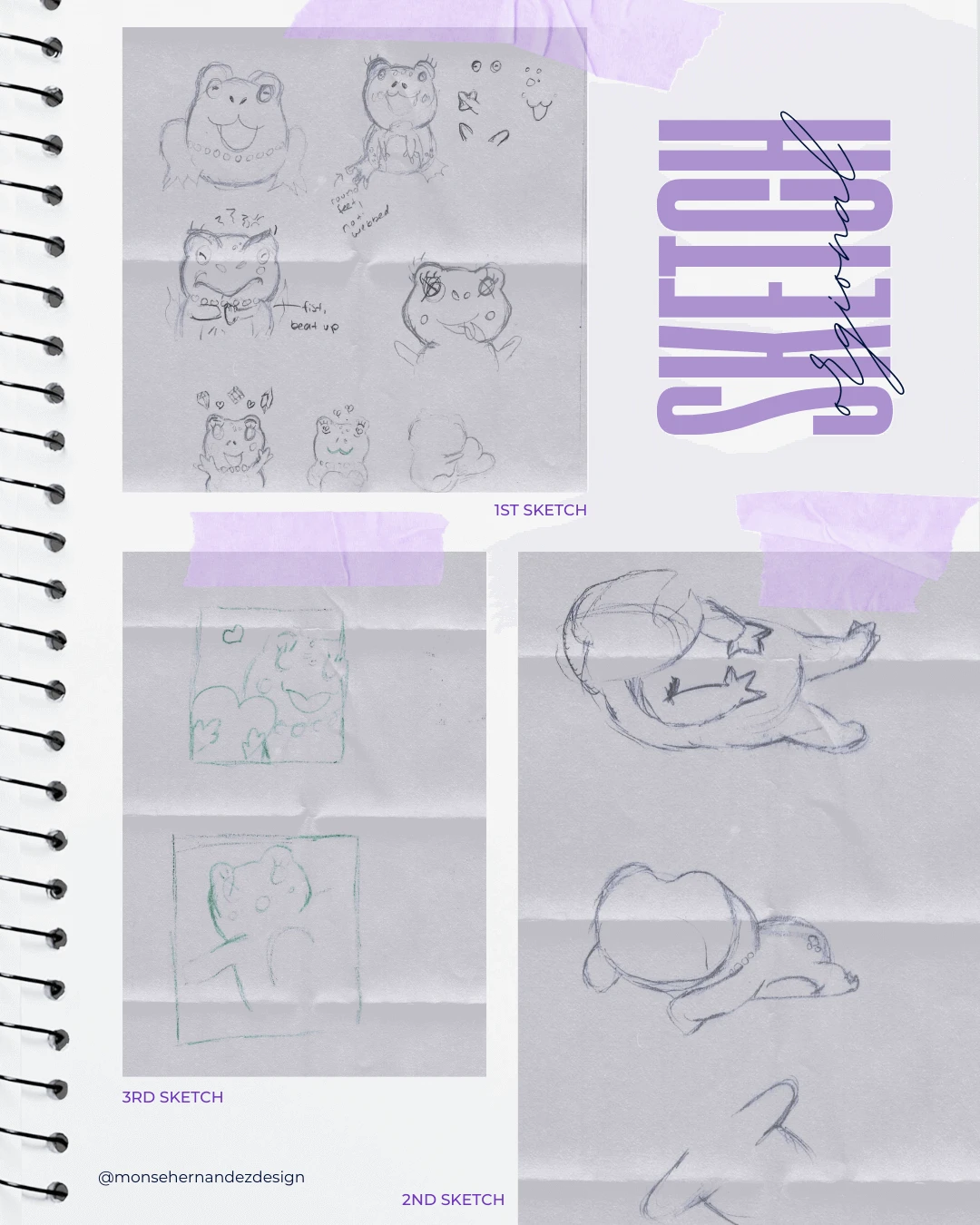
Sketching

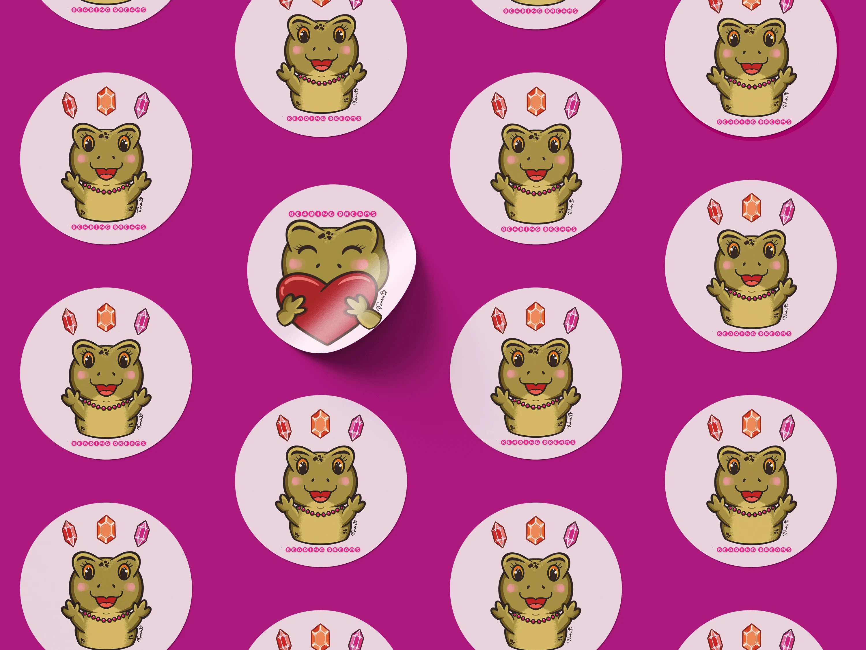
1st Sketch: Finding the perfect balance between semi-realism and cuteness was the biggest challenge. Should the feet be webbed, chubby, or round? Experimenting with different shapes and features was a fun and iterative process until the right Toadette design emerged.
2nd Sketch: With the body shape finalized, I explored different poses to express the emotions the client envisioned. I was still refining the feet was an unexpectedly tricky detail, whether designing for humans or animated creatures!
3rd Sketch: By this stage, I had fully grasped the character’s form. The final sketch established the structure and details needed to bring the remaining four designs to life. It was fun making different poses and making this toadette extra adorable.
03 | From Chaos to Clarity Stage
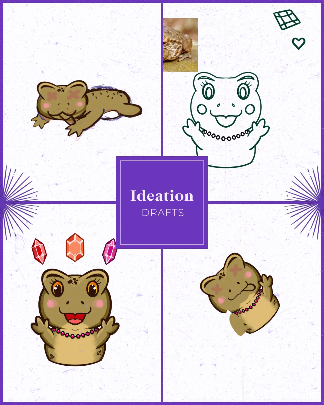
Ideation

Radiates wonder and enthusiasm for beading and gemstones, exuding creativity, and a touch of magic for every shopper—whether online or in-store.
Target Audience: The brand attracts creative, imaginative beading and gemstone enthusiasts who love expressing their style. They appreciate the fun and whimsical aspects of the brand, seeking both high-quality gemstones and a delightful shopping experience.
Brand Personality: Exudes creativity, charm, and wonder for jewerly making.
WHY SHARE THE "UGLY" DRAFTS OF THE PROCESS?
Design is a process of exploration, not instant perfection.
Each draft is a different way of solving a visual problem I worked through. These early stages leave more room for creativity and refinement, making sure the final design is not just visually appealing but intentional and strategic. And believe it or not, these are only a handful of selected drafts (the countless others have been buried deep in my files).


04 | The Grand Reveal Stage
Bringing Concepts to Life
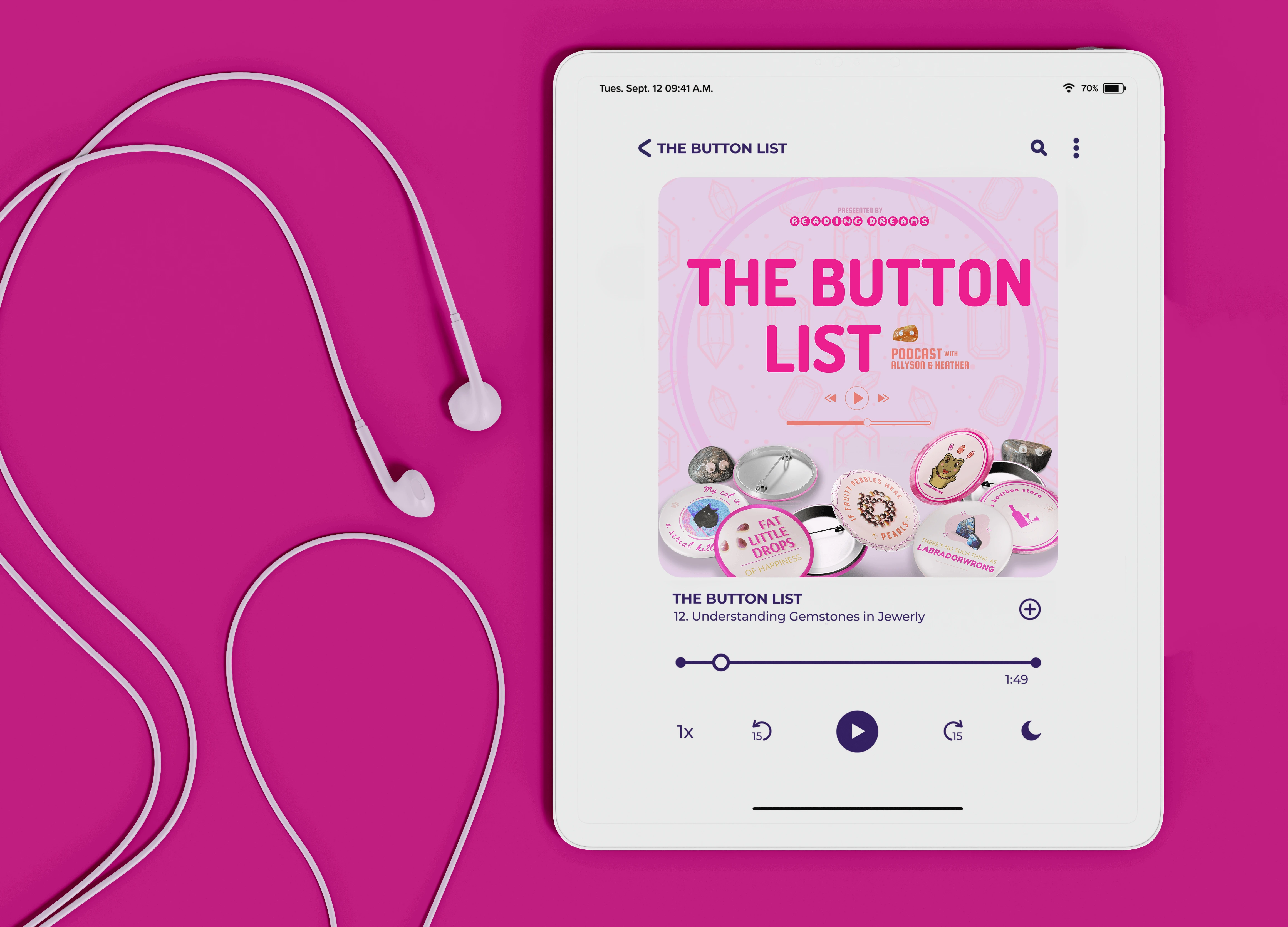
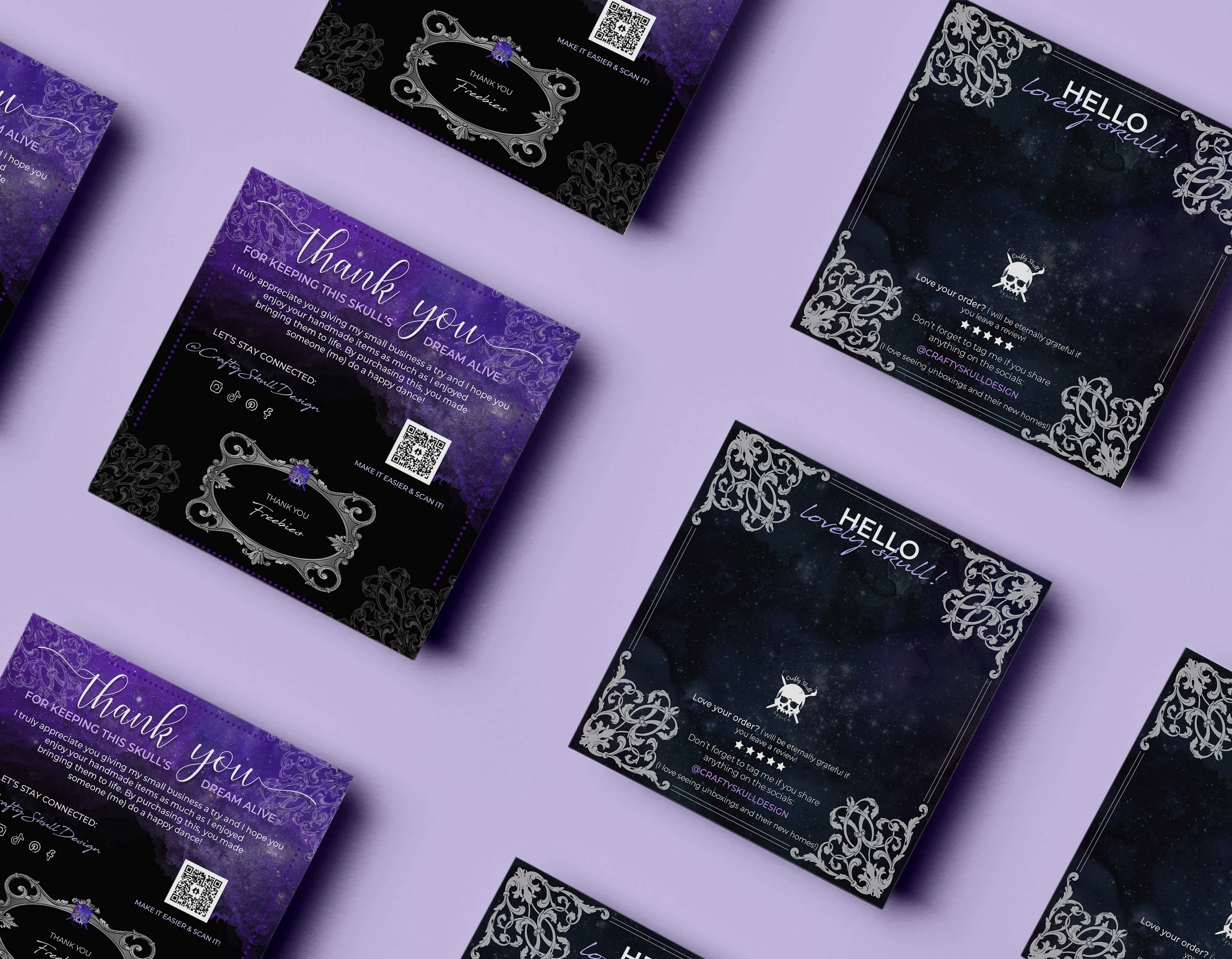
The design for Beading Dreams centered on creating a whimsical, playful identity that captured the vibrant personality of the shop and its crafting community. The process began with sketch explorations to find the right balance between semi-realism and cuteness for the character, experimenting with body shapes, and poses until the final “Toadette” mascot emerged: complete with pink pearls and bold lashes. Built to reflect the store’s existing bold pink branding, the character became the heart of the brand’s visual identity, designed for adaptability across digital and physical applications such as social media, emotes, merchandise, and keychains.
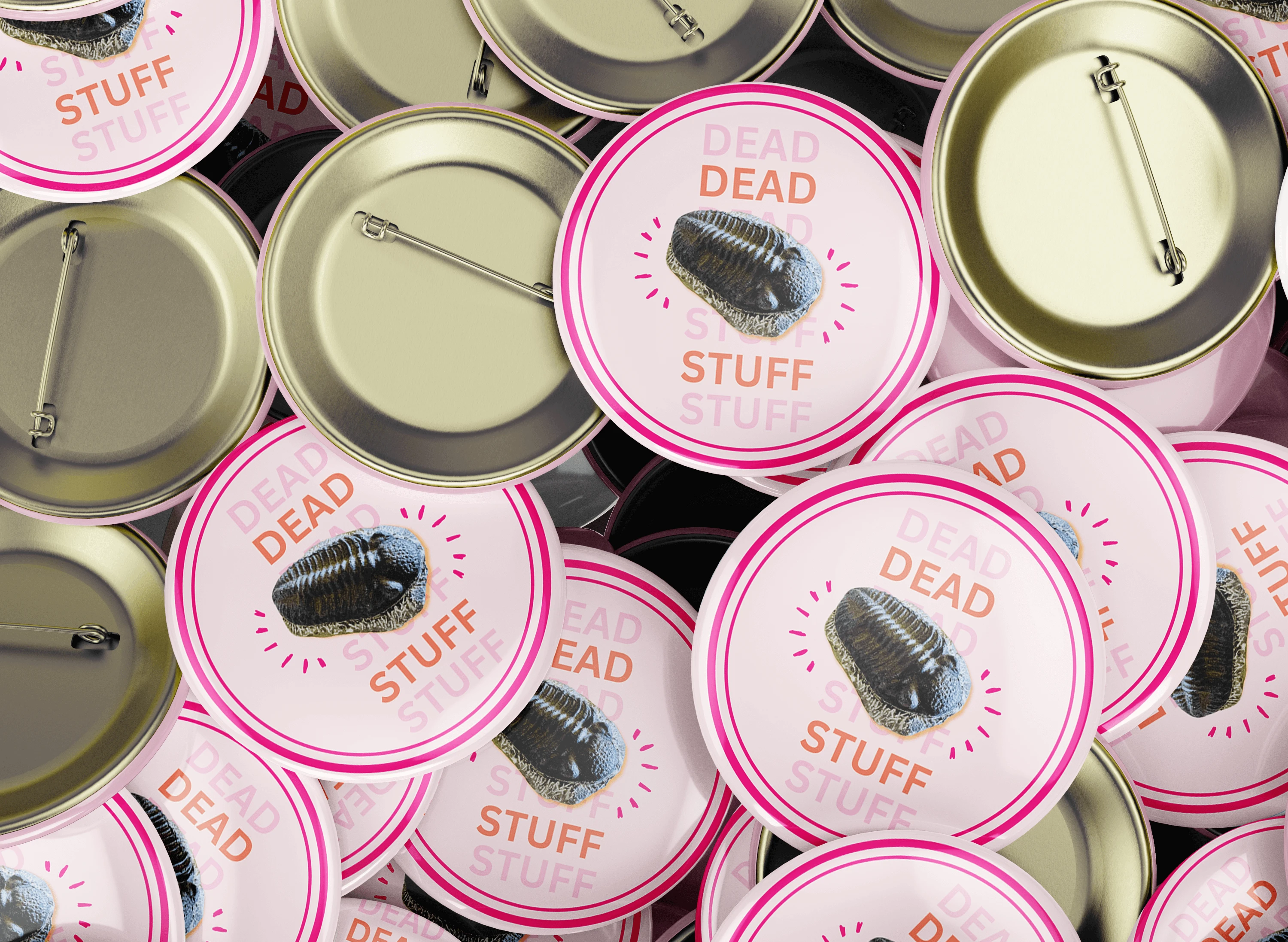
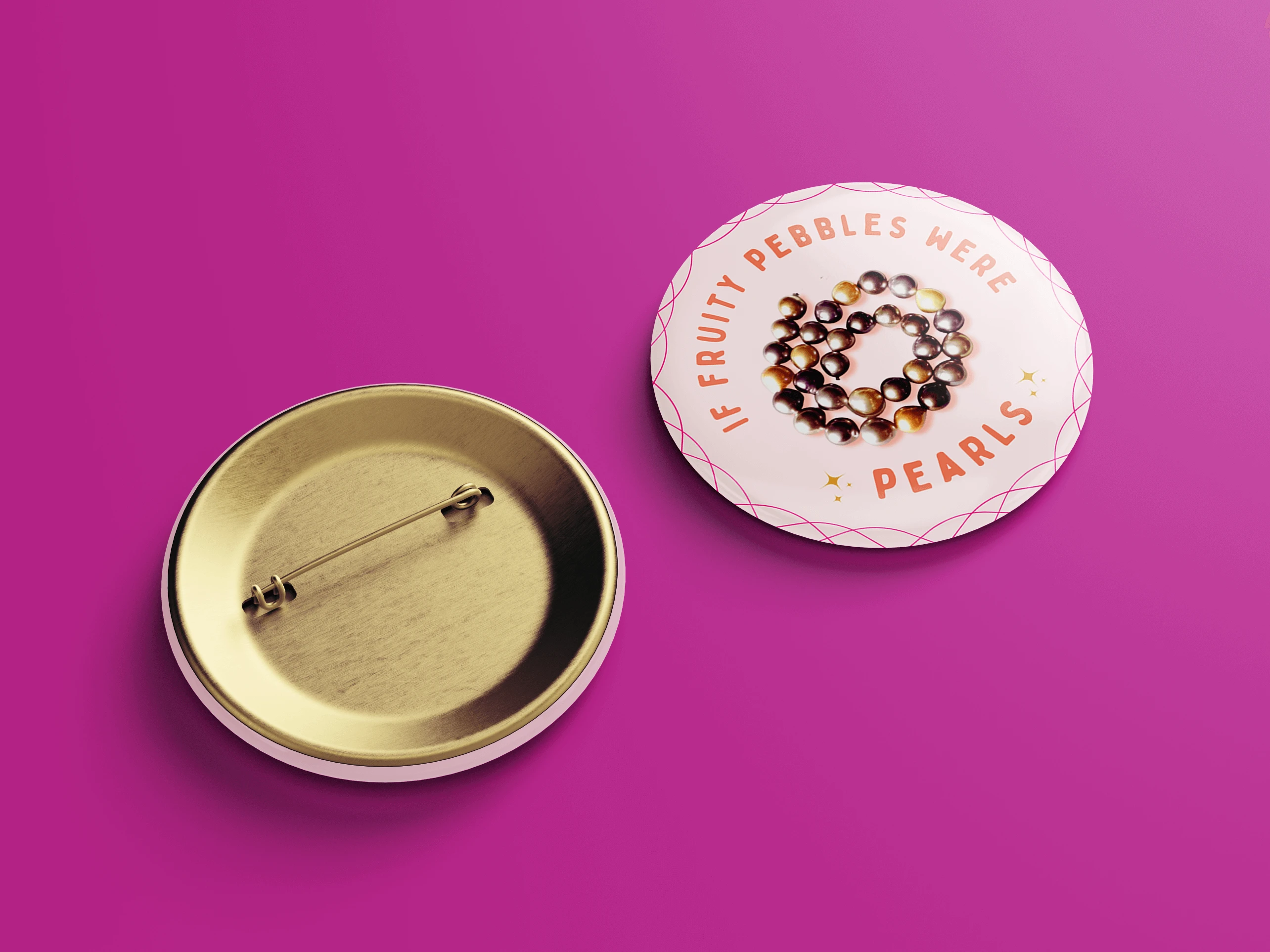
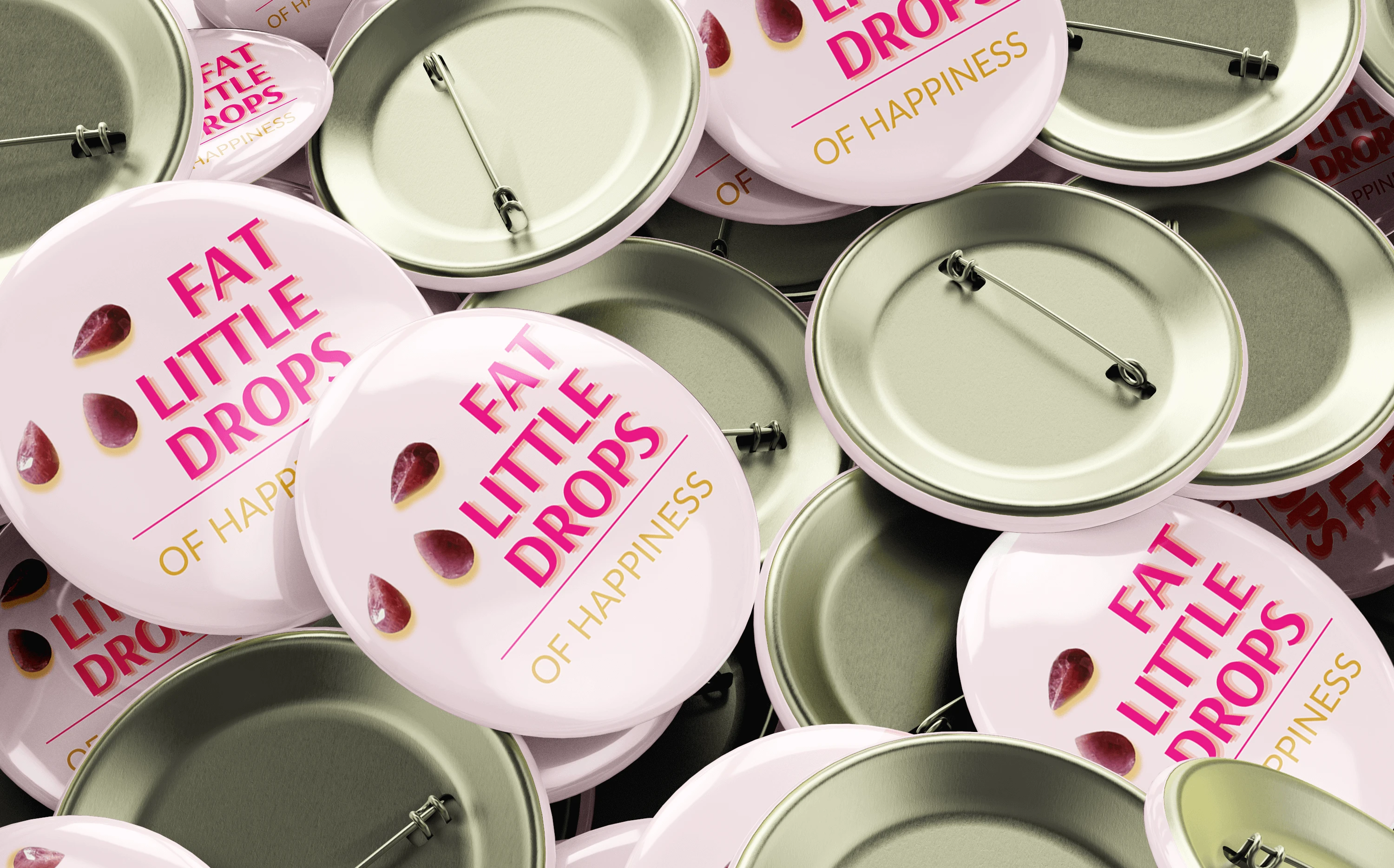
In addition, the creative pink color palette inspired the design of six unique button graphics for future merchandise, pairing shiny gemstone photos with humorous sayings that played into the shop’s theme. The same visual system extended seamlessly into marketing, where Toadette and the button designs were adapted into a podcast cover.
Beyond visuals, the project expanded into podcast editing and production support, using audio editing software to strengthen the brand’s presence across multiple platforms. Altogether, this cohesive identity infused charm, magic, and joy into Beading Dreams while embodying the creativity and community spirit of gemstone lovers and crafters alike.
The Breakdown
BONUS STAGE: Behind the Scenes of the Design

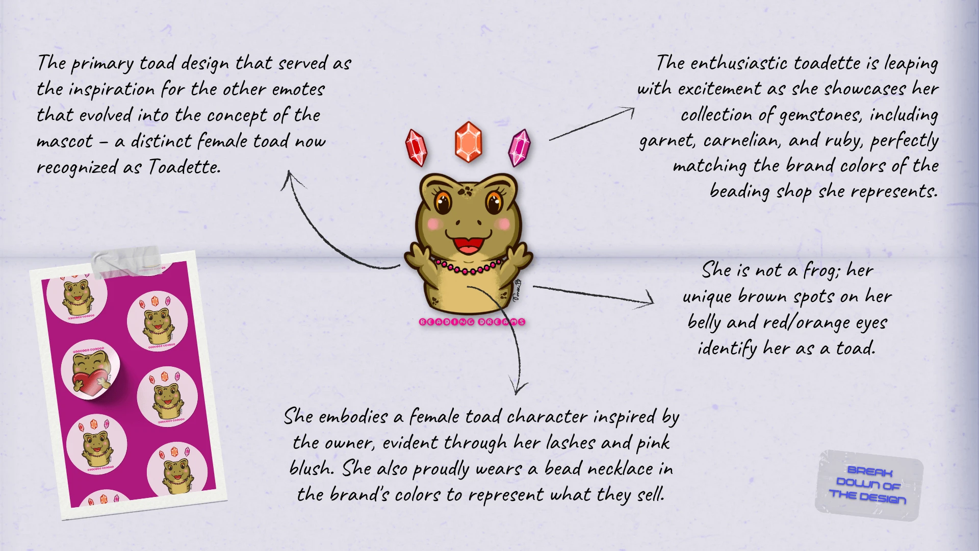
WHY SHOWCASE THIS ON THE WEBSITE?
The difference between me and AI (aside from my great style) is that every decision I make has a reason behind it, rooted in research, experience, and an understanding of how each choice reflects the brand, even in the hidden little details. Here’s a glimpse behind the scenes of what that looks like.
Explore More Designs